Practical guides
Building a small Studio Vallor starter gallery wall
Starter gallery wall art posters: how to build a 2-3 piece beginner set across Studio Vallor collections.
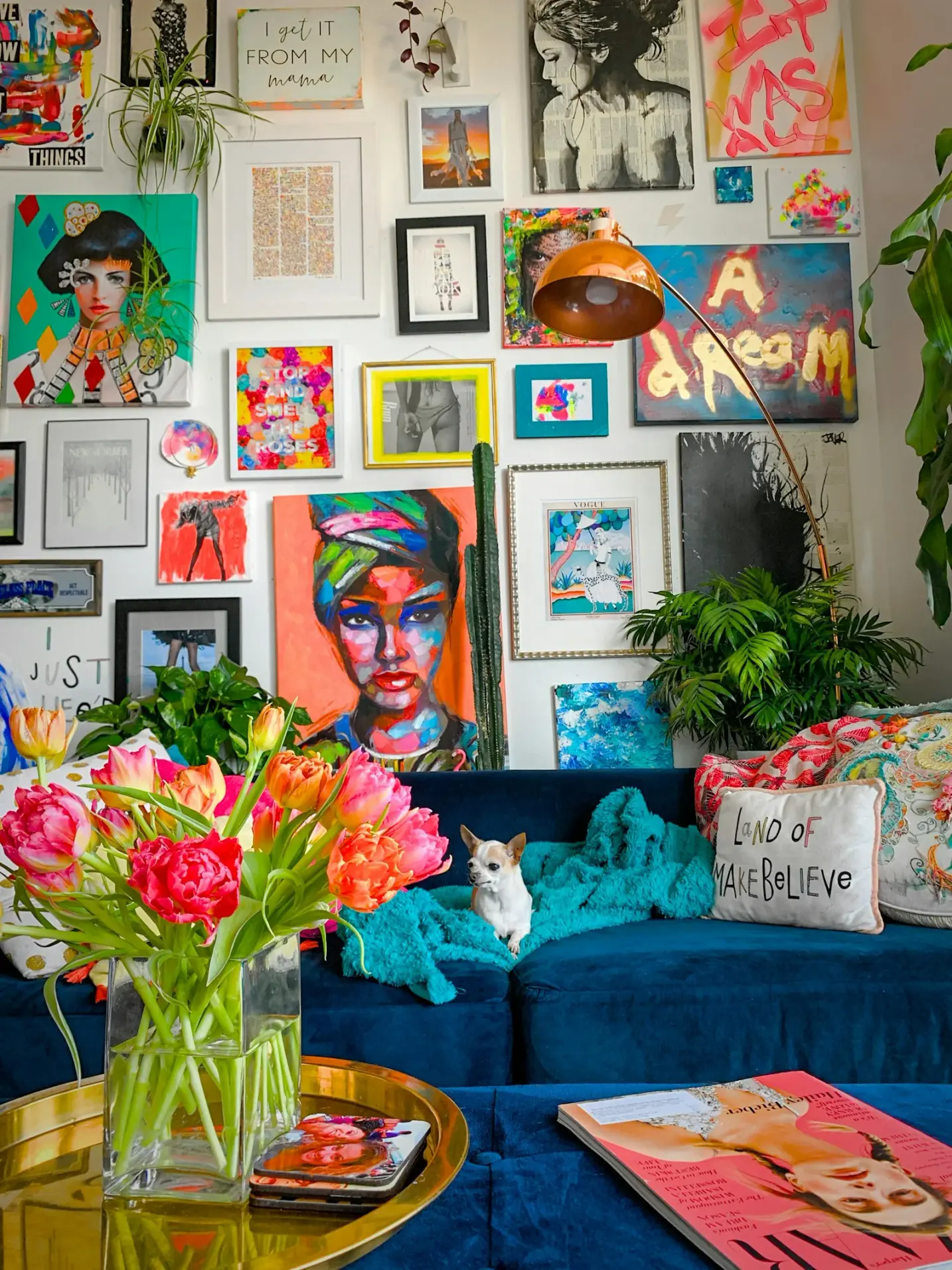
A starter gallery wall does not begin with a dozen frames and a weekend of drilling. It begins with two or three careful posters that already speak to one another, hung with enough air that the wall still feels calm. For first-time premium poster buyers, that smaller beginner art print wall set is often the wiser first move: less risk, clearer rhythm, and a composition you can live with while you learn how your room actually behaves.
This guide is about starter gallery wall art posters in the Studio Vallor sense. Soft commercial, practical, and rooted in real atelier facts. You will see how a two or three piece logic works across Travel, Abstract, Nature and Children, how to choose formats and frames, and how to avoid the usual first-wall mistakes. Browse the collections index while you read, keep the posters catalogue open for scale, and treat Creating a gallery wall as the companion note when you are ready to expand beyond three pieces.
Studio Vallor prints in Europe on 250 g/m² matte art paper with sustainable inks. Formats stay in the atelier range: 30 × 40, 50 × 70 and 70 × 100 cm. Frames, when you want them, come ready to hang in natural oak, dark oak, matte black and matte white. Free shipping from €50 makes a small first set easier to complete without freight anxiety; conditions live on Shipping and returns. The useful work still happens before checkout: choosing a quiet story of two or three images, matching them to one wall, and hanging them so the room feels finished rather than provisional.
Why this matters for premium art prints
A thin catalogue poster forgives almost any arrangement. Tape three mismatched sheets in a crooked row and the wall still reads as temporary décor. Premium paper does not forgive the same way. On 250 g/m² matte art paper, pigment sits in the fibre with quiet depth. Soft ochres, dusty blues, charcoal fields and pale botanicals hold their nuance. That nuance is exactly what a crowded, uneven first gallery wall can hide.
Starter gallery wall art posters matter because the first hang teaches your eye. If the first set is too large, too mixed, or too loud, you stop trusting the wall. You leave gaps that never fill well. You buy more pieces to “fix” a composition that was never clear. A beginner art print wall set of two or three posters forces a decision: which story does this wall tell, and which pieces can wait for another room?
Premium also changes how light and furniture talk to the art. Matte 250 g/m² scatters daylight instead of throwing a hard mirror. That helps living rooms and hallways, but only if the frames and spacing stay coherent. Three excellent prints with three competing mouldings still look unsettled. Two quieter prints with matched frames and honest gaps often look more considered than a busy salon hang built in a hurry.
There is a permanence question too. People buy premium prints because they expect the wall to still feel right next year. A small starter set respects that ambition without locking you into a twelve-frame grid on day one. You can add a fourth piece later when you know the sofa height, the evening lamp spill, and whether Travel or Nature wants the neighbouring wall. You can also stop at three and keep the composition. Stopping is a valid design decision.
Scale and seriousness travel together. A 30 × 40 cm sheet can look elegant in a tight corridor if the edges stay crisp and the hanging is centred. The same sheet inside a natural oak frame reads as a small finished work. A 70 × 100 cm print can hold a large blank wall if the furniture below is wide enough to justify it. Choosing starter gallery wall art posters without measuring the wall width, the furniture below, and the fixture strength is how good paper ends up looking provisional. Premium invites comparison with other objects in the room. Wood furniture talks to oak frames. Black metal lamps talk to matte black mouldings. White walls and pale textiles talk to matte white frames or to a clean unframed edge. The print is not alone on the wall. Getting that conversation right is why a small first set deserves more care than a bulk décor click.
Finally, a beginner art print wall set protects taste from impulse. Open the Travel collection, the Abstract collection, the Nature collection and the Children collection with your wall measurements written down. Shop for a short sentence of colour and mood, not for every image you like. The wall will thank you for the restraint.
How to choose / place
Start with the room’s job, not with a favourite postcard. Ask how long you will sit facing the wall, how bright the plaster is, who walks past, and whether the composition needs to look finished from the doorway. Then pick format. Studio Vallor’s 30 × 40, 50 × 70 and 70 × 100 cm sizes cover most residential walls without custom framing. A single 50 × 70 above a sofa often settles a living room. Two 30 × 40 sheets can pace a hallway. One 70 × 100 can hold a large blank wall. For a starter gallery of two or three pieces, prefer one clear hero format and companions that do not fight it.
A practical beginner art print wall set often looks like this. One larger piece as the visual anchor, usually 50 × 70 or 70 × 100, with one or two smaller companions at 30 × 40, or three equal 50 × 70 sheets in a calm horizontal row. Equal sizes are easier when you are learning spacing. Mixed sizes need a clearer hierarchy: the largest piece holds the centre or the left visual weight, and the smaller pieces support rather than compete.
Height follows living height more than gallery dogma. Seated rooms can sit a little lower. Circulation spaces can sit a little higher. If the prints will live above a sofa, leave breathing room above the backrest and keep the composition tied to the furniture, not floating into ceiling void. For a detailed method on that wall, see how to hang an art print above a sofa. Framing changes the outer rectangle, so measure the moulded size, not only the paper size, before you mark the wall.
Spacing is the quiet skill of starter gallery wall art posters. Four to seven centimetres between frames is enough for most residential hangs. Too much air and the wall comes apart. Too little and everything clumps. Align centres or bottom edges with intention. Lay kraft paper cut to outer frame size on the floor first, or tape the rectangles lightly on the wall. Step back from the doorway. The eye sees imbalances that the hammer would make permanent. Creating a gallery wall covers rhythm and gutters when you want to grow beyond three pieces without losing calm.
Colour and subject should answer one short story. A Travel horizon beside a soft Abstract field can work when both share temperature and midtones. A Nature botanical beside a Children illustration can work when the palette stays gentle and the frames match. Mixing four universes on one first wall usually looks like a catalogue, not a home. Choose a primary universe, then borrow one neighbour if the mood still holds. Room-by-room styling logic still helps when the lounge opens into dining or a hallway; How to style posters in every room walks those transitions.
Two-piece logic
Two posters are the most forgiving beginner art print wall set. They teach balance without demanding a full salon hang. Hang them as a pair with equal outer height, or as a clear hero and a quieter companion. Equal 50 × 70 sheets side by side above a sofa can feel architectural if the sofa is wide enough and the gap stays even. A 70 × 100 hero with a 30 × 40 companion to one side can feel collected if the companion shares palette and frame family.
Two-piece logic works especially well in hallways and above consoles. The eye reads a conversation rather than a collage. Keep one constraint: same wood, or same matte colour, or same family of subjects. Two Travel editions with soft horizons and matched natural oak already speak. Two Abstract fields with shared graphite and clay already speak. Two Nature studies with dusty greens already speak. Crossing Travel and Abstract is possible when both stay quiet and warm, or both stay cool and graphic. Crossing everything at once is how a starter wall loses its sentence.
Placement for two pieces should respect furniture width. Centring the pair on the sofa or console matters more than centring on the whole architectural wall unless the furniture is clearly off-centre for a reason. Leave a modest gap between the lowest frame edge and the furniture top so the composition breathes. If the wall is sunny, remember that matte paper helps and ordinary glass can hurt; place the pair where you can still read pigment at the hour you actually sit there.
Three-piece logic
Three posters introduce rhythm. A horizontal row of three equal frames is the simplest beginner art print wall set once you trust your spacing. Three 30 × 40 sheets pace a corridor. Three 50 × 70 sheets can hold a longer living wall when the furniture run is generous. A triad with one larger centre piece and two smaller flanks can also work, provided the centre truly leads and the flanks do not shout louder colours.
Three-piece logic asks for a clearer story than two. Think of a short phrase: soft travel, soft travel, quiet abstract; nature, nature, nature; children, children, soft nature. Repeating a universe is not boring when the crops differ and the palette stays related. Alternating every universe for variety is usually noisier than it feels in the shopping cart. If you want one contrast piece in a triad, let the other two hold the mood so the contrast reads as intentional punctuation.
Vertical stacks of three are useful on narrow walls beside doors or windows. Keep the stack centred on the available plaster band, not jammed against the trim. Horizontal rows suit sofa walls and long hallways. L-shaped or stepped arrangements can look stylish in photographs and stressful on a first hang; save those for later unless you enjoy careful geometry. The goal of starter gallery wall art posters is a wall you can live with on a Tuesday evening, not a layout that only works in a staged photo.
Before you drill, confirm that all three outer rectangles still feel calm when you sit, stand at the doorway, and pass with a cup in hand. If one piece only works in isolation on your screen, it may not belong in the triad. Open the posters range and compare crops at the same format so scale surprises do not appear after delivery.
Mixing universes with restraint
Studio Vallor’s four universes give you clear families without forcing a theme park. Travel brings horizons, cities and the quiet of elsewhere. Abstract brings colour fields and measured structure. Nature brings foliage, air and outdoor calm. Children brings soft illustration meant to last beyond a single age band. Mixing them in a starter set is allowed. Mixing them without a shared temperature is how the wall frays.
A useful restraint rule: pick one primary universe for the wall, then allow one secondary universe if it shares palette, contrast level and frame language. Travel plus Abstract works when both stay soft and architectural. Nature plus Abstract works when the abstract borrows the room’s greens, linens or stone. Nature plus Children works when the children’s piece stays gentle and the botanical stays quiet. Travel plus Children can work in a family hallway if both avoid hard postcard saturation. Travel plus Nature plus Abstract plus Children on one first wall is almost always too many voices.
Browse with that restraint in mind. Start in one collection page, shortlist three images that already feel related, then open a second collection only if a gap remains. The collections index is a map, not a mandate to sample every aisle. When the shortlist is ready, check frames and paper once, together, so the beginner art print wall set arrives as one coherent object rather than three separate impulses.
Materials: paper, frame, light
Paper is the first material decision, and for starter gallery wall art posters it should almost always be matte art paper. Studio Vallor’s house sheet is 250 g/m². That grammage helps the poster hang with fewer waves, so soft gradients and quiet fields stay intact when side light rakes across the wall. The matte face lets you read pigment instead of a ghost of the window or the lamp. Living rooms and hallways mix light sources all day. Matte is the finish that stays polite through that mix. For a broader finish conversation, keep Which paper to choose for a high-end poster nearby; the starter-wall conclusion stays simple. Matte first.
European production and sustainable inks sit behind that sheet so colour stays consistent across editions bought months apart. That consistency matters when your beginner art print wall set grows later. A Nature companion ordered in spring should still sit beside an autumn Travel piece without an obvious paper mismatch. Free shipping from €50, under the conditions on Shipping and returns, makes it easier to order the formats that fit instead of compromising on leftovers.
Frames finish the silhouette. Natural oak suits warm textiles and light timber furniture. Dark oak deepens a moodier palette. Matte black anchors graphic Abstract work and strong contrast. Matte white lightens a dark or already busy wall without adding shine. For a first gallery wall, matching mouldings hold the set together even when subjects differ. Matching does not mean identical crops. It means the same family of wood or the same matte colour so the eye reads one composition. If you are still weighing protection versus flexibility, framed versus unframed art posters helps you decide whether the main wall wants a finished edge now or a cleaner sheet you might frame later.
Light is the third material. Matte 250 g/m² already reduces hard reflections compared with glossy sheets. Direct sun still heats pigment and can turn ordinary glazing into a bright rectangle. Place your starter set where you can read it at the hours you use the room. A wall beside the window often keeps the room bright without projecting the window’s shape onto the print. Sheer curtains that cut the beam without killing the room remain useful whether you frame or not. Evening lamps should graze, not blast. A strong spot that creates a hot oval on one poster will unbalance a careful triad.
Care stays ordinary. Dust frames with a soft dry cloth when you can. Keep sheets away from kitchen steam if the lounge opens to cooking. Avoid hanging directly above radiators that bake the lower edge. Store any rotation piece flat, dry and away from direct sun. The print’s European production helps longevity. Your placement and hands finish the job.
Paper and finish in daily rooms
Daily rooms are where paper choices show. A hallway with mixed daylight and overhead spots will punish glossy stock. A living room with a television and a west window will punish anything that mirrors. Matte art paper at 250 g/m² keeps starter gallery wall art posters readable through those ordinary conflicts. Soft Travel skies keep their depth. Abstract midtones stay midtones. Nature greens keep a little grey or brown instead of turning neon under lamp light. Children illustrations stay gentle rather than plastic.
Unframed hanging on matte paper can look studio-like if the sheet stays flat and the wall colour does not fight the paper white. Framed hanging adds a boundary so pale fields do not dissolve into plaster. For a beginner art print wall set, framing is often the kinder first choice on the main wall because the moulding unifies the group. Unframed companions can live on secondary walls later if you want a lighter look. The useful sequence remains image, wall, paper, then frame. Measure twice. Tape once. Order when the empty rectangles still feel calm during a normal afternoon.
Frames that hold a small set together
A small set lives or dies by its outer edges. Three different moulding colours on a first wall usually look undecided even when each print is beautiful. Choose one frame family for the whole beginner art print wall set. Natural oak for warm rooms. Dark oak for deeper, quieter schemes. Matte black for graphic clarity. Matte white for soft, bright walls that already hold enough contrast elsewhere.
Slim profiles tend to suit starter walls better than heavy museum mouldings, especially in rentals and smaller rooms. The frame should finish the print, not outshout it. Ready-to-hang thinking matters when you are learning height: you want hardware you trust and a weight the wall can carry. A framed 70 × 100 needs serious fixings. Two or three 30 × 40 sheets are kinder to plasterboard. If you love a large format in a rental, consider whether the wall and the lease can carry it, or whether a triad of medium sheets would settle the same elevation with less drama.
Mixed framed and unframed pieces on one first wall are possible but need a plan. One framed hero with smaller unframed studies can look intentional in a studio-like room. Random switches usually look unfinished. For most first-time premium poster buyers, matched frames across the starter set are the calmer path. You can always loosen the rules on wall two.
Daylight, lamps and glare
Read the wall at the wrong hour and you will hang for a photograph you never take. Morning light, afternoon slant and evening lamps each rewrite colour. Sit where you will actually sit. If the sofa faces a bright window reflection on the opposite wall, move the composition or prefer matte paper without aggressive glazing. If the hallway is lit by a single cool ceiling spot, avoid parking the palest print directly under that cone.
Glare is not only a sunny-room problem. It is a materials and placement problem. Matte paper helps. Thoughtful glazing helps when you frame. Distance from the brightest beam helps. For rooms that stay bright most of the day, the note on matte poster paper in sunny rooms pairs well with this starter logic. The short rule for a beginner art print wall set remains stable: place for the hours you live in the room, not only for noon on a clear Saturday.
Common mistakes
Buying too many pieces before the first hang. A cart full of favourites is not a composition. Starter gallery wall art posters work when two or three images already share a sentence. Shortlist ruthlessly. Live with kraft paper rectangles for a day if you need to. Add more only when the first set feels inevitable.
Mixing frame colours on the first wall. Natural oak beside matte black beside matte white can look collected in a mature salon hang with many years of objects. On a beginner wall it usually looks unresolved. Match the mouldings. Let the images carry the variety.
Centring on the architecture and ignoring the furniture. The sofa, console or bed is the visual anchor people use. Hang the set for that lived centre unless you are building intentional asymmetry with a lamp or tall plant. How to hang an art print above a sofa covers the seated-eye mistakes in more detail.
Leaving heroic gaps or crushing the frames together. Too much air and the triad falls apart. Too little and the wall feels anxious. Four to seven centimetres is a practical residential band for most matched frames. Check from the doorway after you tape the mock-ups.
Choosing every universe for fear of missing out. Travel, Abstract, Nature and Children each have a job. A starter wall that samples all four often samples none well. Pick a primary, allow one secondary, and keep the rest for other rooms. The Children collection can wait for a bedroom or play corner while the living wall stays calmer with Nature or Abstract.
Hanging too high. Gallery dogma about standing eye level floats many first sets into ceiling void, especially above sofas. Leave breathing room above the backrest. Keep the optical centre in the band of wall you actually look at. If the top of the frames vanishes when you sit, the hang is too high.
Ignoring light. A beautiful pale Travel print in the hottest stripe of afternoon sun will frustrate you by dinner. Matte paper helps; placement finishes the job. Test with paper rectangles at the bright hour and the lamp hour before you drill.
Treating premium paper like temporary décor. Cheap tape, crooked nails and mismatched leftover frames undermine 250 g/m² matte art paper. Use proper fixings, level the row, and give the set the same seriousness you gave the purchase. Soft commercial advice is still practical advice: the wall should look intentional on ordinary days.
Skipping measurement. Formats are clear: 30 × 40, 50 × 70 and 70 × 100 cm. Outer frames add centimetres. Write wall width, furniture width and free height before you fall in love with a crop. A beginner art print wall set that fits is calmer than a dramatic sheet that overruns the sofa.
Studio Vallor collections to explore
Begin with the wall’s mood, then open the matching universe. If the room wants elsewhere and horizon, start in the Travel collection. Soft city edges, coastal air and quiet journeys make strong anchors for a two or three piece starter set, especially when the palette stays related across the row. For mid-century rooms and travel moods with clearer graphic structure, travel posters for mid-century modern interiors can sharpen the shortlist. Hallways that want movement without noise may prefer travel posters as hallway wall art.
If the room wants structure and colour without literal subject, walk the Abstract collection. Calm fields and measured geometry settle open plans and sofa walls when you do not want a postcard narrative. Choosing abstract posters for open-plan living is a useful companion when the living zone never really ends. In a starter gallery, two soft abstracts with matched frames often look more architectural than one loud accent plus random companions.
If the room wants air, foliage and outdoor calm, open the Nature collection. Quiet botanicals and landscapes are natural partners for family lounges and north-facing rooms. Nature posters for a busy family living room and botanical posters for north-facing rooms help you keep plant subjects livable rather than thematic. Nature also pairs gently with Abstract when you want one non-literal companion.
If the wall belongs to a child’s room or a dedicated play corner, explore the Children collection. Soft illustration, durable matte paper and European production keep the piece coherent with the rest of the home. Playroom wall art prints keeps the louder brief where it belongs. On a shared living wall, prefer Nature or Abstract calm and let Children editions live where play is meant to be visible.
Then compare scale across the wider posters catalogue once your primary format is fixed. Shop for the system you have: 50 × 70 into 50 × 70, matched oak or matte black, hardware you trust. Use the collections index when you need to jump between universes without losing the shortlist. Materials stay consistent across those families. Matte art paper at 250 g/m². Ready-to-hang thinking in natural oak, dark oak, matte black and matte white. Atelier formats at 30 × 40, 50 × 70 and 70 × 100 cm. Free shipping from €50 according to the conditions on Shipping and returns. That consistency lets you build slowly: two pieces now, a third later, without paper mismatch.
Related reading helps when the hang itself is still open. Creating a gallery wall shows how to keep spacing honest as the set grows. How to style posters in every room translates lounge walls versus hallways and dining corners. Framed versus unframed art posters weighs protection and presence. Which paper to choose for a high-end poster stays useful if finish questions remain. How to hang an art print above a sofa returns you to seated height when the living room is the first stage. If you later want seasonal rotation without damaging the wall, rotate posters seasonally without wall damage pairs cleanly with a small matched-frame system.
Starter gallery wall art posters are not a lesser project. They are the right scale for learning how premium prints live in your light, with your furniture, at your pace. A beginner art print wall set of two or three Studio Vallor pieces, chosen with one clear story and matched materials, can settle a room for years. Expand when the wall asks for it. Stop when it already feels complete.
FAQ
Should every piece in a starter set use the same frame?
Yes, for almost every first hang. Matching frames in natural oak, dark oak, matte black or matte white hold a two or three piece composition together even when the subjects differ. Same outer profile and same colour family let the eye read one beginner art print wall set rather than three separate purchases. You can loosen the rule later on a second wall or in a mature salon hang. On the starter wall, matched mouldings are the simplest way to look intentional. If you are still deciding whether to frame at all, framed versus unframed art posters walks the tradeoffs; for a small gallery, framing the whole set the same way is usually the calmer answer.
Can I mix Travel and Abstract in one beginner wall?
You can, when both share temperature, contrast level and frame language. A soft Travel horizon beside a quiet Abstract field works when ochres, linens or dusty blues already talk to each other. A hard postcard Travel beside a high-contrast graphic Abstract usually fights. Keep one universe primary and let the second piece act as punctuation. Browse the Travel collection and the Abstract collection with the same format in mind, then reject any pair that only works as separate favourites. Starter gallery wall art posters succeed on shared mood, not on maximum variety.
Why prefer matte paper, and how should I test placement?
Prefer matte 250 g/m² art paper because daily rooms mix daylight, lamps and sometimes television glow. Matte scatters that mix so you keep reading pigment instead of a bright pane. Studio Vallor’s European production and sustainable inks keep that sheet consistent if you add another piece later. Test placement before you drill: cut kraft paper to the outer frame size, tape the rectangles lightly, and live with them through a bright hour and an evening lamp hour. Sit on the sofa. Stand in the doorway. Check gaps of about four to seven centimetres. Adjust until the empty shapes still feel calm. Then order. Free shipping from €50, under conditions on Shipping and returns, makes it easier to choose the formats that fit the mock-up rather than forcing a leftover size onto the wall.
How many posters belong in a first gallery wall?
Two or three. That is enough to create rhythm and not so many that spacing and story collapse. A pair teaches balance. A triad introduces a row or a gentle hierarchy. Four or more can wait until you know the hang height, the light and whether the room wants a wider salon. Use Creating a gallery wall when you are ready to grow. Until then, a small beginner art print wall set from the posters catalogue is the more confident start.
Which formats work best for a small starter set?
Stay inside the atelier range: 30 × 40, 50 × 70 and 70 × 100 cm. For many living rooms, two or three 50 × 70 sheets in a row, or one 70 × 100 hero with a 30 × 40 companion, settle the wall without custom framing. Hallways often prefer 30 × 40 modules. Measure furniture width and free plaster before you choose. Outer frames add to the rectangle, so plan with moulded size in mind. Compare options across the collections once those numbers are written down, and keep the composition tied to the sofa or console rather than floating toward the ceiling.