Practical guides
Pairing travel posters with mid-century furniture
Pairing travel posters with mid-century furniture. Practical guide for premium art posters. Studio Vallor.
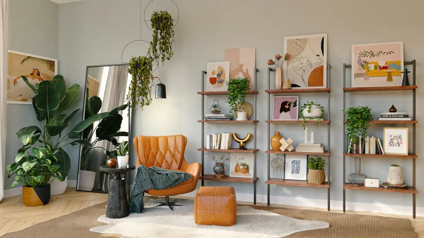
Mid-century modern furniture already carries a kind of quiet travel in its bones. A teak sideboard with tapered legs suggests a road trip through the late fifties. A walnut lounge chair with leather straps feels like a waiting room for a better afternoon. When you hang a travel poster beside that wood, you are not decorating a blank wall. You are finishing a conversation that the furniture started decades ago.
This guide is about that dialogue: horizon travel prints meeting walnut, teak and atomic-age rooms. It is not a corridor depth tutorial. Hallways have their own rules of pace and glance. Here the room is lived in. People sit. Light moves across a coffee table. The print has to hold still while a Danish sofa and a low bookshelf do their work. If you want corridor sequencing instead, read travel posters in a hallway. What follows stays with living rooms, dining corners and the short passages that connect them inside a mid-century plan.
Studio Vallor prints travel editions on 250 g/m² matte art paper with sustainable inks and European production. Formats sit at 30×40, 50×70 and 70×100 cm. Frames arrive in natural oak, dark oak, matte black or matte white. Shipping is free from €50 in metropolitan France. The rest of this article is about placing that print so the furniture still looks inevitable, not nostalgic for its own sake.
Why this matters for premium art prints
Mid-century rooms punish careless wall art. The furniture already speaks in clear silhouettes: thin legs, honest joins, planes that float slightly above the floor. A cheap glossy souvenir poster beside that language looks like luggage left in the wrong decade. A premium travel print, by contrast, can extend the same logic. Calm horizons, soft coastal bands and measured city silhouettes echo the furniture’s preference for structure over clutter.
Walnut and teak bring warmth that many contemporary posters ignore. Cool blue typography on a white ground can freeze a teak sideboard into looking dated rather than considered. Horizon travel art that carries sand, dusk ochre, soft navy or misted green sits nearer the wood’s temperature. The eye reads the print and the grain as one atmosphere. That is the real pairing: not “vintage poster plus retro chair,” but shared climate.
Atomic-age interiors also tend to keep walls quieter than Victorian or maximalist rooms. Plaster is often pale. Shelving is open. The television, if present, is no longer a wooden cabinet but a flat screen that already competes for attention. A travel poster in that setting has to earn its wall without shouting. Matte paper helps because it refuses the mirror flash that glossy stock throws under pendant lights. Weight of 250 g/m² keeps the sheet flat so raking afternoon light does not catch ripples. Those are material reasons, not marketing adjectives, and they matter more when the furniture already looks expensive.
There is also a cultural fit that goes beyond colour. Mid-century design grew up beside the jet age, motor hotels and the idea that a coastline or a mountain pass could be a modern dream rather than a postcard joke. Horizon compositions honour that optimism without needing cartoon lettering or cartoon mascots. A quiet aerial band of sea and land can sit above a low credenza the way a window would if the architecture had given you one. Figurative detail that rewards nose-distance reading often fails when you are across the room on a lounge chair. Broad planes survive the sofa glance.
Premium also means permanence. Mid-century pieces are rarely impulse buys. People restore them, search for the right lamp, wait for the right rug. A travel print that will be replaced in six months breaks that ethic. Choosing European production and sustainable inks is part of treating the wall with the same seriousness as the joinery. Browse the travel collection with your wood tones in mind before you fall for a crop that only works on a phone screen.
Finally, mid-century plans often mix open living with tight secondary zones. The print you choose for the sofa wall may need a quieter cousin above a dining bench or beside a hallway console. Consistency of palette across those walls keeps the apartment from feeling like a souvenir shop. Restraint is how premium art prints keep company with furniture that already knows how to edit itself.
How to choose / place
Start with the furniture’s longest horizontal line. In most mid-century living rooms that line is the sofa back, the sideboard top or the low bookshelf. Your travel poster should answer that line, not float randomly above a gap in the plaster. Measure the furniture run, then choose a format whose outer frame width feels related to that mass. A lonely 30×40 cm sheet above a two-metre teak sideboard looks like an apology. A 50×70 or 70×100 cm print, or a tight pair of related horizons, usually settles the elevation.
Colour should borrow from the wood and the upholstery, not from the loudest object in the room. If the chair leather is cognac, let the print carry a late-afternoon sky rather than neon pink. If the sofa is oatmeal bouclé, soft coastal greys and sand bands will hold. Horizon travel editions often win here because their palette is already atmospheric rather than logo-driven.
Orientation follows furniture logic. A long sideboard invites a landscape horizon or a horizontal pair. A tall walnut bookcase with open shelves may prefer a portrait sheet that shares the vertical rhythm of the spines. Atomic-age rooms sometimes include a sunburst clock or a sculptural pendant. Give those objects air so the travel print does not compete for the same visual spike.
Hanging height in seated rooms differs from hallway height. People live at sofa eye level for hours. Aim so the centre of the image meets a seated gaze more often than a standing one when the print sits above lounge furniture, then adjust if guests mostly stand at a bar or kitchen pass. Leave breathing room above a sofa backrest. Avoid climbing so high that the frame enters the ceiling void and the furniture looks abandoned below.
Test with kraft paper taped at the intended outer outline, including the frame. Mid-century mouldings and tapered legs make empty wall look larger than it is. Live with the paper for a day under morning and evening light. If the mock-up feels too small from the dining chair, it will feel too small once the real print arrives.
Living room
The living room is where walnut and travel horizons do their best work. Picture a low teak coffee table, a leather lounge chair with a bentwood frame, and a pale rug that still shows floorboards at the edges. The wall behind the sofa is the usual candidate. Choose a horizon print whose quietest band of colour answers the wood: dusk sand against teak, soft slate against walnut, a muted coastline that does not invent a tropical postcard the furniture never asked for.
Scale is the first honest filter. Many European living rooms that carry mid-century pieces are not ranch-scale volumes. Ceiling heights are human. Sofa lengths vary. The 70×100 cm format often becomes the hero when the plaster run is continuous and the sofa is generous. The 50×70 cm format suits chimney breasts, narrower elevations or rooms where a single large sheet would crowd a window reveal. Keep 30×40 cm for secondary walls, niches beside a bookshelf or a companion piece in a planned pair, not as the sole statement above a full sofa.
Composition should favour distance. A travel scene with a clear horizon line or a soft aerial plane reads from the kitchen doorway. A dense collage of landmarks forces the eye to squint. Mid-century living is about repose. The print should let conversation continue. If your edition includes typography, prefer quiet lettering that sits inside the colour field rather than carnival type across the sky.
Lighting in these rooms often mixes a floor lamp, a pendant and daylight from one side. Matte 250 g/m² paper keeps the image readable when the lamp comes on. Avoid aiming a hard spotlight at glazing. Soft ambient light flatters both leather and horizon ink. If the sofa faces a bright window, treat glare as a materials problem as much as a placement problem.
Furniture dialogue means alignment. Centring the print on the sofa usually beats centring it on the whole wall when the sofa is the visual mass. One hero print above the sofa and a quieter companion above a sideboard can work when they share palette. Two competing hero scenes usually do not. Mid-century shelves already display books, ceramics and a record player, so leave plaster air around the frame. One strong travel print often looks more expensive than a scatter of souvenirs. If you want a denser arrangement later, plan it as a true gallery with shared frames. Creating a gallery wall covers that craft when you outgrow the single statement.
Dining
Dining zones in mid-century homes are frequently open to the living room or tucked beside a pass-through. The table may be walnut with spindle chairs, or a simpler teak top with woven seats. People sit longer here than in a hallway, yet they also look across at the living wall. Your dining print should not argue with the sofa print.
Prefer one calm travel horizon that can be seen from both seated positions. A 50×70 cm sheet above a sideboard behind the dining bench is a classic mid-century move. The sideboard already offers a horizontal base; the print continues that line into sky and water. If there is no sideboard, hang with enough clearance above chair backs so heads do not brush the frame when guests stand.
Avoid food-themed novelty posters. Mid-century dining already has linen and candlelight. A horizon travel print keeps the wall architectural. Colour should tolerate warm bulbs: yellow-heavy skies can turn syrupy under amber pendants, while balanced midtones survive dinner light better. If the dining wall is short, resist forcing a 70×100 cm sheet. A well-placed 50×70, or a vertical 30×40 flanking a kitchen doorway, respects true scale. Match frame wood to the table when you can. Natural oak beside teak is usually friendlier than a cold white moulding from another decade.
Hallway
Even here, the hallway remains a bridge between rooms, not the main stage. Keep it lighter in ambition than the sofa wall. A single travel print that shares the living room’s palette can pull a guest from the entrance toward the teak sideboard without starting a new theme.
Use smaller or mid formats. A 30×40 or 50×70 cm sheet suits many apartment corridors that serve mid-century open plans. Hang at standing eye level, leave door swings clear, and do not turn the corridor into a second gallery if the living room already carries a large horizon. Shared colour temperature across both zones matters more than matching destinations. For corridor-specific depth and glare, the dedicated hallway travel poster guide goes further.
Bedroom and reading corners
Mid-century bedrooms often hold a low dresser, a bentwood chair and a small bookshelf rather than a hotel headboard wall. Travel posters work here when they stay softer than the living room hero: misted hills, quiet harbours at dusk, pale aerial fields. Reserve sharp graphic cities for daytime zones unless you want the wall to wake you.
Above a dresser, a landscape 50×70 cm print can sit where a mirror might otherwise go, provided you still have a place to check your face. Beside a reading chair, a vertical print shares the posture of a standing lamp. Keep scale intimate. Matte paper remains kind under a single bedside lamp. If nightstands are teak, let the frame continue that warmth with natural oak or dark oak. Matte black can work with black metal lamp stems, but test it against honey teak before you commit.
Materials: paper, frame, light
Paper is the surface you live with. Studio Vallor’s house standard is 250 g/m² matte art paper. The weight keeps the sheet quiet on the wall so walnut grain and horizon ink share one calm plane. The matte face scatters daylight from side windows that mid-century apartments often place asymmetrically. Glossy stock may look sharp on a screen preview. Beside a leather lounge chair under a real lamp, gloss becomes a rectangle of glare.
Sustainable inks and European production sit behind that sheet. Colour stays consistent when you later add a companion print for a dining sideboard. You are not guessing whether a reorder will shift toward green or gray. For a fuller comparison of finishes and why grammage matters, read which paper to choose for a poster. The short advice for mid-century rooms: matte art paper first, especially when teak and brass already reflect enough light on their own.
Framing settles the print into the furniture language. Natural oak warms coastal and landscape horizons and sits comfortably near light teak. Dark oak deepens walnut rooms and steadies dusk palettes. Matte black sharpens graphic travel editions and pairs with black metal legs or a dark stereo console. Matte white can disappear into pale plaster and let the image float, which helps when you want the art to feel almost built-in rather than announced. Studio Vallor frames come ready to hang in those four finishes: natural oak, dark oak, matte black and matte white.
Choosing framed versus unframed is a lifestyle decision as much as an aesthetic one. Unframed sheets suit quieter walls and careful hands. Mid-century living rooms see more traffic, more dusting of nearby shelves and more rearranging of objects. A frame protects edges and gives the print the same finished presence as the sideboard below it. For the trade-offs in detail, see framed versus unframed art posters.
Light completes the triangle. Mid-century lamps are often directional: an arced floor lamp, a cone pendant, a wall sconce with a sculptural shade. Aim for soft wash rather than a hot disc on glass. If afternoon sun rakes across the sofa wall, sheer curtains that tame the beam without killing the room are usually enough. Even matte paper benefits from not living in a permanent UV spotlight. Dust frames with a dry soft cloth. Keep adhesive strips off the printed face. Measure to the outer edge of the moulding when you plan hanging hardware, because glass and wood add weight the bare sheet does not have.
Formats remain 30×40, 50×70 and 70×100 cm. Order the size the furniture run actually needs. Free shipping from €50 in metropolitan France makes it easier to choose the right format the first time instead of compromising on a leftover sheet. Materials only pay off when scale and light are honest.
Common mistakes
Treating any travel poster as automatically mid-century friendly. Cartoon lettering and neon souvenirs fight teak. Horizon calm usually wins.
Choosing scale for the empty wall photograph in your head rather than for the sofa or sideboard you own. A 30×40 cm print above a long credenza looks temporary.
Mixing too many destinations with no shared palette. The room becomes a brochure rack. Mid-century furniture edits itself. The wall should too.
Ignoring wood temperature. A cold blue-white graphic beside honey teak makes the furniture look yellow and the print look clinical. Borrow warmth from the grain.
Hanging at gallery standing height above a lounge sofa. People sit. If the horizon floats into the ceiling, the conversation happens under empty plaster.
Using glossy paper because the phone preview looked crisp. Screens are backlit. Mid-century lamps are not. Matte 250 g/m² stock keeps colour in the fibre.
Introducing a fourth wood tone with a random frame. Match natural oak, dark oak, matte black or matte white to legs, window frames or existing mouldings already in the room.
Filling every plaster gap because the furniture is spare. Negative space is part of the mid-century look. One strong print often beats five small ones.
Centring on the wall while the sideboard sits off-centre. Align with the furniture mass you actually see when you enter.
Buying for nostalgia alone. Atomic-age rooms want clarity, not kitsch. A quiet coastline can feel more modern than a parody of a 1950s airline advert.
Studio Vallor collections to explore
Begin with the travel collection when horizon, road and soft coastal light are the mood you want beside walnut and teak. Compare adjacent atmospheres in the nature collection if a misted hill or quiet botanical field will serve the same calm with a different subject. Soft geometry from the abstract collection can sit on a secondary wall when the main elevation already carries a figurative horizon and you need a quieter companion.
For the full catalogue across themes, browse all collections or the wider posters range with your furniture measurements written down. Shipping is free from €50 in metropolitan France. The useful decision remains earlier: one honest horizon, paper that stays matte under real lamps, and a frame that speaks the same language as the wood.
Mid-century furniture does not need more souvenirs. It needs a travel print that still feels inevitable when you sit down and the teak catches the last of the light.
FAQ
Black frame or wood?
Choose from the furniture, not from habit. Natural oak and dark oak continue the warmth of teak and walnut and usually feel most at home in mid-century rooms. Matte black works when legs, lamp stems or a console already speak in black metal, or when a graphic travel edition needs a sharper edge. Matte white suits pale plaster and lets the image float. If the wood in the room is honey-toned, start with oak before you default to black.
Which size above a teak sideboard?
Measure the sideboard width first. A single 50×70 cm print often balances a medium credenza. A 70×100 cm sheet suits a longer run with continuous plaster above it. Use 30×40 cm as a pair or for a short return, not as the lone hero on a wide top. Tape kraft paper at the outer frame size and check from the sofa and the dining chair before you drill.
Can travel posters sit with leather lounge chairs?
Yes, when the palette stays atmospheric. Cognac and saddle leathers welcome dusk sands, soft ochres and muted coasts. Black leather accepts cooler horizons and graphic silhouettes. Avoid neon souvenirs that vibrate against the hide. Matte 250 g/m² paper keeps the print readable under a nearby floor lamp.
Horizon print or busy city collage?
For mid-century living rooms, prefer a clear horizon or soft aerial plane that reads from across the space. Busy landmark collages force close reading and compete with shelves and lamps. Save denser scenes for smaller walls you pass at walking distance. The sofa wall wants repose.
Framed or unframed with mid-century furniture?
Framed usually looks more finished beside restored wood and protects edges in lived-in rooms. Natural oak, dark oak, matte black and matte white cover most pairings. Unframed can work on a quiet bedroom wall if handled carefully. For the trade-off, see framed versus unframed art posters. Keep the paper matte either way so walnut and travel ink share one calm light.