Practical guides
Travel posters in a hallway: creating depth
Travel posters in a hallway: creating depth. Practical guide for premium art posters. Studio Vallor.
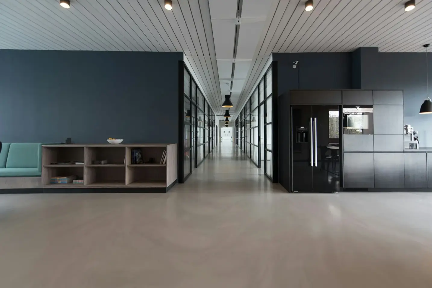
A hallway is a corridor of light and footsteps, not a living room. People pass through it. They glance, they do not sit. That is why travel posters work so well here: a calm horizon can stretch a short wall, while a clutter of souvenir prints makes the same space feel like a drawer left open.
This guide stays with depth, matte paper and honest placement. For a denser arrangement of frames, read Creating a gallery wall. Here the question is narrower: how a premium travel print turns a corridor into a path, not a catalogue.
Why this matters for premium art prints
Depth in a hallway is partly architecture and partly image. A narrow passage already compresses the view. An image with a clear horizon, a road, a coastline or a soft aerial plane pulls the eye forward. The wall stops feeling like a fence.
Souvenir clutter does the opposite. Too many small scenes, each shouting a different city, stop the walk every half metre. The paper may still be good. The composition is not. A premium art print on 250 g/m² matte stock deserves a wall that lets it breathe. European production and sustainable inks keep colour quiet under artificial light; the placement still has to honour that quiet.
Renters often inherit a pale corridor with one ceiling spotlight. That light is harsh on glossy surfaces and kind to matte ones. Choosing travel art for the hall is not only about wanderlust. It is about giving a short wall a longer breath without inventing a false window.
How to choose / place
Prefer one strong motif, or a short rhythm of two or three, over a grid of postcard sizes. A calm horizon print reads from the front door. A dense skyline of tiny landmarks does not. Vertical formats suit tall, narrow walls between doors. Landscape formats need a longer stretch, often opposite a coat rack or above a console.
Studio Vallor formats sit at 30 × 40, 50 × 70 and 70 × 100 cm. In many European flats, a single 50 × 70 in portrait already carries a hallway wall. A 30 × 40 can mark a short return near the kitchen. Reserve 70 × 100 for a generous corridor that will not crowd the image against a door swing.
Hang so the centre of the print meets a standing eye, roughly in the mid-140s of centimetres from the floor, then adjust for your household height. Leave space around door frames. Test with kraft paper taped at the intended outline before you drill. If you rent, use a proper hook rated for the finished weight once framed, not a hope and a pin.
Corridor travel art works best when the motif shares one palette: sea and sand, soft ochre cities, misted mountains. Mixing neon typography with a quiet coast breaks the depth you were trying to build.
Materials: paper, frame, light
The house paper is 250 g/m² with a matte face. In a hallway lit by spotlights or wall washers, matte scatters the beam instead of returning a hard rectangle of glare. That matters more here than in a softly lit bedroom, because corridors often run on artificial light alone.
Frames come ready to hang in natural oak, dark oak, matte black or matte white. Oak warms a travel landscape. Matte black sharpens a graphic cityscape. Measure to the outer edge of the moulding; glass and wood add weight the bare sheet does not have. Match the fixing to that finished weight. Keep adhesive strips off the printed face.
If the hallway has a window at one end, check raking light at the brightest hour. Matte paper still helps. Ordinary reflective glass can undo the work. Place the print where hands and bags will not scuff the surface as people pass.
Common mistakes
Treating the hallway as leftover wall and filling it with every small print that did not fit elsewhere. Depth needs restraint.
Choosing glossy paper because the phone preview looked sharp. Screens are backlit. Hallway lamps are not.
Hanging a wide landscape on a stub wall beside a door, so the image is cut by the swing or by coats on a hook.
Centring for the empty corridor, then discovering the light switch plate or thermostat sits inside the frame line. Map the wall first.
Stacking five different destinations with no shared tone. The corridor becomes a brochure rack.
Studio Vallor collections to explore
Start with the travel collection when you want horizon, road and soft coastal light. Browse the wider posters if a quiet nature motif or a soft abstract will serve the same depth with a different subject. Delivery is free from €50 in metropolitan France; the conditions sit on Shipping and returns.
A hallway does not need more souvenirs. It needs one image you still want to pass twice a day.
FAQ
How many prints?
It depends on wall length, light and the visual weight of each print. Prefer one clear statement, or a short aligned row of two or three that share a palette. Matte paper helps under corridor lamps; tape the outlines and live with them a day before you drill.
Vertical formats?
Vertical sheets suit tall, narrow hallway walls between doors. Landscape needs a longer unbroken stretch. Match the format to the wall you have, not to the postcard in your head. Matte 250 g/m² paper and a careful test placement matter more than forcing a favourite orientation.
Lighting?
Hallways often run on artificial light. Matte paper reduces glare from spots and wall washers. Avoid aiming a hard beam straight at glass. Soft, even light keeps a travel horizon readable; harsh raking light turns the pane into a mirror. Test the wall at night as well as by day if there is any daylight at all.