Practical guides
Travel Poster with Oak Floors and Rugs | Studio Vallor
Pair a travel poster with oak flooring and warm rugs: undertones, rug bridge, frame and scale tips.
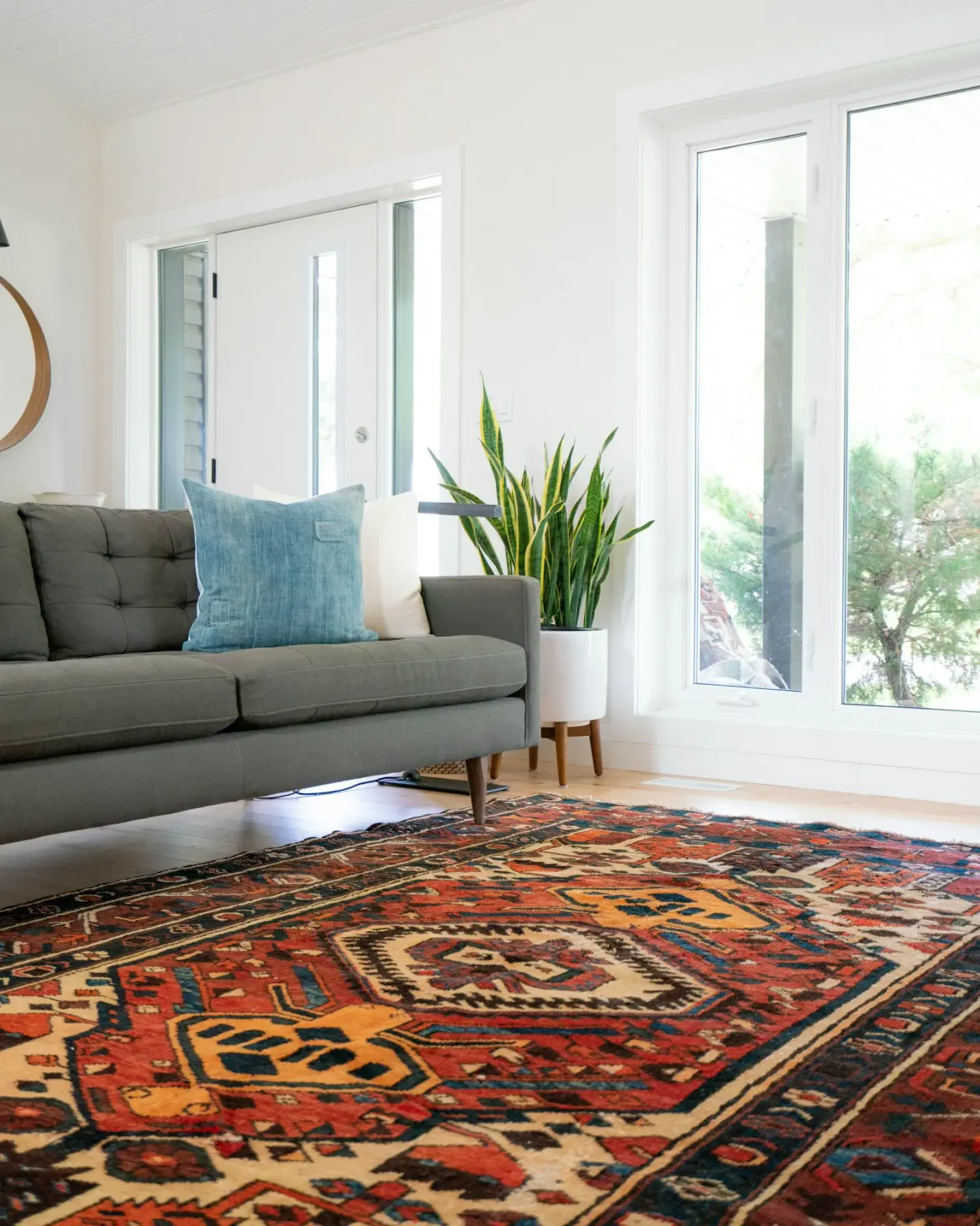
A travel poster can warm a room for colder months, or it can float like a postcard stuck to plaster while the oak below does all the real work. Floors are the largest continuous surface most people see. When the print ignores their undertone, the wall feels temporary. When print, rug and timber share one temperature of colour, the destination settles into the house.
This guide is for homes with oak flooring that want a fresher wall without a full renovation. You already live with wood grain, lamp light and the rug that softens the walk from door to sofa. The job is to sample that wood undertone into the travel image, then let a warm rug carry the handshake between floor and frame. Studio Vallor prints travel and destination moods on 250 g/m² matte art paper with sustainable inks and European production. Formats stay at 30×40, 50×70 and 70×100 cm. Frames come in natural oak, dark oak, matte black and matte white. Shipping is free from €50. What follows is how to read golden versus ash-leaning oak, how rugs bridge destination colour, which frames respect timber, and how to keep a travel poster oak flooring rugs pairing grounded instead of souvenir-like.
Why floors decide if a travel print feels grounded
Walls get the credit in photographs. Floors decide whether the credit is earned. Oak boards run under furniture, catch skirting shadows and reflect lamp light upward into the lower third of a poster. That reflection is not a detail for designers only. It tints the air around the art. Warm golden oak throws a soft amber wash toward cream walls and toward any print hung above a console or sofa. Cooler ash-leaning oak throws a greyer, quieter bounce. A coastal blue that looked calm on a white website can suddenly look thin against cool boards, or muddy against honey-toned planks, depending on what the floor is doing.
Grounding is a vertical conversation. The eye drops from image to moulding to skirting to timber in one sweep. If those steps share an undertone, the travel print feels installed. If they jump from cold sky pigment to yellow floor with nothing in between, the print feels taped on. Rugs sit in that middle band. They are the soft plane that can borrow a note from the destination and a note from the wood at once. Without that bridge, even a beautiful cityscape hangs in a climate of its own.
Oak also sets expectations about honesty of material. People who choose real timber usually prefer surfaces that look tactile rather than glossy and shop-bright. Matte 250 g/m² art paper fits that preference. It holds travel colour without plastic glare, so the pigment can sit beside grain and wool without looking like a different product category. Glossy souvenir paper fights oak. Matte paper cooperates. If you want a fuller note on weight and finish, which paper to choose for a poster stays useful beside this flooring focus.
Season matters. In colder months, rooms lean on rugs, throws and warmer lamps. A travel poster that worked as a light summer accent may need a deeper rug or a softer frame relationship once evenings close early. You do not always need a new print. You often need the floor story, meaning rug and undertone, to catch up with how the room is actually used from October onward. Homes refreshing walls for autumn and winter should judge candidates under the lamps they will live with, not only under noon daylight from a window.
Furniture height changes what the floor “says” about the art. A low sofa leaves a wide band of boards visible under the wall. A tall console or a deep media unit covers more timber and pushes the eye toward rug edges and skirtings. In open plans, oak can run from kitchen to living zone while the travel print lives on only one elevation. The continuous floor still unifies the volume. Choose a print whose temperature will not quarrel with that long timber field, even if the kitchen cabinets are cooler or warmer than the living wall paint.
Noise and softness play a quiet role. Bare oak can feel acoustically bright. A warm rug softens footsteps and also softens the visual jump from hard wood to framed paper. That softness helps destination imagery feel domestic rather than gallery-temporary. Grounded travel art is rarely about more objects. It is about the large surfaces agreeing.
Finally, floors decide scale of ambition. Strong grain and wide planks already supply pattern and character. A travel poster on that stage should not fight for the same kind of attention with dense souvenir graphics unless the rug and frame clearly mediate. Quieter compositions with clear colour mass often read better above expressive oak than a sheet crowded with stamps, maps and slogans. Browse the travel collection while standing where you can see both wall and boards. If the mock-up only shows white laminate, you are shopping blind.
Reading oak undertones before you pick a destination print
Undertone is the temperature hiding inside a colour that looked simple at first glance. Oak is never just “brown.” It leans gold, honey, pink, olive, grey or cool beige depending on species, stain, age, oil and the light in the room. Before you fall for a harbour blue or a terracotta townscape, sample the floor the way you would sample a paint chip. Hold a cream card, a grey card and a warm sand textile against the boards at the same spot where the poster will hang. Notice which card looks cleaner. That is your undertone clue.
Daylight and evening light disagree. Northern windows cool oak toward ash and olive. Warm LEDs pull the same boards toward honey. If you mostly see the living room after work, trust evening. If the room is a daytime reading place, trust the cooler read as well, then choose a print that survives both. Squint at the floor until grain detail fades. What remains is the average temperature. Match the travel poster’s dominant land, sky or paper field to that average, not to a single bright knot in one plank.
Stain and finish change the story. Whitewashed or limed oak behaves closer to cool stone. Traditional oiled oak often stays warm. Dark oak stains can still carry warm red-brown or cool espresso depending on the dye. Do not assume “dark” equals “warm.” Hold your candidate print’s palette against the actual stained board. Phone photos of floors are unreliable; white balance lies. Bring a printed colour reference or a textile you trust into the room.
Wall paint interacts with oak before the poster arrives. Cream walls on golden oak create a warm envelope. Cool grey walls on the same oak create tension that a travel print must either resolve or avoid. If walls and floor already argue, choose a quieter destination image and let the rug do more of the bridging. If walls and floor already agree, you can afford a bolder sky or a stronger graphic accent in the print.
Typography and graphic blacks in travel posters sit differently on warm versus cool floors. Black lettering on a warm golden field can feel crisp and intentional above honey oak, especially with a matte black or dark oak frame. The same black on a cool mist print above ash-leaning boards can feel graphic and modern. Problems start when warm timber meets a cold blue-violet sky with no rug mediation, or when cool timber meets a yellow-cream poster field that makes the floor look orange by contrast. Reading undertones first prevents those mismatches.
Think in families, not in perfect twins. A soft sand in a coastal print can cousin golden oak. A chalky blue-grey can cousin ash-leaning oak. Exact matching of wood to pigment is neither possible nor desirable. Related temperature is the goal. Studio Vallor’s matte paper and sustainable inks keep those families stable under lamps, which matters when you are comparing a print to living timber rather than to a screen.
Warm golden oak
Warm golden oak carries honey, amber, soft yellow-beige and sometimes a gentle pink in the grain. It loves travel imagery that already holds sun: late-afternoon plazas, ochre walls, dry hills, cream paper fields, soft terracotta roofs, desert roads and coastal scenes where the sand is truly sand-coloured rather than cool grey. Natural oak frames continue that story into the moulding. A warm rug in oatmeal, camel, rust-softened clay or deep honey wool will lock floor and wall together.
Avoid destination prints whose main field is icy blue-violet or stark blue-white unless you deliberately cool the room with a grey-beige rug and accept a contrast strategy. Contrast can work in graphic interiors, but most homes with golden oak want comfort in colder months. Comfort usually means shared warmth. If you love a cool harbour scene, sample a warm secondary from the print (stone quay, cream sail, sunlit facade) into the rug rather than forcing the coldest blue to speak to the floor alone.
Lighting tips for golden oak: warm bulbs enhance the timber and can push cool pigments toward muddiness. Test coastal blues in the evening. Prefer blues with a green or grey lean over blues with a purple lean. Prefer creams with a soft yellow lean over blue-white paper backgrounds. Dark oak frames can still work as a grounded edge if the image itself stays warm; matte black works when typography is strong and you want a crisp outline without inventing a cold third climate.
Scale tip for golden rooms: wide honey planks already feel generous. A 50×70 or 70×100 cm travel sheet above a sofa usually balances that generosity better than a small 30×40 cm print that can look timid against expressive grain. Keep the composition’s warm mass visible in the lower half of the sheet so seated viewers connect image to rug and boards in one glance.
Cooler ash-leaning oak
Cooler ash-leaning oak carries grey-beige, soft olive, muted taupe and less yellow bounce. It pairs cleanly with misty coasts, northern light, mountain air, chalk skies, soft stone cities and graphic travel posters that use blue-grey, ink and cream with restraint. Matte white or pale natural oak frames keep the elevation airy. Rugs in soft grey, blue-grey, stone and quiet charcoal bridge wood and wall without dragging yellow into the story.
The common mistake is forcing a biscuit-coloured “warm” rug onto ash oak because winter marketing said warm equals beige. Yellow cream on cool boards can make the floor look dirty and the rug look costume. Choose neutrals that share the floor’s grey or olive whisper. Then, if you want winter comfort, add warmth through wool texture and through a travel print that holds a measured ochre or clay accent, not through a rug that fights the timber.
Cool oak also forgives cooler wall paints. Soft greige, pale stone and quiet greys sit well. Against that envelope, a travel poster with strong sun-yellow fields may need a careful rug: something that contains both a cool field and a warm motif, or a solid that sits between grey and sand. If that feels complicated, pick a quieter print. Ash-leaning floors reward clarity.
Frame note: matte black often looks sharp on cool oak with graphic destinations. Natural oak still works when the print’s paper field is cream rather than blue-white. Dark oak can deepen a night city mood. Avoid novelty coloured frames; they invent a story the timber did not ask for. Studio Vallor’s four finishes (natural oak, dark oak, matte black, matte white) cover the range without seasonal fashion mouldings.
Rugs as the bridge between wood and wall
Rugs do the job frames cannot. A frame edges the paper. A rug edges the living zone and sits in the same visual band as skirting and furniture legs. When you want travel poster oak flooring rugs harmony, treat the rug as a translator. It should borrow temperature from the boards and a colour cue from the destination, then stay calmer than the loudest note on the sheet.
Start with field colour, not with motif. The largest area of the rug sets the climate. A warm oatmeal field under golden oak supports sunlit travel prints. A stone or blue-grey field under ash oak supports mist and harbour moods. Motifs come second. A quiet border, a soft diamond, a worn kilim geometry can add life, but if the motif introduces three new hues the poster never asked for, the bridge collapses into clutter.
Pattern load is the main winter conflict. Busy kilims, strong geometrics and high-contrast tribal repeats already supply place and energy on the floor. A vivid travel poster then becomes a second postcard. Often the cleaner path is a quieter print when the rug is patterned, or a quieter rug when the print is the hero. Texture-rich solids and tone-on-tone weaves are underrated bridges. Wool pile, flatweave with visible structure and low-contrast stripes give winter softness without a second destination story.
Size the rug so it participates in the art wall’s elevation. A small mat floating in the middle of the room does little for a poster above the sofa. A rug that runs under the front legs of the sofa and toward the wall plane gives the eye a continuous soft path from timber to textiles to frame. You do not need the rug to touch the skirting in every layout, but you do need it close enough to the furniture cluster that holds the art wall that the three surfaces feel related.
Sample destination colour into the rug the same way you would sample into a throw: one family, not the whole palette. If the poster’s sky is chalk blue, a soft blue-grey in the rug edge or a muted related field can echo it. If the poster’s land is clay, a rust or terracotta whisper in the rug can echo it. Keep saturation a step quieter than the print. Matte wall pigment and dyed wool will never be identical; relatedness is enough. For sofa-level textile thinking that pairs with this floor bridge, travel poster colours and sofa throws extends the same sampling logic upward onto cushions and blankets.
Layering rugs can help awkward rooms, but stacking loud patterns rarely helps travel art. A flat jute or sisal underlayer with a smaller softer wool on top can warm cool oak without visual noise, provided the top rug’s field still respects undertone. Keep layers aligned with the furniture, not scattered as islands. Islands make the poster look like it belongs to a different apartment.
Maintenance and honesty matter in family homes. Choose a rug you will actually keep down through colder months. A precious pale runner that gets rolled away every muddy weekend cannot be the bridge your travel print depends on. Slightly deeper mid-tones hide life better and still carry undertone. Studio Vallor’s travel sheets stay on the wall; the rug has to survive the floor. Design for that reality.
Light across pile changes colour. Cut pile can look cooler than flatweave of the same yarn under lamps. Check your candidate rug at night under the same bulbs that wash the poster. If the bridge survives evening, it will serve the season you bought it for.
Frame colours that respect timber
Frames are architecture, not accessories. Above oak floors they either continue the wood story or draw a deliberate outline. Studio Vallor offers natural oak, dark oak, matte black and matte white so you can choose that role without novelty colours that fight both timber and travel pigment.
Natural oak is the softest echo of warm floors. It suits golden oak boards, sunlit destinations, cream paper fields and rooms that want the image to feel grown from the same material family as the planks. On ash-leaning floors, natural oak still works when the print is warm-cream rather than cold blue-white; otherwise the moulding can look slightly yellow against cooler boards. In that case, prefer matte white or matte black depending on the image’s graphic strength.
Dark oak deepens warm rooms and supports night scenes, strong architecture and richer land colours. It can also calm a busy travel composition by adding gravity. On very cool ash floors, dark oak should be checked in person or against a sample: some dark stains lean red-warm and may reintroduce the yellow problem. When it works, dark oak is a handsome cousin to espresso furniture legs and bronze lamps.
Matte black is the crisp edge. It works on oak when you want outline rather than wood echo. Graphic lettering, bold posters and modern rooms benefit. Black does not warm the floor; it frames the paper. Pair it with a rug that still handles undertone so the black line does not leave the print floating in a cold rectangle. Matte finish matters; glossy black can look like plastic beside honest timber.
Matte white disappears into pale walls and keeps misty or chalky travel prints airy. On golden oak, pure blue-white moulding can feel chilly unless the wall paint is also cool. Soft white that leans warm, or simply choosing natural oak instead, often reads better in honey-toned rooms. White frames shine when the floor is cooler and the rug is stone or grey.
Glass and glare interact with oak’s bounce light. Lamps reflecting in glazed frames can steal the colour you carefully matched to the boards. Matte paper helps inside the frame; thoughtful hanging height and lamp placement help outside it. For general placement logic across rooms, how to style posters in every room remains a practical companion when this article’s flooring focus is settled.
Do not mix four frame finishes on one oak-facing elevation. One finish for the hero travel print is enough. If you later add a small companion work, match the moulding. Mixed metals and mixed woods beside expressive floor grain create visual static. Respecting timber means editing finishes as carefully as you edit pigment.
Scale above sofa or console on wooden floors
Scale is where many travel posters lose the floor. Oak planks are long horizontal lines. A tiny print centred above a wide sofa becomes a postage stamp floating in plaster while the boards and rug do the heavy visual lifting. Presence must be proportional to the furniture width and to the strength of the timber field.
Above a standard sofa, 50×70 cm is a frequent sweet spot and 70×100 cm suits larger walls or bolder destination statements. 30×40 cm works better above a narrow console, in a hallway niche, or as a secondary piece, not as the sole anchor on a long living-room elevation. When boards are wide and highly figured, err toward the larger formats so the art can meet the floor’s character as an equal.
Hang with seated sightlines in mind. The lower third of the poster and the upper edge of sofa cushions share a glance with the rug’s near edge. Colour mass that lives only at the top of a tall sheet feels distant from oak and wool. Choose crops where sky, land or typography weight appears where people actually look while sitting. Consoles change the geometry: a lamp, a bowl and a travel print must share the surface without crowding. Leave air; oak rooms already have grain. More objects are not more grounded.
Open plans need restraint. One hero travel print on the main sofa wall, supported by rug and frame, usually beats a scatter of small destination sheets competing with kitchen sightlines. Continuous oak already unifies the volume. Extra posters can fragment it. If you want place imagery in a hallway as well, keep the living-room hero clearer and let secondary spaces carry quieter relatives rather than twins.
Gallery clusters above wood floors ask for balance and breathing room. Even spacing, aligned edges and a shared frame finish prevent the cluster from looking like luggage stickers. An external note on how to hang a balanced gallery wall at home is a clear practical reference when you move beyond a single sheet. Balance in frames and balance against timber are related skills: both reward air and punish clutter.
Furniture legs and rug borders are scale cues. Tall, thin metal legs expose more oak and make small art look smaller. Soft skirted sofas hide boards and can support slightly calmer print scale if the rug field is generous. Match your format decision to what the eye actually sees of the floor, not only to sofa width on a product page.
Studio Vallor’s fixed formats keep future swaps sane. European production and consistent 250 g/m² matte paper mean a later size step-up stays in the same colour climate as the sheet you tested against your oak. Free shipping from €50 makes it easier to order the format that truly fits rather than forcing an undersized print and hoping the rug will compensate. Rugs help undertone; they cannot invent presence.
Mistakes that make travel art float above the room
Choosing the poster on a white screen and never checking it against the boards. Undertone lives in the room. Bring a textile or stand with a laptop next to the actual oak before you commit.
Ignoring the rug and expecting the frame alone to ground the print. Frames edge paper. Rugs speak to floors. You usually need both.
Pairing a busy kilim with a busy destination sheet. Two place stories fight. Quiet one of them.
Forcing yellow-cream “winter warmth” onto ash-leaning oak. The floor will look wrong and the travel print will inherit that wrongness.
Hanging a 30×40 cm hero above a long sofa on expressive planks. Colour dialogue cannot replace scale.
Using glossy paper that flares under lamps bouncing off pale oak. Matte art paper keeps pigment honest beside timber.
Mixing matte black, oak and white frames on one elevation for variety. Variety reads as indecision against strong grain.
Sampling every hue from the poster into the rug. One related family is a bridge. A rainbow is a souvenir shop.
Judging only at noon. Evening bulbs change oak, wool and travel colour together. Sit after dark.
Buying three new accent objects the week the print arrives. Edit the rug and frame relationship first. Wait. Then decide if anything else is needed.
Treating dark oak stain as automatically warm. Check red-brown versus cool espresso before you pick a sunlit print.
Letting the travel poster carry slogans and map clutter while the floor already supplies pattern. Prefer clearer compositions above busy grain.
Path to travel collections
When the undertone of your oak is clear and the rug’s job is defined, start in the travel collection. Look for a sheet whose dominant temperature cousins your boards, with enough calm field that a warm rug can bridge without shouting. Compare mood and scale across all posters if you want to weigh destination energy against quieter nature or abstract options that still sit well on timber. The wider collections view helps when you are deciding which room should carry place imagery and which should stay calmer through the colder months.
Stay inside Studio Vallor formats (30×40, 50×70, 70×100 cm) so hardware and future rotations remain simple. European production, sustainable inks and 250 g/m² matte art paper keep colour steady beside real oak and wool. Frames in natural oak, dark oak, matte black and matte white let you echo timber or draw a crisp edge without novelty mouldings. Shipping is free from €50, which makes the honest size choice easier than settling for a leftover format that never quite meets the sofa or console.
Move at the speed of the room. One travel poster, one rug bridge and one frame decision usually beat a cart of almost-matching accents. The wall should feel like it grew from the floor, not like it arrived from a gift shop.
FAQ
Does a busy kilim fight the poster?
Often. If the rug is patterned, keep the travel print quieter. Busy floor geometry already supplies place and energy; a vivid destination sheet then becomes a second postcard. Prefer calmer skies, softer fields and fewer graphic stamps, or choose a quieter rug when the poster must stay bold.
Black frame on oak?
Works as a crisp edge; oak frames echo the floor more softly. Matte black outlines graphic lettering and modern destinations without pretending to be timber. Natural or dark oak mouldings continue the wood story when you want warmth and continuity instead of outline.
Two travel prints on wood floors?
One hero plus textiles is usually cleaner. Two destination sheets on the same oak-facing elevation often split attention and push you toward more accents than the boards and rug can support. If you want a second travel image, give it another wall or a quieter role, and keep the main rug tied to the hero’s undertone.