Practical guides
Travel Poster Colours and Sofa Throws | Studio Vallor
Match a travel poster with sofa throws: sample one hue, bridge with neutrals, avoid souvenir clutter.
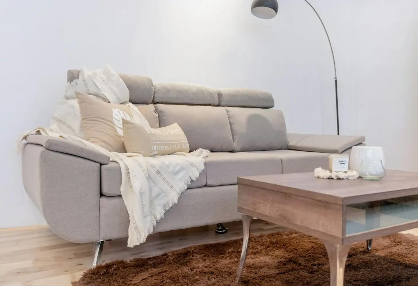
A travel poster can make a living room feel wider than its square metres. It can also make the sofa look like a gift shop if the textiles refuse to speak the same language. The fix is rarely a full soft-furnishing reset. One shared colour between the print and the throws is enough to turn souvenir energy into a designed conversation.
This guide is for rooms that already have cushions, blankets and a sofa people actually use. You want the wall to join that soft landscape, not compete with it. Studio Vallor prints travel and destination moods on 250 g/m² matte art paper with sustainable inks and European production. Formats stay at 30×40, 50×70 and 70×100 cm. Frames come in natural oak, dark oak, matte black and matte white. Shipping is free from €50. What follows is how to sample a single hue from sky, land or typography, how neutrals bridge bold destinations, and when the throws should stay quieter than the print so the travel poster match sofa throws pairing feels intentional rather than themed.
Why textiles decide if a travel print looks intentional
Wall art does not finish a room by itself. The eye reads the largest soft surfaces next to it within seconds. On a sofa wall, that means throws, seat cushions and the upholstery itself. A travel print can be beautifully composed and still look stranded if every textile nearby belongs to a different colour climate. The print becomes a postcard pinned to a neutral sofa. Guests enjoy the image and then wonder why the rest of the elevation feels unfinished.
Textiles decide intention because they carry mass. A throw draped across a seat occupies a real volume of colour in the lower third of the view. The poster occupies the upper third. When those two zones share an undertone, the wall reads as one composition. When they do not, the room splits into “art upstairs” and “sofa downstairs.” That split is what makes travel art feel like décor shopping rather than interior design. Coordinate wall art textiles thinking is simply the discipline of closing that gap with one deliberate echo.
Travel imagery raises the stakes more than a calm abstract. Destination prints often carry saturated sky blues, sun-warmed ochres, graphic blacks in lettering, or green hills that sit far from the beige of many European sofas. Without a textile bridge, those colours hang in isolation. With a bridge, even a bold coastal scene settles into the room. The shared hue does not need to be loud. A soft indigo throw beside a deep harbour print can do more than a pile of cushions printed with maps and anchors. Quiet relatedness beats costume.
There is also a daily-use layer. People touch throws more than they touch frames. Colour that lives in wool or cotton gets handled, folded, left in a heap, pulled out again. If that lived-in colour already nods to the poster, the room stays coherent even when the sofa is slightly messy. If the throws are random leftovers from old schemes, the poster has to work twice as hard to look considered. Living rooms are rarely magazine-still. Designing for real softness means letting textiles carry part of the poster’s story.
Light makes the relationship honest. Daylight on a travel print can flatter sky and sea. Evening lamps shift everything toward warm or cool depending on the bulbs. Textiles absorb and bounce that light. A camel throw under a warm lamp can pull amber out of a print that looked cooler at noon. A blue-grey throw under cool LEDs can drain warmth from a sunset scene. When you test a travel poster match sofa throws idea, sit down after dark with the lamps you actually use. The dialogue that survives evening light is the one worth keeping.
Scale plays a role too. A small 30×40 cm travel print above a wide sofa rarely anchors the textiles below it. The throws dominate by sheer width. In that case, either step up format (50×70 or 70×100 cm for many sofa walls) or keep textile colour especially disciplined so the modest print still feels connected. The reverse is also true. A large destination sheet with loud colour can overwhelm pale, mismatched cushions. One shared hue in a throw restores balance without forcing you to buy a new sofa.
Frames participate quietly. Natural oak softens warm destinations and coastal creams. Dark oak and matte black support graphic travel posters with strong typography or night city moods. Matte white can disappear into pale plaster when you want the image and the textiles to do the talking. The moulding should not invent a third colour story. Let it support paper and fabric. Matte 250 g/m² art paper helps here because it avoids the plastic glare that makes travel colour look like a shop window under lamps. If you want a deeper note on finish, which paper to choose for a poster covers weight and surface in more detail.
Finally, intention is a social signal. Guests may not name undertones, but they feel when a room was assembled with care. A travel print living room textiles pairing that shares one hue reads as chosen. A sofa full of unrelated novelty cushions under a beautiful destination print reads as accidental. You do not need a theme. You need a link. Browse the travel collection with a throw from your sofa nearby, not only with a blank white screen behind the mock-up. The right sheet will already seem to know your textiles.
Sampling a hue from sky, land, or typography
Sampling means choosing one colour family from the print and letting it appear, softer or quieter, in a throw or a pair of cushions. It does not mean cloning the whole palette onto the sofa. Most travel posters offer three useful sampling zones: sky or water, land or architecture, and typography or graphic marks. Pick one. Let the others stay on the wall.
Sky and water are the easiest entry for many European living rooms. Soft blues, mist greys, harbour teals and pale horizon bands often sit well with linen and wool. If the print’s sky is a chalky coastal blue, a throw in a related muted blue or blue-grey will echo without shouting. If the water is deep navy, you can sample that depth in a smaller dose: a navy edge on a cushion, a charcoal-navy blanket folded at one end of the sofa. Exact colour match is not the goal. Related tone is. Dye lots and screen calibration will never deliver a perfect twin anyway, and a perfect twin often looks try-hard. A cousin colour looks adult.
Land and architecture offer warmer samples. Terracotta roofs, sunlit stone, ochre fields, clay paths and warm plaster walls give you amber, sand, rust and soft brown. Those hues love natural oak frames and camel or oatmeal throws. If your sofa is already warm-neutral, sampling land colour is often the most seamless path. If your sofa is cool grey, sampling land can still work as a deliberate warm counterweight, but keep the throw’s saturation modest so the room does not tip into holiday villa costume. Poster colour throw blanket logic here is simple: pull the warmth that already exists in the image into a textile you will use on cold evenings.
Typography and graphic marks are the sharpest sampling zone. Many travel posters carry black lettering, a strong red accent, a graphic sun, or a solid block of colour in a border. Sampling from type works when you want a crisp living room rather than a soft coastal mood. A charcoal throw can echo black lettering. A single cushion in a restrained red can nod to a small graphic accent without turning the sofa into a flag. Be careful with very loud graphic samples. If the print’s red is already a hero on the sheet, repeating it at throw scale can double the volume. In that case, sample a quieter neighbour colour from the same print, or keep the red only in a small cushion and let the main throw stay neutral.
How you sample in practice matters. Hold a candidate throw beside the framed print in the real room, not only against a phone screen. Squint. If the two surfaces still feel related when detail disappears, the undertone is working. If they fight when you squint, the hues belong to different families even if their names sound similar on a label. “Blue” is not one colour. A greenish harbour blue and a purple-leaning denim blue will argue under warm lamps. Trust the squint test more than the product name.
Limit yourself to one primary sample. Secondary textiles can stay neutral or carry a much quieter version of the same idea. Two competing samples from different zones of the print recreate the souvenir problem with better fabric. Sky blue throw plus terracotta cushion plus black-and-white patterned blanket under a multi-coloured destination print is not coordination. It is a luggage carousel. Choose the sky, or the land, or the graphic accent. Build the sofa around that single decision.
Format and crop affect which hue is available to sample. A wide coastal horizontal may give you a large sky field that is easy to echo. A vertical city poster may give you more architecture and type. When you browse posters, look at where the colour mass actually sits on the sheet. Sample from mass, not from a tiny detail lost in a corner. A postage-stamp ochre window will not carry a throw. A broad band of ochre wall will.
If the print sits above the sofa, remember seated viewing. You see the lower third of the image and the upper edge of the throws in one glance. Sample a hue that appears in that overlapping visual band when possible. A colour locked only at the very top of a tall print may feel distant from the sofa. For hanging height that respects seated living, how to hang an art print above a sofa remains a practical companion to this colour work.
Studio Vallor’s matte paper helps sampling because colour stays stable under lamps without glossy hotspots. Sustainable inks and European production keep editions consistent, which matters if you later add a second textile or a companion cushion after living with the first choice. Free shipping from €50 makes it easier to choose the format that gives you enough colour mass to sample honestly, rather than compromising on a leftover size that never quite reaches the sofa’s width.
Neutrals that bridge bold destinations
Bold destinations need quieter neighbours. Neutrals are not empty. They are the bridge that lets a saturated travel print stay in a calm home. Cream, sand, oatmeal, soft taupe, warm grey, chalk and gentle charcoal all do different jobs. The right neutral depends on the undertone of both the print and the sofa.
Warm neutrals bridge sunlit destinations. Think stone, clay, late-afternoon travel scenes, Mediterranean plaster, desert roads. An oatmeal throw or a sand linen cushion lets ochre and terracotta in the print feel grounded instead of touristy. Natural oak frames continue that warm bridge into the wall architecture. If your sofa is already camel or warm beige, you may only need a slight deepening or lightening of that family in the throw, plus the poster’s sampled accent elsewhere in a smaller textile.
Cool neutrals bridge coastal and misty destinations. Soft grey, blue-grey, chalk white and pale stone work beside harbour scenes, northern light, mountain air and graphic city blues. A cool oatmeal that leans grey will connect better than a yellow cream. Matte white or pale oak frames can keep the elevation airy. The mistake is forcing a warm biscuit throw under a cold sea print and hoping “neutral” will somehow reconcile them. Neutrals still have temperature. Match the temperature of the bridge to the temperature of the destination.
Deep neutrals bridge night scenes and strong typography. Charcoal, soft black, espresso brown and graphite let a graphic travel poster feel anchored. They also forgive a sofa that is mid-grey or ink-coloured. A charcoal throw under a poster with bold black lettering creates a vertical rhythm from moulding to seat. Keep texture interesting so deep neutrals do not feel flat: a ribbed knit, a herringbone wool, a washed linen with visible weave. Texture replaces the need for extra pattern when the print is already busy.
Use neutrals as the majority of the sofa softscape. The sampled hue from the print should appear as a measured presence, not as the only textile colour. A practical rhythm for many living rooms is two or three neutral throws and cushions, plus one textile that carries the sampled hue. That ratio keeps the travel print as the hero while still creating a poster colour throw blanket link the eye can find. If every cushion tries to “match the poster,” the wall loses authority.
Patterned neutrals are allowed when the pattern is quiet. A tone-on-tone stripe, a soft check, a barely visible herringbone can add depth without introducing new hues. Loud ethnic prints, novelty destination motifs and competing geometrics usually fight travel posters. The print already supplies place. The sofa should supply comfort and a colour handshake, not a second postcard.
Consider the floor and curtains as extended neutrals. A rug with a warm stone field can bridge a sunlit print even when the sofa throw stays quieter. Curtains in chalk or soft taupe can stop a bold poster from floating on a cold white wall. You do not need to replace everything. You need the surfaces nearest the art wall to stop arguing. Distant rooms can keep their own logic.
Frame finish is part of the neutral bridge. Natural oak is a warm neutral in wood form. Dark oak is a deep warm neutral. Matte black is a graphic deep neutral. Matte white is a light cool or warm neutral depending on the paint it sits against. Choose the moulding that continues the bridge you already chose in fabric. Then stop adding finishes. Four frame colours exist at Studio Vallor for a reason: they cover the architectural range without inventing seasonal novelty mouldings.
When the destination is especially bold, widen the neutral field before you strengthen the sample. Live with a cream throw and the new print for a week. If the room still feels disconnected, add the sampled hue in a small cushion. People often reverse that order and flood the sofa with colour, then wonder why the travel poster looks like part of a theme park. Neutrals first. Accent second. That order protects bold destinations.
If your hallway already carries travel art and you want the living room to feel related without copying the same sheet, travel posters as hallway wall art can help you keep place imagery coherent across thresholds while this article stays focused on sofa textiles. For gallery balance when several frames share a wall, an external note on a balanced gallery wall at home is a clear practical reference. Balance in frames and balance in textiles are cousins: both ask you to leave air and avoid souvenir clutter.
When to keep throws quieter than the print
Sometimes the smartest textile move is restraint. Keep the throws quieter than the print when the poster is already doing heavy visual work. Busy compositions, saturated palettes, strong lettering and dense architecture all ask for a calmer sofa. Quiet textiles do not mean boring textiles. They mean lower saturation, simpler pattern, and fewer competing accents.
Keep throws quieter when the print is the clear hero of the room. A large 70×100 cm travel sheet above the main sofa is a statement. Matching that statement with equally loud blankets creates two heroes and no supporting cast. Soft sand, chalk, warm grey or muted versions of one sampled hue will let the poster lead. Texture can still be generous: heavy wool, brushed cotton, linen with weight. Comfort stays rich while colour stays polite.
Keep throws quieter when the sofa fabric is already patterned or strongly coloured. If the upholstery is a tweed, a bold weave or a saturated velvet, the throws should not introduce a third loud story. Sample a hue from the print into a solid cushion at most, and let the main throw sit in a neutral that reconciles sofa and wall. Travel print living room textiles coordination fails most often when every soft surface insists on personality.
Keep throws quieter when you love patterned throws for other reasons. Patterned textiles and patterned posters can coexist, but one should lead. If the throw carries a visible motif, prefer a calmer travel poster: more negative space, softer gradients, fewer graphic stamps. If you already own a vivid destination print, prefer solid or near-solid throws. The FAQ below returns to this point because it is the most common sofa conflict in real homes.
Keep throws quieter in small rooms and open plans that already hold a lot of objects. Visual noise multiplies across an open volume. A bold travel poster plus bold textiles plus a busy rug can make the living zone feel restless. Quieter throws restore a place to rest the eye. The poster still supplies destination and colour. The sofa supplies calm.
Seasonal rotation is another reason for quieter throws. You may want to change blankets between summer linen and winter wool without changing the poster every time. A quieter textile base makes that rotation easy. The sampled hue can move from a light cotton cushion in summer to a deeper wool throw in winter without forcing a new print. Warm abstract evenings and travel walls can share a home across the year when textiles, not walls, absorb most of the seasonal shift. For temperature thinking on abstract walls as evenings darken, warm abstract palettes before winter pairs well with this travel-and-textile focus.
Quieter does not mean colourless. A muted teal throw under a vivid coastal print is still a sample. A dusty clay throw under a sunlit townscape is still a sample. The difference is chroma. Dial saturation down one or two steps from the loudest note on the sheet. Matte paper already softens travel colour compared with glossy souvenir prints; let fabric continue that soft honesty.
Children’s cushions, pet blankets and everyday quilts complicate the picture. Real sofas accumulate useful soft things. Designate one or two “display” textiles that hold the colour dialogue with the wall, and accept that the dog blanket may stay visually quiet or get folded away when you care about the elevation. Design for the Tuesday evening version of the room, then allow life. Intention survives better when it is flexible.
Frame and mount choices also interact with quiet textiles. A heavy dark oak frame around a vivid print already adds gravity. Soft throws keep that gravity from tipping into severity. A pale oak frame around a misty travel scene wants soft neutrals so the whole elevation stays light. Match textile volume to frame weight as much as to image colour.
When in doubt, remove one loud cushion before you buy anything new. Many sofa walls improve by subtraction. After a week with quieter textiles, decide whether the travel poster needs a single sampled echo or whether the neutrals alone already make the print feel intentional. Often they do. One shared colour is enough. Sometimes one shared temperature in neutrals is enough for a while.
Mistakes
Treating the sofa like a souvenir stand. Map cushions, destination slogans and novelty blankets under a travel poster create theme-park clutter. Let the print carry place. Let textiles carry comfort and one related hue.
Chasing an exact colour match on a screen. Phone screens lie, dye lots vary, and perfect twins look stiff. Choose a related tone in the same family. Live with it under your lamps before you buy a second textile in the same colour.
Sampling every hue in the poster. Sky plus land plus typography on three different cushions is not coordination. Pick one sampling zone and protect it.
Ignoring undertones in “beige.” Yellow cream under a cold harbour print will fight the wall. Grey-beige under a terracotta townscape will look dirty. Neutrals have temperature. Use them on purpose.
Hanging a tiny travel print above a wide sofa and expecting textiles to fix scale. Colour dialogue cannot replace presence. Step up to 50×70 or 70×100 cm when the sofa wall needs a real anchor, or accept that textiles will dominate and keep them especially calm.
Pairing a busy patterned throw with a busy graphic poster. One of them should quiet down. If the throw pattern stays, choose a calmer print. If the print stays bold, choose a quieter throw.
Judging the pairing only at noon. Evening lamps change travel colour and fabric colour together. Sit on the sofa after dark before you decide.
Buying three new accent colours the week the poster arrives. That is how rooms tip into costume. Change one textile link first. Wait. Edit again only if the wall still feels stranded.
Forgetting the frame’s role. A cold blue-white moulding around a warm destination, or a novelty colour frame, invents a third story. Stay with natural oak, dark oak, matte black or matte white.
Using glossy paper on a lamp-facing sofa wall. Reflections steal the colour you wanted to sample into the throws. Stay with 250 g/m² matte art paper so pigment and fabric can share an honest dialogue.
Studio Vallor collections to explore
When you are ready to choose with textiles in hand, start in the travel collection. Look for a sheet where one hue is clear enough to sample into a throw without needing the whole palette on the sofa. Then compare scale and mood across all posters if you want to weigh travel against quieter abstract or nature options that still speak to your soft furnishings. The full collections overview helps when you are still deciding which room should carry destination energy and which should stay calmer.
Stay inside Studio Vallor formats (30×40, 50×70, 70×100 cm) so hanging hardware and future swaps stay sane. European production, sustainable inks and 250 g/m² matte art paper keep colour steady beside real wool and linen. Frames in natural oak, dark oak, matte black and matte white let you tune the neutral bridge without novelty mouldings. Shipping is free from €50, which makes it easier to order the size that actually relates to your sofa’s width instead of forcing a mismatch and hoping cushions will hide it.
Move slowly enough to sit with the pairing. One travel poster and one thoughtful textile echo usually beat a cart of almost-matching accents. The room should feel like a place you returned to, not a display of places you bought.
FAQ
Exact colour match?
A related tone beats a perfect duplicate. Sample the family of the hue (soft coastal blue, dusty clay, charcoal echoing type) and accept a small shift in lightness or warmth. Exact matching often looks stiff and fails under real lamps anyway. Relatedness reads as design; cloning reads as effort.
Patterned throws?
Then keep the poster calmer. Busy fabric plus a busy destination print creates two competing stories. If you love a patterned throw, choose travel art with more breathing room and fewer graphic stamps. If you already love a vivid travel poster, prefer solid or near-solid throws and let texture supply interest.
Two travel prints?
Usually one hero print plus textiles is cleaner. Two destination sheets on the same sofa wall often split attention and push you toward more accents than the room can hold. If you want a second travel image, give it another elevation or a quieter role, and keep the sofa textiles tied to the hero’s single sampled hue.