Practical guides
Choosing abstract posters for open-plan living
Choosing abstract posters for open-plan living. Practical guide for premium art posters. Studio Vallor.
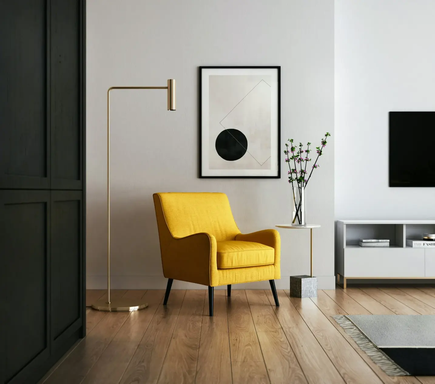
An open-plan living room asks more of a wall than a closed salon ever did. Kitchen light, sofa chatter and a dining table share one continuous volume, so whatever hangs on the longest plaster plane becomes the room’s quiet centre of gravity. Choose wrong and the print vanishes into the architecture. Choose with scale and calm geometry in mind and the same wall steadies the whole plan.
This guide is for people buying abstract posters for an open plan living room, not for a corridor niche. The keywords are practical: how large a geometric print open plan spaces can carry, whether one piece or a grid works better, and how paper, frame and daylight keep colour readable when the living zone never really ends. Studio Vallor prints for European interiors on 250 g/m² matte art paper with sustainable inks. Formats stay at 30×40, 50×70 and 70×100 cm. Shipping is free from €50. The rest of this article is about placing that work so the open plan still feels like a home.
Why this matters for premium art prints
Open-plan living multiplies every visual decision. A sofa wall in a closed room faces one activity. In an open plan the same wall faces cooking, homework, weekend guests and the television at once. A premium art print has to hold that traffic without shouting. Loud contrast that feels exciting on a phone screen often feels like visual noise when you live beside it for twelve hours a day.
Scale is the first filter. A small poster centred on a vast blank field looks like a leftover. Guests read it as temporary. You start avoiding that wall with your eyes. Abstract posters open plan living room projects succeed when the print’s outer edge relates to the furniture run below it, not only to the ceiling height. The image should feel inevitable once you sit down, not like a catalogue sample taped up for a photograph.
Calm geometry helps for the same reason. Soft blocks of colour, measured lines and quiet rhythm travel better across a large volume than a single hot accent that vies with kitchen tiles and pendant lights. A geometric print open plan interiors can lean on is one that organises the wall the way a rug organises the floor: it sets a tempo without competing with every other surface. Premium paper and careful hanging only pay off if the composition itself can survive long viewing.
Studio Vallor treats abstract work as interior architecture companion, not as disposable decoration. European production keeps colour consistent across editions. Matte 250 g/m² art paper keeps pigment in the fibre so daylight does not turn the sheet into a mirror. Those material choices matter more in open plans because windows are often larger and seating often faces the brightest wall. If you want the broader catalogue before you decide on composition, browse the abstract collection and the full posters range side by side with your floor plan in mind.
Premium also means living with the piece through seasons. Winter light is low and generous to contrast. Summer light is high and cruel to glossy surfaces and undersized frames. An open plan rarely has a door you can close to hide a weak choice. The wall stays on stage. Choosing abstract posters with that permanence in mind saves you from replacing the print every time you rearrange the sofa.
How to choose / place
Start from where you sit, not from where the nail feels convenient. Stand in the kitchen doorway, then sit on the sofa, then stand at the dining table. Note which wall holds your gaze when conversation pauses. That wall is your candidate for abstract art, even if it is not the one closest to the entrance. Open plans reward the view from life, not the view from the floor plan PDF.
Measure the furniture run before you fall in love with a crop. If the sofa is two and a half metres wide, a lonely 30×40 cm sheet will look apologetic. If the dining side of the wall is broken by a doorway, a grid may thread the interruption better than one oversized rectangle. Write the wall width, the sofa width and the free height above the backrest. Those three numbers decide more than mood boards do.
Colour should answer the room’s quietest materials, not its loudest appliance. Warm plaster, oak flooring and linen sofas welcome ochre, clay and muted indigo. Cool concrete and black metal welcome graphite, soft white and restrained teal. Abstract posters open plan living room schemes fail when the print tries to “pop” against a red kettle and a patterned rug at once. Let one surface lead. The poster can be that surface if the geometry stays calm.
Placement height follows living height more than gallery dogma. In open plans people stand more often than in a seated lounge, yet they still rest on the sofa for hours. Aim for a centre of mass that works from both postures. For a detailed method on sofa walls, read how to hang an art print above a sofa. The short version: leave breathing room above the backrest, avoid climbing so high that the art floats into ceiling void, and keep the frame’s outer edge loosely aligned with the sofa’s visual weight.
Finally, leave negative space around the print. Open plans already fill with objects. A calm geometric print needs air on the plaster so the eye can register its edges. Crowding the wall with shelves, clocks and plants on every side turns even a strong composition into background clutter. Place the poster, live with the empty plaster for a week, then add only what still feels necessary.
Scale for large walls
Large walls in open plans are not blank canvases in the gallery sense. They are structural planes that carry light, doorways and the silhouette of furniture. Scale means matching the print’s mass to that plane so the architecture does not swallow the art.
The 70×100 cm format is the usual starting point for a main sofa wall when the free plaster is generous. It reads as a statement without needing a museum budget. The 50×70 cm format works when the wall is interrupted by a window reveal, a chimney breast or a doorway, or when you prefer a single piece that still leaves clear plaster as a frame of its own. The 30×40 cm format rarely carries an open-plan living wall alone. Use it for niches, kitchen returns or as a module inside a grid, not as the hero of a three-metre expanse.
Horizontal furniture asks for visual width. A wide sofa under a tall narrow print can feel unbalanced even if the print is beautiful. Rotate your thinking with the furniture: if the sofa is a long horizontal bar, a landscape-oriented abstract or a horizontal pair often settles the elevation better than a single portrait sheet hung too high. Studio Vallor’s formats can be hung with the long edge horizontal or vertical depending on the edition’s composition. Check the crop before you order. Calm geometry often works both ways; busy diagonals sometimes do not.
Distance matters as much as centimetres on the wall. In an open plan you often see the living wall from six or eight metres away while you cook. Fine linework that rewards nose-distance reading will dissolve into grey at that range. Broad colour fields, clear shapes and confident spacing survive the kitchen-to-sofa glance. That is why abstract posters for open plan living room walls favour resolute geometry over fragile detail. Walk the distance with a kraft paper mock-up taped at size. If the mock-up disappears when you stand at the hob, the real print will too.
Do not fill every centimetre. A large wall can still want a single generous print with plaster margins. Edge-to-edge coverage looks commercial and leaves no rest for the eye. Premium interiors usually keep a calm border of wall around the frame so the piece feels placed, not pasted. When the wall is truly vast, prefer one large work or a tight grid over a scatter of small frames that read as visual static from across the room.
Calm geometry vs loud contrast
Calm geometry is not the same as empty. It is composition that repeats a limited set of shapes, angles or intervals so the mind can settle. Soft rectangles, gentle arcs, measured stripes and balanced negative space give an open plan a pulse without adding another loud voice to the kitchen and the television.
Loud contrast is high-key colour clash, sharp black against pure white with no midtones, or a single neon accent that vibrates against every neutral in the room. On a small phone screen that energy feels fresh. Across an open volume it often feels restless. You notice it when you want to rest. Guests mention the wall instead of the conversation. The print wins the wrong contest.
A geometric print open plan homes can live with tends to borrow the room’s existing temperature. If your floors are warm oak, let the poster’s darkest tone sit near walnut rather than pure black. If your walls are cool white, let the lightest field in the print be a paper white that matches the plaster rather than a blue-white that fights it. Studio Vallor’s abstract editions lean toward that kind of interior logic: colour that holds, edges that are clear, atmospheres that stay livable.
Contrast still has a job. Without some difference between shapes, the wall turns foggy and the print looks under-inked from the dining table. The goal is controlled contrast: enough separation that forms read at distance, not so much that the wall pulses. Matte 250 g/m² paper helps here because it keeps deep tones matte and readable instead of bouncing daylight back into your eyes. Sustainable inks sit in the grain, so soft transitions stay soft instead of turning plasticky.
Test contrast the honest way. Print a cheap colour reference or hold fabric swatches against the wall at the intended height under morning and evening light. Open plans change character when the kitchen lights come on. A composition that feels calm at noon can turn aggressive under warm pendants if the yellows in the print suddenly match every bulb. Choose geometry that still feels quiet after dark.
If you love a bolder abstract, give it a quieter neighbour wall or a secondary zone, such as the corridor that leads into the open plan. Keep the main living elevation composed. The room will thank you every evening.
One large piece or a grid
This is the decision that shapes everything else. One large piece says focus. A grid says rhythm. Open plans can carry either, but they punish hesitation: a half-hearted middle ground of two random frames usually looks accidental.
One large piece works when the sofa wall is continuous, when the furniture run is clear, and when you want a single calm statement that anchors the living zone. A 70×100 cm abstract with generous plaster margins often does more for the room than three smaller prints fighting for attention. The eye knows where to land. Conversation has a backdrop instead of a collage. Framing stays simple: one moulding, one glazing decision, one hanging height.
A grid works when the wall is wide but broken, when you want flexibility to add or rotate editions later, or when the architecture already speaks in modules (panels, niches, repeated windows). Equal spacing and matching frames matter more than the number of sheets. Three or four related abstracts in 30×40 or 50×70 cm can read as one composition if gutters stay consistent and the outer rectangle aligns with the sofa. For layout craft and spacing habits, see how to create a gallery wall. In an open plan, keep the grid tighter than you would in a corridor. Wide gaps between small prints read as holes from the kitchen, not as breathing room.
Mixing one hero print with tiny satellites rarely succeeds on a main open-plan wall. The satellites look like afterthoughts. Either commit to the single large work or commit to a designed grid. If budget pushes you toward smaller formats first, plan the final outer rectangle now and leave plaster marked for the missing modules so the wall never looks unfinished for long.
Orientation inside a grid should stay disciplined. All landscape, all portrait, or a planned mix with a clear centre. Random rotation of abstract posters across an open plan living room wall creates fidget. Calm geometry depends on alignment as much as on the shapes inside each sheet.
Studio Vallor formats are built for both strategies. Start from the collections overview if you want to compare abstract work with travel or nature editions before you lock the layout. Abstract usually wins the large open wall because it does not compete with figurative detail at cooking distance. Travel scenes can still thrive on adjacent walls once the living elevation is settled.
Materials: paper, frame, light
Paper is the surface you actually look at for years. Studio Vallor prints on 250 g/m² matte art paper as the house standard for interior posters. The weight keeps the sheet flat on the wall so raking light does not catch ripples. The matte face scatters daylight instead of returning a hard window reflection into the sofa. In open plans with large glazing, that finish is not a luxury detail. It is how colour stays visible after lunch.
Sustainable inks and European production sit behind that sheet. Colour stays consistent from proof to edition. You are not fighting a different cast every time you reorder a companion print for a grid. For a deeper comparison of finishes and grammage, read which paper to choose for a poster. The short advice for sunny open living: matte art paper first, gloss almost never.
Framing protects edges and settles the print into the architecture. Natural oak warms abstract fields that already lean earthy. Dark oak and matte black sharpen geometry and suit cooler rooms. Matte white can disappear into pale plaster and let the image float, which helps when you want the art to feel almost built-in. Choose the moulding to answer the furniture legs and window frames, not to introduce a fourth wood tone by accident.
Glazing is where bright open plans punish haste. Ordinary reflective glass can undo matte paper’s work if the sofa faces a window. Prefer anti-reflective or museum-style glazing when the print sits in strong daylight. Unframed hanging is possible on quieter walls, but open living rooms see more hands, more cooking vapour and more traffic. A frame is usually the calmer long-term choice for the main elevation.
Light design completes the triangle. Avoid aiming a spotlight so hard that it creates a hot disc on the glazing. Soft wall washing or ambient ceiling light keeps abstract colour even. If a pendant already hangs over the dining table, make sure its glow does not stripe the poster after dark. Live with temporary lighting for an evening before you drill. Abstract posters open plan living room walls fail as often from bad light as from bad scale.
Care is simple. Dust frames with a dry soft cloth. Keep the sheet out of continuous direct sun when you can, even with matte paper, because UV still ages pigments over years. Sheer curtains that tame the beam without killing the room are enough in many European apartments. Free shipping from €50 makes it easier to order the right format the first time instead of compromising on a leftover size. Conditions live on the shipping and returns page. The useful decision remains earlier: paper, frame and honest light around a composition that fits the wall.
Common mistakes
Buying for the photograph, not for the afternoon. A loud abstract that looks bold in a listing image can exhaust an open plan by Thursday. If you hesitate when you imagine eating dinner under it every night, trust that hesitation.
Choosing a format that only fits the empty wall in your head. Measure the sofa and the free plaster. A 30×40 cm sheet on a three-metre elevation reads as a sticker. Scale up or plan a grid.
Hanging too high because “galleries hang high.” Galleries do not have sofas and kitchen islands. Open-plan living follows seated sightlines more than white-cube rules. Drop the centre until the print converses with the furniture.
Mixing frame finishes across a grid. Black, oak and metal together turn calm geometry into a hardware display. Match mouldings and glazing so the abstracts can speak as one piece.
Filling every wall in the open volume. When living, dining and kitchen share space, not every plane needs art. One strong abstract elevation is enough. Let other walls hold shelves, windows or quiet plaster so the room can breathe.
Ignoring daylight direction. South and west light will test matte paper and glazing. Hang a mock-up through a clear day. If the kraft sheet flashes, fix placement or glazing before the real print arrives.
Treating abstract as a colour dump for leftover cushions. The poster should lead or clearly support a palette, not absorb every leftover accent in the flat. Edit. Calm geometry needs a limited cast of tones.
Ordering without checking companion pieces for a future grid. If you might expand later, stay inside one family of compositions from the abstract collection so spacing and palette stay coherent when the second and third sheets arrive.
Studio Vallor collections to explore
Begin with abstract work when the open plan needs a steady visual anchor. The abstract collection gathers geometric and colour-field posters suited to large living walls. Look for editions whose shapes still read from the kitchen distance, and favour calm intervals over frantic fragmentation.
Then walk the wider posters catalogue to compare scale and mood. Sometimes a quieter nature field or a spare typographic piece belongs on a secondary wall once the main abstract is set. Use the collections index when you want to move between families without losing the thread of paper quality and format.
Studio Vallor keeps production European and printing on 250 g/m² matte art paper with sustainable inks across these lines. Formats remain 30×40, 50×70 and 70×100 cm so grids stay modular. Free shipping from €50 applies under the usual conditions. The house is built for interiors that are lived in, not only styled once for a shoot. Choose the abstract that still feels inevitable when the dishwasher is running and the evening light is low.
If you are still weighing gallery logic against a single statement piece, return to the gallery wall guide and the sofa-height guide linked earlier. Those practical notes pair cleanly with abstract selection: spacing, height and paper finish are the same craft whether the image is geometric or figurative. Open plans simply raise the cost of getting them wrong, because the wall never leaves the stage.
FAQ
Should I choose one large abstract poster or a grid in an open-plan living room?
Choose one large piece when the sofa wall is continuous and you want a single calm focus. A 70×100 cm format with clear plaster margins often anchors an open plan better than several small frames. Choose a grid when the wall is wide or interrupted, or when you want to grow the arrangement over time. Keep frames matched and spacing even so the grid reads as one composition from the kitchen. Avoid a vague middle path of two unrelated sizes. Commit to focus or to rhythm.
Will a loud colour abstract work on a large open-plan wall?
Sometimes, but treat loud colour as a risk, not a default. High-contrast or neon-leaning abstracts can energise a closed study and still exhaust a shared living volume. Prefer calm geometry with controlled contrast for the main elevation, and reserve bolder colour for a smaller adjacent wall if you need a spark. Test the palette against your flooring and evening lighting. If the print still feels quiet after dark from the dining table, it can carry the room. If it vibrates, scale the ambition down.
Which format works best for abstract posters in an open plan living room?
For a primary sofa wall with generous plaster, start with 70×100 cm. Use 50×70 cm when the wall is broken by architecture or when you want a strong single piece with more breathing room. Keep 30×40 cm for grids, niches or secondary walls. Always mock up the outer rectangle against the sofa width before you order. A geometric print open plan spaces can trust is one whose mass matches the furniture run below it.
Does matte paper matter more in open-plan spaces?
Yes. Open plans often combine large windows with seating that faces the brightest wall. Matte 250 g/m² art paper scatters light and keeps pigment readable through the day. Glossy surfaces turn into mirrors under the same conditions. Pair matte paper with thoughtful placement and, when framed, anti-reflective glazing if the wall takes strong sun. Studio Vallor’s European production and sustainable inks are built around that matte interior use.
How high should I hang abstract art above the sofa in an open plan?
Hang so the composition relates to seated eye level and to the sofa’s visual weight, not only to the ceiling. Leave a clear gap above the backrest, avoid floating the frame into empty upper wall, and check the view from the kitchen as well as from the cushions. Step-by-step guidance lives in the sofa-height article linked above. In open plans, verify height from multiple standing points before you drill the final holes.