Practical guides
Kids Posters for Shared Living Rooms | Studio Vallor
Choose children posters that suit a shared adult living room: motifs, frames, and placement.
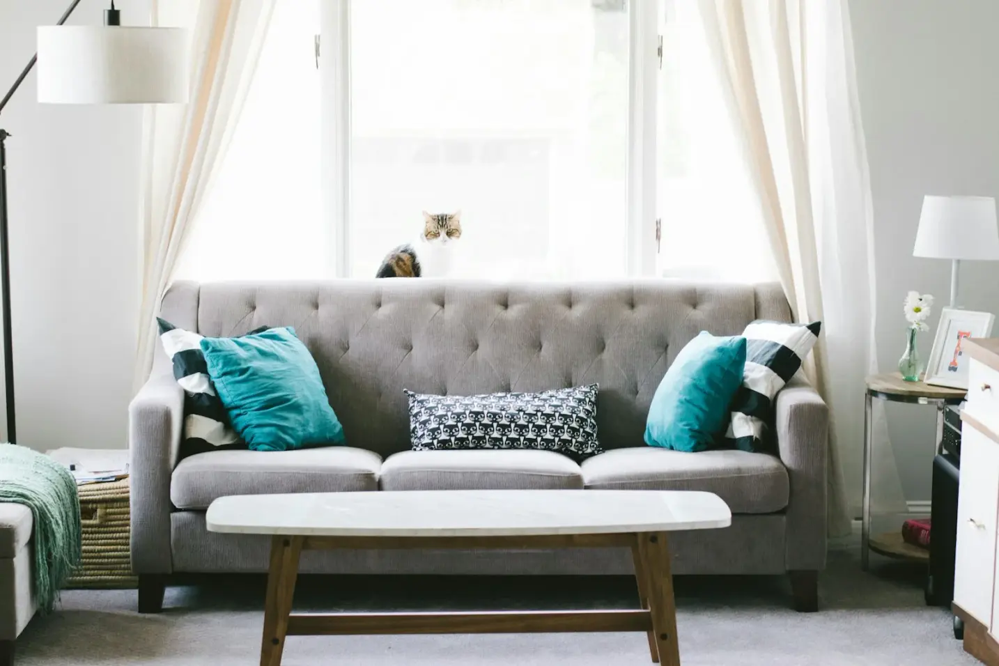
Many European apartments keep the play corner in the living room. There is no spare nursery wing, no sealed playroom behind a door, just a sofa, a window, and a rug where trains and soft animals appear every afternoon. The wall beside that rug still has to work when friends come for drinks, when grandparents sit down with coffee, and when you finally put your feet up after bedtime. Kids art prints in a shared living room succeed when they welcome children without reading as nursery leftovers left behind after the cot years.
This guide is for families who want adult friendly kids wall art: illustration that feels designed, frames that match the rest of the home, and placement that serves both the play corner and the sofa. Studio Vallor prints premium art posters on 250 g/m² matte art paper with European production and sustainable inks. Formats stay at 30 × 40, 50 × 70, and 70 × 100 cm. Frames arrive in natural oak, dark oak, matte black, or matte white. Shipping is free from €50. What follows is how to choose kids posters that suit an adult living room without stripping the warmth children need.
The Children universe is the natural starting point. Browse calm editions in the children collection, compare atelier sizes across the posters catalogue, and keep the wider collections index open if you want Abstract or Nature pieces on the same elevation. The aim is not a theme-park lounge. It is a family lounge children poster language that guests register as intentional interior design, not as temporary decoration waiting to be replaced.
Shared walls need dual audiences
A shared living room wall has two audiences in the same day, often in the same hour. A child on the floor looks up at a motif and invents a story. An adult on the sofa looks across and wants the room to feel settled. If you hang only for the floor view, the wall can tip into nursery territory: oversized cartoon faces, sugary pink grounds, lettering that belongs on a birthday cake. If you hang only for the adult view, the play corner can feel cold, as if childhood were something to hide before company arrives. The useful middle is dual authorship. The print should reward a child’s imagination and still hold composition, palette, and paper quality when the toys are half put away.
Think of the wall as a conversation between two heights and two speeds. Children scan quickly and love recognisable shapes: animals, boats, soft landscapes, gentle geometry. Adults scan for calm edges, balanced negative space, and a finish that matches oak shelving or a linen sofa. When a poster satisfies both scans, the room stops apologising for itself. You no longer rush to shove the play basket behind the armchair before the doorbell rings. The art already says this space belongs to everyone.
European open-plan flats make that dual job harder and more important. In a sixty-square-metre layout in Lyon, Lisbon, or Rotterdam, the living room often shares sightlines with the kitchen and the entrance. Guests see the play corner before they sit down. Loud merch travels into that first impression. Soft illustration does not. A quiet fox study, a rounded hillscape, or a limited-palette animal scene can sit beside a grown-up abstract without starting a fight, provided the colours speak to each other. That is the practical meaning of kids art prints living room shared: one wall, two audiences, one coherent home.
Dual audience also means dual lighting. Daylight from a balcony door can bleach a thin glossy print and throw glare toward the sofa. Evening lamps near a reading chair can flash on glass if the hang is too low or too close to a side light. Matte 250 g/m² stock helps because pigment stays readable when light sources mix. Framing helps because the object reads as furniture rather than as paper taped for a season. Those material choices are not decoration trivia. They are how a family lounge children poster survives the real schedule of breakfast crumbs, afternoon forts, and late conversations.
Finally, dual audience is emotional. Parents often feel torn between wanting a grown-up living room and wanting children to feel claimed by the space. Design-led children’s prints dissolve that false choice. The wall can be warm without being babyish. It can be adult without being severe. When the motif ages with the child, and the frame matches the sofa wall, the shared living room stops feeling like a compromise and starts feeling like a finished room that happens to include play.
Motifs that age with the child
Motifs are where most shared-room mistakes begin. Licensed cartoon faces age out with the next film cycle. Ultra-bright mascot graphics look energetic in a product photo and exhausting above a real oak floor. Soft illustration ages differently. A gentle whale in open water, a simplified city of rounded roofs, a quiet forest edge with open sky, a map-like pattern that rewards looking: these images invite stories without locking the wall to a toddler stage. When the child is four, the print is a character. When the child is ten, it is still a picture. That longevity matters in a living room you will not redecorate every year.
Prefer posters drawn as art, not as packaging. Large logo lettering, lunchbox contrast, and franchise colourways belong on objects that are meant to be replaced. Wall art in a shared adult living room should pass a simple dinner-party test. If the toys were cleared and friends arrived with wine, would the print still feel honest beside the sofa? If the answer is no, it is merch wearing a frame. If the answer is yes, you are closer to adult friendly kids wall art. Studio Vallor’s Children editions lean toward that authorship: coherent palette, calm subject, room for the eye to rest.
Colour is the quiet editor. Family lounges already carry chroma from toys, cushions, and snack packaging. The wall can afford restraint. Soft ochre, dusty blue, warm linen grounds, muted sage, charcoal line work, and clay pink used sparingly tend to sit beside adult furniture without shouting. Neon lime and electric magenta can look playful in isolation and frantic once primary-coloured blocks cover the rug. Borrow one hue already present in curtains, oak, or a throw, then let the children’s print hold a quieter neighbour tone. That small dialogue stops the play corner living room print from reading like a sticker applied after the interior was finished.
Subject matter can stay child-welcoming without becoming a nursery alphabet. Animals work when they are observational rather than cartoonish: soft contour, open backgrounds, limited expression that leaves room for imagination. Landscapes work when they feel outdoor and breathable rather than theme-park. Gentle geometry works when shapes feel tactile and friendly without turning into a classroom chart. What ages poorly in a shared lounge is anything that screams a single developmental stage: giant baby animals with oversized eyes, pastel rainbows with glitter energy, or typography that spells out “little explorer” as if the room needed a caption.
If you want the play zone to talk to the rest of the house, consider motif families that can neighbour Abstract or Nature. A children print with soft blue-grey water can sit near a misty botanical. A warm ochre animal study can sit near a muted abstract field. Palette is the bridge. Subject can differ. Guests will read the wall as collected rather than as two apartments colliding. For a deeper playroom-specific take on designed illustration versus character merch, Kids' playroom wall art that still looks designed stays useful even when the play corner lives in the lounge. The shared living room simply raises the adult bar higher, because the sofa view never leaves.
Scale of motif inside the image matters as much as frame size. Dense scenes with tiny characters everywhere can feel busy once toys add a second layer of detail below. Open compositions with one clear subject and breathing ground settle a family lounge better. Negative space is not emptiness. It is the visual rest that lets adults recover from a loud afternoon. Children still find the animal, the boat, or the hill. They do not need every centimetre of paper filled to feel welcome.
Placement near play corner vs sofa
Placement decides whether a good motif becomes adult friendly or accidentally nursery. In most shared lounges you have two candidate elevations: the wall that faces or borders the play rug, and the wall above or beside the sofa. Sometimes they are the same long wall with different jobs along its length. Sometimes they are opposite each other across a coffee table. Map both before you order. Stand where you sit in the evening. Sit where the child plays after school. Notice what each viewpoint actually sees.
Near the play corner, hang slightly lower than a pure adult living-room centre, but not so low that the frame becomes a climbing edge or a shoulder bump. The goal is a tidy band that a child on the floor can read without the print becoming the lowest object in the room. Keep the lower edge above the zone where backpacks swing and wheeled toys turn. In many apartments that means a play-corner optical centre a little below classic sofa height, yet still high enough that the composition looks intentional from the doorway. Kraft-paper rectangles help. Tape the outer size of a framed 30 × 40 or 50 × 70 for a weekend and live with the empty shape while ordinary chaos happens underneath.
Near the sofa, follow adult seating logic more closely. A calm gap between cushion tops and frame bottom, often in the fifteen-to-twenty-five-centimetre range depending on sofa loft, keeps art and furniture in conversation. If the children’s print lives on the sofa wall itself, treat it with the same seriousness you would give a botanical or abstract: centred on the sofa run, not floating toward the ceiling, not cramped by a tall side lamp. How to hang an art print above a sofa covers seated eye level in more detail. The family version adds one check: from the play rug, does the same print still feel present, or does it abandon the child’s side of the room?
When play corner and sofa share one long wall, think in zones rather than in a single centred trophy. A 50 × 70 children print closer to the rug can mark the play territory. A quieter abstract or nature print closer to the sofa can mark the adult territory. Matching frames and a shared palette keep the elevation one composition. Uneven gaps and mixed mouldings make it look like leftovers. If you are building a wider arrangement, Creating a gallery wall and How to style posters in every room help you expand without losing calm. For hang technique on multi-frame walls, an external guide such as How to hang a gallery wall can complement the studio approach.
Traffic is the unromantic part of placement. The path from entrance to kitchen often clips the play corner. The wall immediately beside that path is a poor home for glazed art at child height. Prefer the calmer plaster that faces the rug or the sofa, and keep furniture buffers where shoulders pass close. A low bookcase under a print can protect the wall better than hope. A scooter lane along the long open stretch should not host your only framed piece. Soft illustration deserves pause, not collision.
Format choice follows wall width and furniture mass. Studio Vallor atelier formats are 30 × 40, 50 × 70, and 70 × 100 cm. Framing adds outer centimetres. In compact European lounges, 30 × 40 near a play nook can feel precise and adult if the frame is serious and the motif is open. Mid-size 50 × 70 often carries the main shared wall without overwhelming a two-seater. A 70 × 100 children print can work on a generous elevation if the composition stays breathable and the hang stays tidy from sofa view. Tape first. A print that feels playful on a phone screen can feel huge once it claims the only free plaster in a narrow Parisian living room.
Light at each placement differs. Play corners often sit near windows because floor space is brighter there. Matte paper helps against glare. Avoid parking a glazed frame where afternoon sun throws a hard rectangle into seated eyes. If the sofa wall is dimmer, a warmer oak frame and a motif with a soft light ground can keep the children’s print from disappearing into shadow. Placement is not only centimetres on a tape measure. It is how the print behaves from breakfast to evening lamp.
Play-corner height
Play-corner height should favour readability from the floor without inviting climbing. Imagine a child seated with a book or kneeling with blocks. The main subject of the poster should meet that upward glance comfortably. Then walk to the sofa and check that the same hang still looks composed, not drooping toward the skirting. If sofa view makes the print look like it slid down the wall, raise it a few centimetres. Slightly lower near the play zone is fine. Visibly sagging relative to the rest of the room is not.
Sofa-view check
Do a sofa-view check at night with lamps on. Evening is when adult guests judge the room. If the children’s print flashes, crowds the lamp, or sits awkwardly beside the television glow, adjust before you commit to a second hole. Adult friendly kids wall art earns that name when it survives the grown-up hours as well as the afternoon play block.
Frames that look adult
Frames do more narrative work than many parents expect. The same soft animal illustration in a chunky glitter frame reads as nursery. The same illustration in natural oak, dark oak, matte black, or matte white reads as interior design. In a shared living room, choose the moulding family you would accept above the sofa even if no toys were present. That single filter removes most of the babyish signal guests pick up in the first few seconds.
Natural oak links kindly to pale timber floors, light shelving, and warm plaster. Dark oak deepens a room that already has walnut tones or charcoal textiles. Matte black sharpens a cooler lounge with metal accents and grey upholstery. Matte white keeps a bright Scandinavian-leaning wall airy when the print itself carries enough line and colour. Matching the play-corner frame to the sofa-wall frames is often more important than matching the motifs exactly. Coherent edges make mixed subjects look collected.
Glazing and depth matter in family rooms. A framed print protects edges from dusting and accidental bumps better than a bare sheet. Keep hangs high enough that curious hands meet wall more often than glass. Prefer secure fixings suited to plaster or masonry. Leaning a large glazed frame on a low play-shelf looks casual until someone runs past. For materials and finish logic that apply across poster types, Which paper to choose for a high-end poster remains a useful companion. The shared-lounge conclusion stays simple: matte art paper inside, adult moulding outside.
Unframed hangs can work in quieter adult bedrooms or carefully managed hallways. In a living room that doubles as a play zone, framing is usually the kinder long game. The object becomes furniture. Children learn it is part of the architecture. Guests read intention. Studio Vallor’s frame options exist so the Children editions can sit beside Travel, Abstract, and Nature without a visual apology. Browse finishes while you compare sizes in the posters catalogue, and keep free shipping from €50 in mind when you plan a framed pair rather than a temporary unframed trial that never quite looks finished.
Frame scale should respect the print and the wall. An oversized heavy moulding on a delicate 30 × 40 can crush a soft motif. A skinny unfinished strip on a 70 × 100 can make a strong image feel temporary. Choose a proportion that would look correct in a design shop, not only in a children’s aisle. When in doubt, match the frame language already used elsewhere in the home. Continuity is the adult signal.
Common mistakes
The first common mistake is importing nursery logic wholesale into the lounge. Cot-height hangs, pastel overload, and character faces that belong above a changing table make the living room feel stuck in a phase the family has already left. Shared walls need a different brief: welcome children, satisfy adults, age forward.
The second mistake is treating the play corner as invisible to guests. Families sometimes hang a loud print “only for the kids” on a wall that every visitor faces from the sofa. There is no private children’s wall in an open lounge. If guests see it, design for them too. Soft illustration and adult frames solve that without removing play.
The third mistake is mixing one children’s print with adult abstracts without a palette link. Subject contrast can look curated. Colour contrast without a bridge looks accidental. If the abstract is stone and ink, let the children print borrow a grey or soft blue. If the abstract is warm clay, let the animal study hold a related ochre. Same wall is possible. Random wall is not.
The fourth mistake is hanging too low for too long. A print placed for a crawling toddler can still be hanging at skirting-adjacent height when that child is in school. Raise with the years, or start at a dual-audience height that already works from sofa view. Slightly lower near play is a nuance, not a permanent crouch.
The fifth mistake is buying for a week of delight rather than for years of looking. Licensed cycles turn over. Soft motifs stay. In a room you live in daily, longevity is comfort. Related calm-family thinking appears in Creating calm with nature posters in a busy family lounge, which pairs well when you want outdoor rest on a neighbouring elevation.
The sixth mistake is skipping paper quality because “it is only for the kids.” Children notice glare and flimsy edges less consciously than adults, but the whole room pays the cost when a thin sheet buckles and flashes. Matte 250 g/m² with sustainable inks keeps the play corner living room print readable under mixed light. Premium materials are how the wall stays adult while the floor stays playful.
Studio Vallor collections to explore
Start with the children collection when the brief is kids posters that still suit a shared adult living room. Look for open compositions, limited palettes, and subjects that pass the dinner-party test. Compare 30 × 40 for tight play nooks, 50 × 70 for the main shared wall, and 70 × 100 only when the elevation and the motif both have air.
Use the posters catalogue to lock format, paper expectation, and framing early. Matte 250 g/m² art paper, European production, and sustainable inks are the house baseline. Natural oak, dark oak, matte black, and matte white keep children’s editions visually at home beside the sofa. Free shipping from €50 makes a framed pair more realistic than a hesitant single unframed sheet that never quite settles the wall.
Widen the plan through collections when you want Abstract or Nature as neighbours. A calm abstract can sit on the sofa half of a long wall while a children print marks the play half. Soft botanicals can add outdoor rest without competing with illustration. The link is palette and frame, not identical subject matter. For playroom-focused design language that still applies when play lives in the lounge, keep playroom wall art prints nearby. For layout craft, return to create a gallery wall and how to style posters in every room.
The practical shopping sequence is simple. Measure the wall. Tape kraft paper. Choose a motif that ages. Choose an adult frame. Check sofa view and play-corner view on the same evening. Order materials that match the rest of the home. That sequence turns kids art prints living room shared from a compromise into a clear interior decision.
FAQ
Are bright cartoon characters okay in a shared living room?
Skip licensed cartoon faces on the main lounge wall. Prefer calm illustration with soft contour, open ground, and a limited palette. Bright character merch can delight for a season in a bedroom or on objects meant to turn over. In a shared adult living room it reads as nursery leftover and ages out quickly. Soft animal studies, gentle landscapes, and friendly geometry welcome children without turning the sofa wall into a franchise display.
Can a kids poster share a wall with an adult abstract?
Yes, if the palette links both prints. Subject can differ. Colour should converse. Matching frames in natural oak, dark oak, matte black, or matte white help the pair look collected. Keep gaps even and align edges with intention. When palette and moulding agree, guests read one composed elevation rather than two competing rooms.
How high should kids wall art hang near a play corner?
Hang slightly lower near the play zone so children on the floor can read the image, but keep the result tidy from sofa view. Avoid cot-height permanence and avoid climbing-edge lows. Raise the optical centre enough that backpacks and toys pass underneath, then check the same hang from every regular adult seat with evening lamps on.
Which size works best in a compact European living room?
Many shared lounges land well with 50 × 70 as the main print, or with 30 × 40 in a tighter play nook. Use 70 × 100 only when the wall and the composition both have breathing room. Always plan for framed outer dimensions, and tape kraft paper before you drill.
Do I need a different paper for children’s prints in the lounge?
No. The same matte 250 g/m² art paper that serves Nature and Abstract editions serves Children editions. Matte reduces glare under mixed family lighting. European production and sustainable inks keep colour coherent with the rest of the home. Frame for protection; choose motif for dual audience; let paper quality stay consistent across rooms.