Practical guides
Poster Size for Low Ceilings: Stop Forcing XXL on a 2.3 m Wall
Pick art poster sizes for apartments under 2.4 m ceilings: formats, orientation, and breathing room.
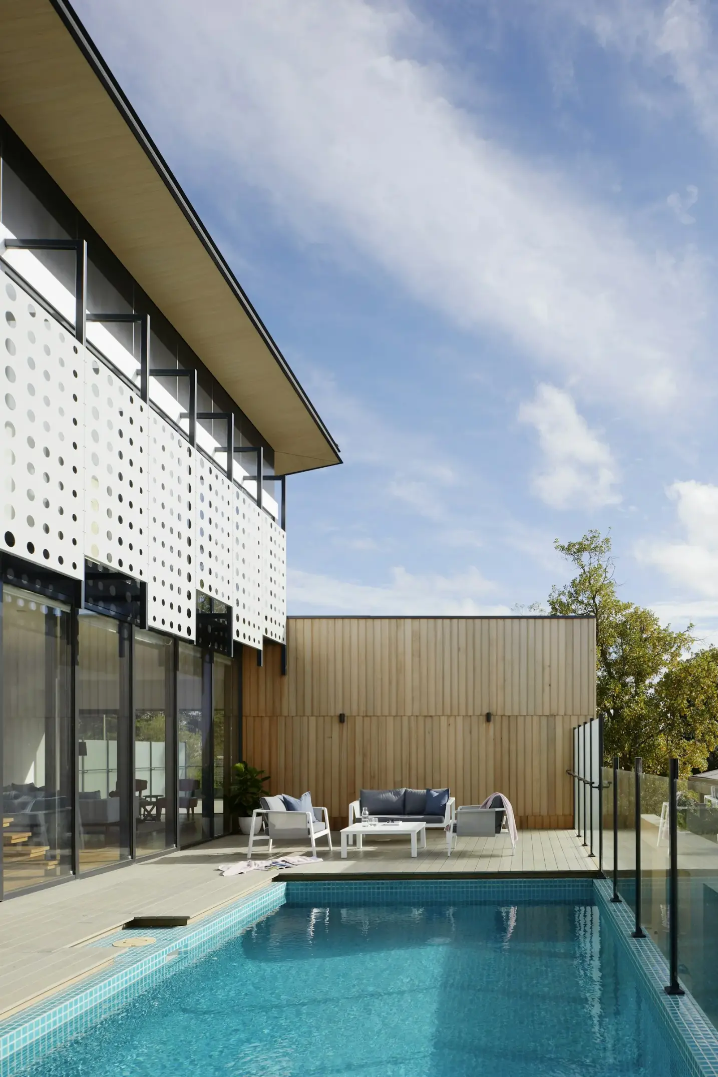
Poster size low ceiling decisions are where European rental flats expose wishful shopping. The print looked generous on a phone. The wall looked empty in a listing photo. Then the framed sheet arrives, the top moulding climbs toward the cornice, and the room suddenly feels shorter than it did with bare plaster. In apartments under 2.4 m, and especially around the familiar 2.3 m band of postwar and 1970s stock, oversized wall art does not read as luxury. It reads as pressure.
This guide answers a practical long-tail question: what poster size works with low ceilings in apartments when you still want premium paper and a calm hang. You will see why art print small room height needs a different scale habit than loft advice, when an oversized poster low ceiling pairing fails, and how wall art scale apartment logic changes once sofa backs, door heads and skirting claim their share of the vertical. Browse the posters catalogue while you measure, keep Creating a gallery wall nearby if you prefer several medium pieces, and treat how to hang an art print above a sofa as the furniture companion when the sofa, not empty plaster, should set the height.
Studio Vallor prints in Europe on 250 g/m² matte art paper with sustainable inks. Formats stay inside a residential atelier range: 30 × 40, 50 × 70 and 70 × 100 cm. Frames, when you want them, arrive ready to hang in natural oak, dark oak, matte black and matte white. Free shipping from €50 softens the cost of ordering the size that actually fits; conditions live on Shipping and returns. The useful work still happens before checkout: writing the clear height between furniture and ceiling, choosing orientation that respects that band, and leaving honest air above and below the frame so the wall can breathe.
Why low ceilings punish oversized prints
Low ceilings punish oversized prints because vertical room is a shared budget, not an empty gallery. A 2.3 m living room already spends height on skirting, sofa back, possible picture rail, and the visual weight of the ceiling plane itself. When you hang a tall framed sheet that was styled for a 2.7 m loft, the leftover plaster above and below collapses into thin strips. The eye reads those thin strips as stress. The print may be beautiful. The architecture feels crowded.
Magazine photography often hides this. Camera height, wide lenses and staged emptiness make XXL art look proportioned in spaces that would feel tight in real life. On a Tuesday evening in a compact Paris studio, a Lyon one-bed from the 1960s, or a Brussels walk-up with 2.35 m clear height, the same crop can dominate the wall like a billboard. Wall art scale apartment living is not about denying yourself impact. It is about matching impact to the centimetres you actually own.
Oversized poster low ceiling mistakes usually begin with paper size alone. People compare 70 × 100 cm to a blank wall and conclude there is “plenty of room.” They forget the outer frame. Oak and matte black mouldings add centimetres on every side. Hanging hardware needs a drop from the top edge. Breathing room above the sofa backrest and below the ceiling line needs its own band. Suddenly a sheet that looked safe on a product page consumes most of the free plaster. The room loses the quiet margin that makes premium prints feel intentional.
Light makes the punishment clearer. Matte 250 g/m² art paper scatters daylight instead of throwing a hard mirror, which helps small rooms that mix window light and lamps. Still, a tall print under a low ceiling often sits partly in a shadow band and partly in a brighter stripe. The lower third can darken toward the sofa while the upper third catches the last of the day. That split is easier to live with when the print is not already fighting the ceiling for air. Art print small room height works better when the pigment field sits inside a calmer middle band of the wall, not stretched from near the backrest to near the cornice.
Furniture scale compounds the issue. Low-ceiling flats often use lower sofas, compact sideboards and shorter bookcases to keep sightlines open. An oversized vertical poster above a modest sofa creates a top-heavy stack: low seating, tall art, close ceiling. Guests feel the compression even if they cannot name it. Horizontal compositions and medium formats restore balance because they widen the story without climbing the wall. That is why poster size low ceiling advice is rarely “buy the biggest option.” It is “buy the option that leaves the room looking taller than it is.”
Rental constraints sharpen the same point. Many European leases discourage experimental hole patterns. If the first XXL hang sits too high or too tall, correcting it means fillers, fresh paint touch-ups, or living with a constellation of mistakes. Measuring the free vertical first, then choosing among Studio Vallor’s 30 × 40, 50 × 70 and 70 × 100 cm formats, is kinder than forcing an oversized poster low ceiling experiment and hoping the doorway view forgives it.
There is also a psychological effect. In compact rooms, people already feel closer to walls and ceilings. A print that nearly fills the vertical can feel like it is leaning in. Soft Abstract fields, quiet Nature horizons and gentler Travel edges still bring atmosphere when the format respects height. Browse the collections index with your clear wall height written down, not with a wish for museum scale. The goal is presence without oppression.
Finally, oversized work can steal attention from everything else you already own. In a 2.3 m apartment, rugs, plants, lamp shades and curtain heads share a short stage. When wall art scale apartment choices ignore that stage, the print wins by force. Good residential hanging lets the print lead without silencing the room. Low ceilings punish XXL because they remove the forgiving void that larger homes use as a buffer. Without that buffer, scale has to be honest.
Safe format ranges for under 2.4 m
Safe format ranges for under 2.4 m start with a tape measure, not a mood board. Stand at the wall you will use. Measure from the top of the sofa backrest, console or headboard to the ceiling or to the underside of any cornice. Subtract the breathing room you want above the furniture and below the ceiling. What remains is your usable art band. Poster size low ceiling choices should fit inside that band once frames are included, not merely as bare paper dimensions.
In many 2.25 to 2.40 m European living rooms, the clear band above a standard sofa is surprisingly modest. A sofa back might sit near 80 to 90 cm from the floor. Leave roughly 15 to 25 cm of air above cushions so the frame never collides with leaning heads or throws. Leave another 10 to 20 cm under the ceiling so the top moulding does not scrape the plane above. The leftover middle band often lands near 80 to 110 cm depending on the flat. That is plenty for calm residential art. It is not a free invitation for every oversized poster low ceiling fantasy styled in a double-height loft.
Studio Vallor’s 30 × 40 cm format is the safe small module for tight verticals, hall niches and bedside walls. Framed, it remains compact. A single sheet can sit quietly above a narrow console. Two or three can build a short stack or a horizontal row without climbing into the ceiling’s personal space. In a 2.3 m bedroom in Nantes or a studio corridor in Berlin, 30 × 40 cm often looks intentional where a larger sheet would feel like a notice board. Art print small room height benefits from modules that still leave plaster visible as a frame around the frame.
50 × 70 cm is the residential workhorse under 2.4 m. Vertically oriented, the paper height is 70 cm before moulding. With a typical frame, you still often remain inside a usable middle band above a sofa if you hang with living-room sense rather than museum dogma. Horizontally oriented, the 70 cm side becomes width and the 50 cm side becomes height, which is frequently the kinder choice when ceiling pressure is obvious. Many compact lounges in Milanese walk-ups and Madrid mid-century blocks look more open with one or two framed 50 × 70 sheets than with a single tall hero that eats the wall.
70 × 100 cm can work under 2.4 m, but only with conditions. Use it when the furniture is low, the wall is relatively free of doors and windows, and you are willing to hang with disciplined air rather than centring on empty plaster. A horizontal 100 cm width with 70 cm height is often safer than a vertical tower. A vertical 70 × 100 hang in a 2.3 m room is the classic oversized poster low ceiling risk: it can look magnificent in an open-plan with height to spare and oppressive in a rental with a close lid. If you love the crop, test the outer frame height with kraft paper or painter tape before you order. For open-plan cases with more generous volume, oversized abstract posters in open-plan rooms covers a different spatial story; here the apartment height is the boss.
EU apartment examples help keep the ranges concrete. A Haussmannien chambre de bonne converted to a studio may offer charming light and stubborn low clear height; 30 × 40 and 50 × 70 keep the romance without crushing the volume. A Dutch row-house living room with 2.35 m ceilings and a long sofa often prefers a horizontal 50 × 70 pair centred on the seating rather than one vertical 70 × 100. A Swedish rental with white walls and modest windows can take a single 70 × 100 if the hang sits lower than gallery habit and the orientation respects the width of the sofa. Wall art scale apartment advice is local: same paper, different architecture.
Frames change the safe range in small but real ways. Natural oak and dark oak add warmth and a visible silhouette; matte black draws a sharper edge; matte white nearly dissolves on pale plaster. Heavier visual silhouettes can make a tall print feel taller. In low rooms, many people choose matte white or natural oak for medium formats so the moulding does not add optical height stress. The sheet remains 250 g/m² matte art paper with sustainable inks and European production either way. The frame is the volume dial.
Mixed formats need a height budget for the whole composition, not only the hero. If you plan a 50 × 70 centre with 30 × 40 flanks, measure the tallest outer edge and the total width against sofa and ceiling. Gallery wall spacing between frames keeps gutters honest once sizes are chosen. Safe ranges fail when people pick each print in isolation and discover the stacked height only after the first nail.
Free shipping from €50, under the conditions on Shipping and returns, makes it easier to order the format that matches the taped band instead of forcing a leftover XXL and “making it work.” European production keeps later companions consistent when you add a second piece months later. Safe poster size low ceiling practice is therefore a sequence: measure usable height, choose among 30 × 40, 50 × 70 and 70 × 100 cm with frames in mind, tape the outer rectangle, then buy.
Horizontal vs vertical orientation
Horizontal versus vertical orientation is often the cheapest way to fix wall art scale apartment problems without changing your taste in images. The same edition can feel oppressive as a tall portrait and generous as a wider landscape once the ceiling sits close. Orientation is not a secondary filter after checkout. In rooms under 2.4 m, it is part of the size decision.
Vertical prints climb. That is their gift in corridors with height to spare and their risk above sofas in low flats. A vertical 50 × 70 still asks for 70 cm of paper height plus moulding. A vertical 70 × 100 asks for a full metre of paper before the frame. Under a 2.3 m ceiling, those climbs compete with furniture and with the visual need for air. If the subject is a figure, a tall botanical stem or a stacked abstract, vertical can still be right, but the hang must sit carefully in the middle band and the surrounding plaster must remain visible. Poster size low ceiling success with vertical work depends on restraint elsewhere: quieter neighbours, matched frames, no second tall stack beside the first.
Horizontal prints widen. They borrow the sofa’s logic. Seating is a horizontal mass; a landscape-oriented print can echo that mass and make the wall feel longer rather than taller. In compact rooms, lengthening the perceived wall often helps more than emphasising height you do not have. A horizontal 50 × 70 above a two-seat sofa in a Lisbon rental can look tailored. The same image cropped or chosen as a vertical can look like it is trying to push the ceiling away and failing.
Diptychs and short rows amplify orientation effects. Two horizontal 50 × 70 frames side by side create a wide calm band that suits low rooms when gutters stay even. Two verticals side by side create a picket of height that can feel busy under a close ceiling unless each print is modest, such as 30 × 40. External reading on gallery wall ideas can spark arrangement shapes; your tape measure still decides whether those shapes fit art print small room height realities.
Subject matter should negotiate with orientation, not override it. Travel horizons often prefer horizontal calm. Abstract fields can go either way, though soft lateral gestures usually forgive low ceilings better than aggressive vertical thrusts. Nature studies with wide foliage or shoreline lines sit happily as horizontals in family lounges. Tall single stems can work as vertical 30 × 40 or 50 × 70 accents in niches where the ceiling conflict is weaker. Children editions in bedrooms follow the same rule: if the ceiling is modest, widen the story before you stack it.
Doorways and windows also vote. A vertical print beside a tall window can create a competing pair of uprights that make the remaining wall feel narrower. A horizontal print under a wide window band can settle the architecture. Walk the room from the entrance before you commit. Oversized poster low ceiling tension is often an orientation mismatch visible from the doorway long before anyone reads the caption on the wall.
Studio Vallor’s three formats give you orientation levers without leaving residential scale. 30 × 40 flips easily between intimate portrait and compact landscape. 50 × 70 is the flexible middle. 70 × 100 is the impact choice that needs the most honesty about height. Matte 250 g/m² paper keeps either orientation readable under mixed light; sustainable inks keep midtones steady. Frames in natural oak, dark oak, matte black or matte white should match across a pair so orientation, not moulding variety, carries the design idea.
If you are torn, mock both orientations with paper rectangles. Tape a vertical outer size for a day, then a horizontal one. Sit on the sofa at noon and again at lamp hour. The orientation that still leaves the ceiling feeling farther away is the winner, even if the phone thumbnail preferred the taller crop. Wall art scale apartment living rewards that boring test more than it rewards dramatic scrolling.
Leaving air above and below the frame
Leaving air above and below the frame is the quiet skill that makes poster size low ceiling hangs look considered. The print needs a margin of plaster the way a paragraph needs margins on a page. Without those margins, even a correctly chosen 50 × 70 can feel jammed. With them, even a carefully placed 70 × 100 can feel deliberate.
Air below the frame usually means the gap above furniture. Above a sofa, that gap protects cushions, heads and the habit of tossing a throw over the backrest. Too little air and the frame feels welded to the seating. Too much air and the print floats toward the ceiling, which is disastrous in a low room because it wastes the middle band where eyes actually rest. A practical residential range often sits around 15 to 25 cm from the top of the backrest to the bottom of the frame, adjusted for sofa depth and how people sit in that household. How to hang an art print above a sofa stays the detailed companion for furniture-led height; here the low-ceiling reminder is simple. Do not steal bottom air to feed a taller print.
Air above the frame is the ceiling’s share. Under 2.4 m, that share matters more than design blogs written for taller rooms admit. When the top moulding nearly touches the ceiling line, the room loses the thin bright band that makes height feel available. Keep a visible strip of wall above the frame. Ten to twenty centimetres is a useful starting intention, more if the cornice is decorative or the ceiling paint is a different tone. Art print small room height improves when the ceiling still has a quiet border of plaster to itself.
Centring habits often destroy both air bands at once. People centre a composition on the entire wall rectangle from floor to ceiling, ignoring the sofa. In a tall gallery that can look pure. In a 2.3 m apartment it pushes art upward, shrinks the top air, and exaggerates oversized poster low ceiling stress. Centre on the usable band between furniture and ceiling instead. Treat that band as the picture plane. The optical centre of the print or set should live where seated eyes travel, not where standing museum dogma points.
Gallery walls need outer air as well as internal gutters. Even spacing between frames, often in a 5 to 7.5 cm residential band, keeps the set coherent, but the whole outer rectangle still needs breathing room above and below. A dense salon hang that fills every vertical centimetre will feel heavier under a low ceiling than the same images with a calmer outer margin. Creating a gallery wall helps when rhythm grows beyond a single hero; gallery wall spacing between frames keeps the internal air honest so you are not tempted to stretch the set vertically to “fill” height you should leave alone.
Light interacts with those margins. Matte art paper at 250 g/m² avoids glossy glare, yet wall colour still flashes in the gaps. Equal air above and a stable band below keep those flashes from becoming uneven slits of bright plaster. Evening lamps near the ceiling can wash the top margin; leaving enough air prevents the top moulding from sitting inside a hot stripe. Sustainable inks and European production keep colour consistent; placement keeps that colour readable.
Painter tape remains the rental-friendly rehearsal. Tape the outer top and bottom edges of the planned frame or set. Live with the empty shape. If the top tape feels close to the ceiling when you enter from the hall, lower the whole composition before you drill. If the bottom tape crowds the sofa, raise slightly or choose a shorter format. Leaving air is easier to adjust in tape than in patched plaster.
Frame colour changes how much air you perceive. Matte black against white paint draws a hard boundary; you may want a touch more margin so the silhouette does not feel clamped. Matte white can sit a little closer to pale ceilings without the same optical clamp, though real centimetres still matter. Natural oak and dark oak read warmer and medium; they usually like the same honest margins as any other moulding. Do not use a pale frame as an excuse to erase the ceiling gap entirely.
In bedrooms, air below may relate to a headboard rather than a sofa. Keep the frame from colliding with pillows stacked for reading. In hallways, air above matters near door heads; a print that aligns awkwardly with a door architrave can feel taller than it is. In dining alcoves under low ceilings, a horizontal medium print with clear top air often beats a vertical that competes with pendant lights. Poster size low ceiling logic is the same across rooms: usable band first, margins second, nail last.
Mistakes
Forcing XXL because the wall looks empty in a wide photo is the first mistake. Phone cameras exaggerate space. A blank 2.3 m wall can look vast in a listing and modest in person. Order from measurements, not from loneliness on a screen. Browse posters with your usable height written on paper.
Hanging at standing museum height in a seated low room is the second. A centre near 145 cm from the floor can push the top of a tall frame into the ceiling’s danger zone. In compact apartments, living height beats dogma. Keep the optical centre where conversation happens.
Choosing vertical 70 × 100 by default is the third. That format is excellent in the right volume. Under many low ceilings it is the definition of an oversized poster low ceiling mismatch. Prefer horizontal orientation or step down to 50 × 70 unless tape proves the tall crop still leaves air.
Ignoring frame outer size is the fourth. Paper centimetres are incomplete. Mouldings in natural oak, dark oak, matte black or matte white all change the silhouette. Measure the framed plan, not only the Studio Vallor sheet size.
Stretching a gallery wall upward to fill height is the fifth. Extra vertical tiers can make art print small room height feel shorter. Widen with a row, or keep a single calm band, before you build toward the ceiling. External gallery wall ideas are starting points; your ceiling is the editor.
Matching a tall bookcase with an equally tall print beside it is the sixth. Two upright masses under a low lid create a canyon. Offset with a horizontal print or a lower cluster so the room keeps a lateral escape for the eye.
Centring on empty plaster above a sofa is the seventh. The furniture is part of the composition. Wall art scale apartment hangs that ignore the sofa produce floating rectangles and starved top margins.
Buying a fourth print to hide a scale mistake is the eighth. More images rarely fix a frame that is simply too tall. Fix format and air first. Then decide whether the story needs another piece from the collections.
Skipping the doorway check is the ninth. Close-up approval lies. Walk in from the hall with a cup. If the top edge feels tight, believe that feeling.
Trusting glossy finish habits in small bright rooms is a quieter tenth. Studio Vallor’s matte 250 g/m² art paper is already on your side for mixed light; do not undo that with a hang so high that lamp wash hits only the upper third. Which paper to choose for a high-end poster remains useful if finish questions linger after scale is settled.
Studio Vallor collections to explore
Begin with the mood you want inside a disciplined format, not with the largest sheet on the site. If the room wants elsewhere without vertical strain, start in the Travel collection. Soft horizons and quieter city edges often prefer horizontal 50 × 70 hangs in low lounges. Matched natural oak or matte black keeps the silhouette steady so poster size low ceiling choices stay about proportion, not competing mouldings.
If the room wants structure and colour without a postcard story, walk the Abstract collection. Measured fields settle compact walls when orientation respects height. Abstract work can take a carefully taped 70 × 100 in some flats, especially as a horizontal impact piece, but 50 × 70 remains the forgiving everyday hero for apartments under 2.4 m. For a taller-volume contrast, oversized abstract posters in open-plan rooms shows how the same family behaves when architecture gives you more air.
If the room wants foliage and outdoor calm, open the Nature collection. Botanical width and soft landscape lines help art print small room height feel restorative rather than crowded. Slightly smaller modules, including 30 × 40 accents in niches, keep family rooms breathable.
Children editions belong where play and rest are meant to be visible. The same scale logic applies: usable band, honest air, orientation that does not fight the ceiling. Many households keep the calmer Nature or Abstract story on the low living wall and let Children pieces live in bedrooms. The collections index helps you jump between universes without losing the shortlist.
Materials stay consistent across those families. European production. Sustainable inks. Matte art paper at 250 g/m². Ready-to-hang thinking in natural oak, dark oak, matte black and matte white. Atelier formats at 30 × 40, 50 × 70 and 70 × 100 cm. Free shipping from €50 according to the conditions on Shipping and returns. That consistency lets you build slowly: one correctly scaled piece now, a companion later that respects the same height budget.
Related reading keeps the hang practical. Creating a gallery wall covers multi-piece rhythm when one hero is not enough. How to hang an art print above a sofa returns you to seated height. How to style posters in every room helps when the low-ceiling question moves from lounge to bedroom or hall. Compare crops across the wider posters catalogue once your usable band is written down.
Poster size low ceiling work is not a denial of impact. It is how premium Studio Vallor prints look intentional in ordinary European apartments: formats that fit the free plaster, orientation that widens rather than crowds, air above and below the frame, and materials quiet enough that small rooms still feel open at the end of the day.
FAQ
Can I hang a 70 × 100?
Yes, when the usable band between furniture and ceiling still leaves honest air after the outer frame is included. Prefer horizontal orientation in many 2.3 to 2.4 m rooms, tape the outer rectangle first, and step down to 50 × 70 if the top margin collapses. A 70 × 100 Studio Vallor print on 250 g/m² matte art paper can look excellent under a low ceiling only when the architecture still gets its borders.
Better two medium prints?
Often yes. Two framed 50 × 70 sheets, or a short row with 30 × 40 companions, can deliver wall presence without the vertical stress of one oversized poster low ceiling stack. Keep gutters even, match frames, and centre the whole set on the sofa. Creating a gallery wall helps if the pair wants to grow later.
Centre height?
In low apartments, centre on the usable band between furniture and ceiling, not on the full floor-to-ceiling wall. Seated living rooms usually want a lower optical centre than standing gallery habit. Leave air above the backrest and below the ceiling so wall art scale apartment hangs feel calm from the doorway as well as from the sofa.