Practical guides
Nature posters in a rental with white landlord walls
Nature posters in a rental with white landlord walls. Practical guide for premium art posters. Studio Vallor.
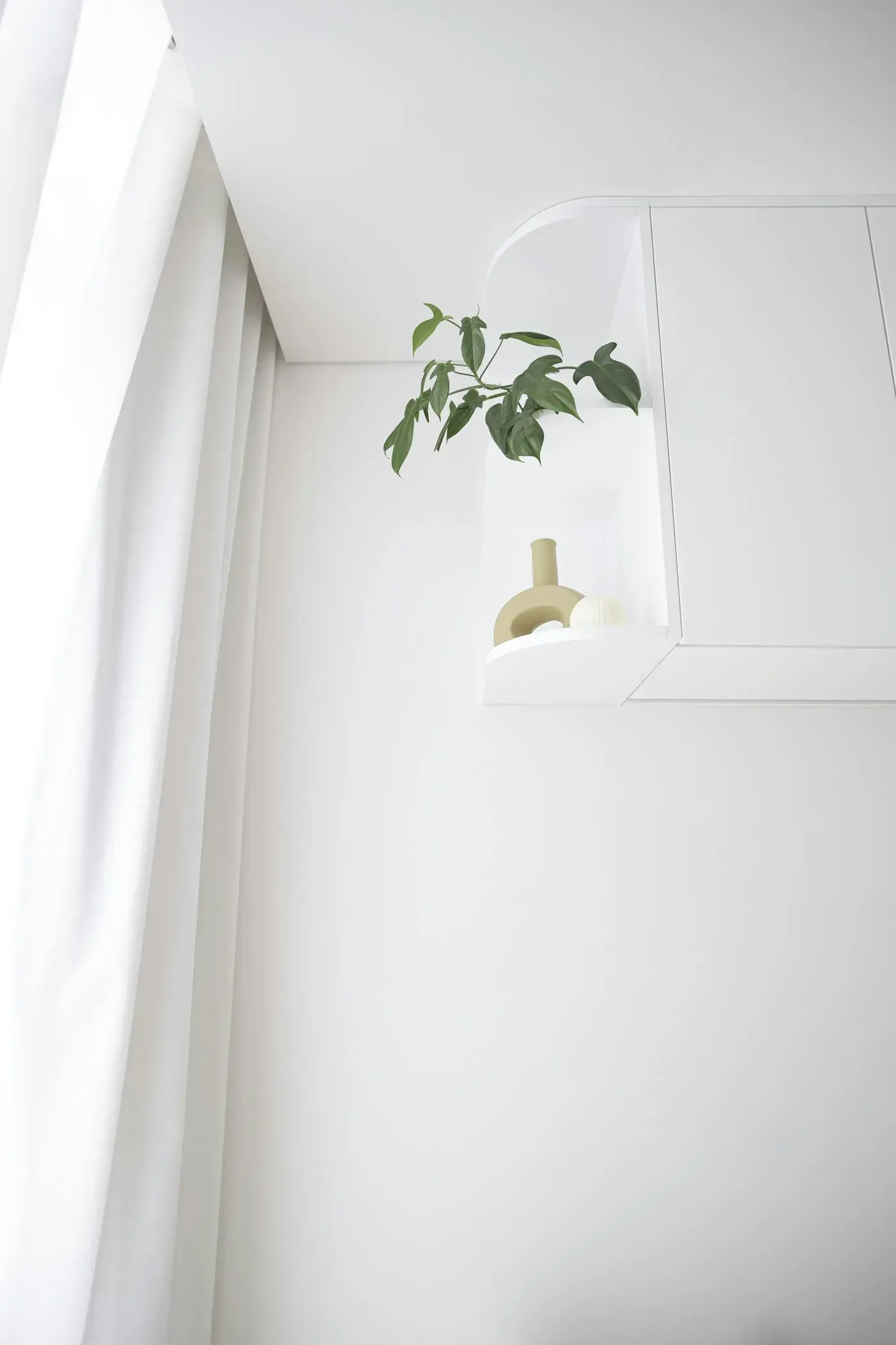
White landlord walls are honest and hard. They photograph well, they pass inventory, and they leave every soft colour looking temporary until something on the wall claims the space. For renters, paint is often off the table. Removable wallpaper risks deposits. Furniture alone rarely warms a box of plaster. Nature posters in a rental with white landlord walls do quieter work: botanicals, foliage and open landscapes bring mid-tones, organic edges and a sense of outside air without touching the landlord’s finish.
This guide is for people who live in white boxes and want them to feel lived in. The angle is practical and renter-safe. How do plant prints warm white apartment walls without looking like office posters? Which formats hold a bare elevation? How do you hang with Command-friendly methods, rotate with the seasons, and still keep a premium presence? Studio Vallor prints on 250 g/m² matte art paper with durable, sustainable inks and European production. Formats stay at 30×40, 50×70 and 70×100 cm. Frames arrive in natural oak, dark oak, matte black and matte white. Shipping is free from €50. Browse the nature collection, compare sizes in the posters catalogue, and keep the wider collections open when Travel, Abstract or Children editions might share the same white plane.
Nature posters white rental walls is not a styling trick for a weekend. It is a way to make the place you rent feel like a home you chose, even when the walls stay the colour of the inventory checklist.
Why this matters for premium art prints
A white rental wall is a stage with no set. Every object on it is judged. A thin glossy print curls at the corners, catches the window as a bright rectangle, and reads as temporary even when you love the motif. A premium nature print on matte 250 g/m² art paper sits flatter, scatters light instead of bouncing it, and keeps pigment in the fibre so greens and soft ochres stay botanical rather than plastic. That difference is not luxury theatre. It is why a plant print white apartment scheme can feel settled after one week instead of looking like a student move-in.
White walls also punish weak scale. A small postcard centred on a long living elevation disappears into plaster. The room still feels empty. An intentional nature poster, sized to the furniture and the free wall width, becomes a vertical companion: leaves, stems, a quiet horizon. Guests stop asking when you will “do something with the walls.” You already did, without paint.
Premium materials matter more in rentals because you see the print every day and you may take it with you. Cheap paper that yellows, ripples or scuffs at the edges becomes a reminder of compromise. Matte art paper with European production keeps colour consistent across editions, so a botanical you hang in this flat can later sit beside a landscape in the next one. Durable inks help the sheet survive daylight, lamps and the occasional move between rooms. Free delivery from €50 makes it easier to order the format that fits instead of settling for a leftover size that never warms the wall.
There is an emotional job too. White landlord walls can feel institutional: clinic, corridor, temporary housing. Nature imagery softens that reading without pretending the room is a countryside cottage. A single fern plate, a calm canopy, a soft herbarium composition, or an open coastal landscape introduces organic line and mid-tone depth. The plaster stays white. The atmosphere changes. That is the premium angle: the print is not covering a defect. It is completing a room the landlord left unfinished on purpose.
Renters also need reversibility. Drilling may be limited. Painting is often forbidden. A framed or carefully hung nature poster can leave with you, and Rotate posters seasonally without wall damage shows how to keep the wall intact while the mood shifts. Premium hanging systems, Command-friendly strips rated for the frame weight, and honest placement tests protect both your deposit and the print. A cheap poster you are afraid to hang properly never warms anything. A well-made sheet you trust to hang and rehang becomes part of how you live.
Finally, white walls exaggerate finish. Gloss becomes glare. Thin stock becomes waves under raking afternoon light. Undersized frames look like temporary clips. Choosing matte paper, a coherent frame colour and a format that holds the elevation is how nature posters white rental walls schemes stay readable from the sofa and from the doorway. For the broader paper logic, keep Which paper to choose for a high-end poster nearby. Here the rental conclusion stays simple: matte first, scale with intent, hang in a way you can reverse.
How to choose / place
Start with the wall you actually face, not the emptiest corner. In most white rentals the living elevation behind the sofa, the wall opposite the bed, or the long run beside a dining table does the emotional work. Walk the path from entrance to sofa, from bed to wardrobe, from kitchen to table. Note where your gaze rests when conversation pauses. That pause is where a nature poster earns its place. Empty corners beside radiators often stay empty for a reason: they receive awkward light, bags and shoulders. Hang where life looks, then let secondary walls wait.
Decide what “warming” means for your white. Cool landlord white with blue undertones often wants botanicals with soft sage, olive, dusty eucalyptus, charcoal stems and slightly warmer grounds (linen, stone, pale clay). Warmish off-white can welcome cooler greens without freezing the room. Pure brilliant white under LED ceilings can make neon plant graphics look sour; mid-tone foliage with clear hierarchy holds better. A plant print white apartment pairing works when the poster borrows one tone already present in timber, linen or a houseplant and adds one quieter tone that only lives in the print.
Measure before you fall for a crop. Write down free wall width, furniture width, ceiling height and the clear band above the sofa or headboard. Studio Vallor formats are 30×40, 50×70 and 70×100 cm. Framing adds outer centimetres, so plan the moulded size if you want oak or black from day one. In a compact rental living room, a single 50×70 botanical above the sofa is often the sweet centre: large enough to feel intentional, small enough to keep air around the frame. In a generous white box with a long sofa, 70×100 can carry the elevation if the image stays open. The 30×40 format rarely warms a main white wall alone; keep it for hallways, niches, kitchen nooks or pairs that share a palette.
Colour should answer the quietest materials you already own. Oak floors and beige textiles welcome sage, ochre veins and soft brown stems. Grey laminate and black metal shelves welcome graphite botanicals, misty landscapes and restrained teal accents. Avoid matching the red kettle, the patterned rug and the throw pillows at once. Let the nature poster lead a limited cast of tones. The room will feel calmer, and the white walls will stop competing with every object.
Placement relative to furniture should stay calm and readable. Above a sofa, leave breathing room between the top of the back cushions and the bottom of the frame, often roughly fifteen to twenty-five centimetres depending on sofa height and wall height. Centre on the furniture run unless you are building a deliberate asymmetry with a lamp or a plant. Above a bed, keep the print high enough that pillows do not crowd the lower edge, and choose an image calm enough for sleep: open botanicals and soft landscapes usually outperform dense jungle photography. In a dining nook, hang so seated eye level still finds the mid-tones; white walls make a low hang look like an afterthought.
If you want more than one nature print, prefer rhythm over accumulation. Two 30×40 sheets with matching frames and a shared palette can pace a long white corridor better than one oversized dense canopy. Three herbarium-style plates in a horizontal line can feel collected without needing paint. Keep gaps even. Align bottom edges or centres, not both randomly. When the grid grows, Creating a gallery wall helps you expand without turning the rental into a collage of leftovers. For a first hang in a white landlord flat, one clear botanical or landscape is often stronger than a busy grid. How to style posters in every room walks room by room when you are ready to extend the logic beyond the main wall.
Renter-safe hanging
Renter-safe hanging is the difference between a deposit returned and a wall you apologise for. Start by reading what your lease allows. Some landlords accept small nails; others expect no holes at all. Command-friendly hanging is often the practical path for framed posters when the wall is painted plaster or painted plasterboard in decent condition. It depends on wall type, light and print weight. Prefer matte paper (lighter assemblies than heavy glazing stacks when you choose carefully), know the rated weight of your strips or hooks, and test placement with paper templates before you commit adhesive to the wall.
Weigh the finished object honestly. A 70×100 cm print in a wood frame with glass can exceed what a single strip set is rated for. Distribute load according to the product instructions, clean the wall with the recommended wipe, and wait the full cure time before hanging. Press firmly. Do not hang above radiators that cycle hot, or on dusty, chalky paint that never bonded. If the paint is failing, adhesive will fail with it. In that case, lean toward freestanding easels for smaller formats, or ask the landlord in writing about a single discreet nail and a patch promise at move-out.
Unframed matte posters can hang with clean clips, magnetic wooden hangers or slim rails that avoid drilling. Keep them high enough to avoid shoulders and bags. Accept that corners are more exposed. If children or pets share the room, framing is usually the kinder long game. Either way, the sheet underneath should stay the same: matte 250 g/m², European production, botanical calm. For seasonal swaps without wall drama, lean on Rotate posters seasonally without wall damage and keep spare Command-rated hardware matched to your heaviest frame.
Test before you permanently commit. Cut kraft paper or newspaper to the outer frame size, tape it lightly at the intended height, and live with the empty rectangle for a day. White walls make height mistakes obvious. A template that looks slightly high at night under warm lamps may look perfect at noon. Adjust once on paper. Hang once for real.
Warming white without paint
Warming white without paint is a palette and texture problem, not a renovation. Nature posters help because organic forms break the hard rectangle of the wall. Soft greens, dusty olives, charcoal stems, warm linen grounds and muted ochre accents pull white plaster toward living rooms instead of waiting rooms. Pair the print with one warm textile already in the room (a linen throw, a wool rug edge, a curtain) so the botanical does not float alone against clinical white.
Frame colour is part of the warming kit. Natural oak brings timber warmth into a white rental and links botanical ochres and stems. Dark oak deepens the same idea with a slightly richer edge. Matte white can disappear into landlord white and leave a mid-tone plant floating cleanly, which is useful when you want the image, not the moulding. Matte black can look sharp with graphic foliage, but on a cool white wall with a pale leaf it can feel severe unless the image has enough structure. Choose the frame after you know the wall’s coolness, not from a thumbnail alone.
Houseplants and nature posters reinforce each other without becoming a theme park. A real fern on a shelf and a botanical on the wall can share a green family without matching leaf for leaf. Keep the plant out of the poster’s reflection path if you use glass. Keep the poster out of steam and splashes if the only free wall is beside the hob. Matte paper deserves a drier elevation.
Light finishes the warmth. White rentals often ship with cool ceiling LEDs. Warm bulbs in the 2700 to 3000 K range usually caress botanical greens and linen grounds better than icy office light. A floor lamp that washes the wall softly does more for a nature poster than a harsh spotlight that coins a hot circle on a leaf. Sheer curtains soften midday glare on white plaster without blocking daylight the print needs to stay readable.
Avoid the trap of “more white accessories.” White frames, white shelves and white prints on white walls can erase the plant. Warming means introducing mid-tones. Let the nature poster carry them. Let timber, woven baskets or a single clay vase echo one note from the sheet. The landlord walls stay inventory-white. The room stops feeling empty.
Format and height
Format and height decide whether nature posters white rental walls schemes feel intentional or apologetic. Sit where you sit. Stand where you stand. In rooms where you mostly sit, centre the print for seated eye level with a slight lift if the sofa is deep and the wall is tall. In corridors and kitchens where you pass upright, raise the optical centre so the botanical does not sink toward skirting boards. White plaster makes a low hang look like a forgotten calendar.
Match format to furniture width more than to “big looks better.” A 70×100 cm landscape above a narrow two-seater can overwhelm a small rental. A 50×70 botanical centred on that sofa often warms better because plaster remains as a natural frame. A pair of 30×40 herbarium plates can pace a long white hallway where one oversized sheet would crowd door frames. Vertical formats suit tall, narrow walls beside bookshelves. Horizontal crops suit wide, low furniture runs when the image allows it.
Leave air. White walls need breathing room around the frame so the print does not feel stuck to the ceiling or crushed by a pendant. Crowding a nature poster under a floating shelf, a TV and a string of photos turns premium paper into visual clutter. Give the botanical one job on that elevation. Secondary objects can live elsewhere.
If you are unsure between framed and unframed, weigh lifestyle as much as look. Framing protects edges, finishes the object and often hangs more securely with proper hardware. Unframed matte sheets feel studio-like and light, which helps Command-friendly setups when weight is a concern. Framed vs unframed: which art poster should you choose? lays out the trade-offs. In a white rental with hand traffic and pets, framed is usually the calmer long game. In a careful adult studio with little wall contact, an unframed 50×70 can look fresh and move easily at lease end.
North-facing white rooms deserve a special note. Cool daylight can make pale greens go grey. Mid-tone structure and open air in the composition hold better than sunlit sparkle that never arrives indoors. Botanical posters for north-facing rooms goes deeper on cool light. The rental takeaway is the same: choose botanicals that still speak at four in the afternoon in February on white plaster.
Materials: paper, frame, light
Paper is the first material decision for nature posters in white rentals, and it should almost always be matte art paper. Studio Vallor’s house sheet is 250 g/m². That grammage keeps the poster flat enough that soft or raking daylight does not pick out waves across a bright wall. The matte face lets you read pigment instead of a window ghost. White landlord walls amplify any sheen; glossy finishes turn the print into a second light source. Matte forgives lamps, courtyard bounce and afternoon sun that grazes the elevation. For the wider finish conversation, keep Which paper to choose for a high-end poster open; the rental conclusion stays simple. Matte first.
European production and a coherent paper stock matter when you might add a second nature print later or move the set to another flat. Matching white points and grain keep a pair of botanicals looking like a set rather than two unrelated purchases. Durable, sustainable inks sit in the fibre of a matte sheet, which helps soft greens and browns stay nuanced instead of sitting on top like plastic colour. You are not chasing a poster that photographs once for social media. You are choosing a plant print that must survive daily viewing on white plaster under mixed light.
Frames change temperature on white walls more than people expect. Natural oak warms the assembly and links botanical ochres, stems and oak furniture. Dark oak deepens the edge without the severity of black. Matte black can look excellent with graphic foliage or high-contrast herbarium work; test it against your specific white, because cool landlord paint can make black feel harsh beside a soft leaf. Matte white lightens the object and can help a mid-tone botanical float, especially when skirting and doors are already white. Slim profiles suit most apartments. Thick ornate mouldings steal attention from soft foliage and can feel heavy in a small rental.
Glazing is optional in the sense that an unframed matte poster can look clean on a calm white wall with little hand traffic. Framing protects edges and dust, and it finishes the piece for visitors and inventory days. If you frame, ordinary reflective glass can reintroduce glare on bright white walls even when the sun never hits the print directly. Soft daylight and a lamp can still ghost across a shiny pane. Prefer glazing that behaves kindly in interiors when you can, and hang so that the main seating position is not locked into a perfect reflection of the window. Studio Vallor ready-to-hang colours stay in the practical family: natural oak, dark oak, matte black, matte white.
Light in a white rental is a partnership between daylight, ceiling LEDs and lamps you control. Daylight on white plaster is generous and sometimes cruel to contrast. Lamps give evening colour. Warm bulbs usually flatter botanical greens better than cold office panels. Avoid a single harsh spotlight aimed at the centre of a leaf; prefer a wash, a nearby floor lamp, or a ceiling light that lifts the whole wall. If you cannot change a cool ceiling fixture, lean on palette and frame: slightly warmer botanical grounds, oak instead of black, and enough mid-tone contrast that the plant remains legible when the room goes flat.
Care stays ordinary and renter-friendly. Dust frames with a soft dry cloth. Keep the sheet out of continuous damp and away from kitchen steam. White bathrooms and laundry corners are poor homes for paper, however beautiful the botanical. Move-out day is easier if you keep original packaging corners or a flat folder for unframed sheets. Free delivery from €50 in metropolitan France (conditions on Shipping and returns) makes it easier to order the format that fits instead of compromising on a leftover size. The useful sequence remains paper, image, wall, then frame, then hanging method.
Unframed hangs deserve a short note for Command-friendly homes. A 30×40 or 50×70 matte botanical on a magnetic hanger or clean clips can feel contemporary and light. Keep weight within what your wall system can hold. Accept that corners need care during vacuum days. If you later add a frame, you can reuse the same paper template height. Either way, the sheet underneath should stay matte 250 g/m² with European production and botanical calm.
Common mistakes
Choosing a tiny print for a huge white wall because it felt “safe” for a rental. Safety here is scale that matches furniture, not invisibility. A timid 30×40 alone on a three-metre elevation leaves the white box unchanged.
Picking neon or ultra-saturated plant graphics because the white flat feels dull. Bright landlord white can make loud greens feel artificial. Soft sage, olive, charcoal and linen grounds usually warm the room more honestly.
Using glossy paper because the catalogue photo looked punchy. White walls plus lamps equal glare. Matte remains the everyday face for nature posters white rental walls.
Hanging too low, too close to the sofa top, or shoved into a dark corner beside the radiator. White plaster makes height errors obvious. Hang where life looks. Template first.
Drilling first and measuring later, or loading Command strips beyond their rating. Renter-safe hanging fails when weight, paint condition and cure time are ignored. Prefer matte paper assemblies you can hang within rated limits, and test placement before adhesive or nails.
Matching every textile to the poster until the room becomes a costume set. One shared note between print and linen is enough. Let white walls stay quiet around a limited cast of tones.
Building a chaotic gallery of leftover postcards, flyers and mismatched frames on the main elevation. One premium nature poster, or a tight rhythm of matching botanicals, warms better than clutter. Expand with Creating a gallery wall only when you have a plan.
Ignoring north light or cool LEDs when choosing pale botanicals. If the leaf disappears at dusk on white plaster, the print was too weak in mid-tones. Choose hierarchy over sparkle.
Forgetting move-out. Choose hanging methods you can reverse, keep patch materials if you use nails with permission, and favour prints you will take to the next home. Premium paper earns that second life.
Treating nature posters as temporary placeholders “until we can paint.” That mindset leads to undersized, glossy compromises. Hang something you respect now. The white walls will already feel warmer.
Studio Vallor collections to explore
Start with Nature. The nature collection is the primary home for botanicals, foliage studies and calm landscapes that warm white landlord walls without paint. Look for open air around subjects, mid-tone structure and grounds that sit a half-step warmer or cooler than your plaster depending on what the room needs. A single clear plant print often does more for a white apartment than a dense canopy that fills every centimetre with ink.
Compare formats in the full posters catalogue with your wall measurements open. Studio Vallor atelier sizes stay at 30×40, 50×70 and 70×100 cm on 250 g/m² matte art paper. European production keeps colour coherent when you add a second sheet later. Durable, sustainable inks and free delivery from €50 (see Shipping and returns) support the renter habit of ordering the right size instead of the leftover one.
When the main botanical is settled, the wider collections let you extend the mood without abandoning white walls. Travel editions can bring a quieter horizon into a hallway that still needs warmth. Abstract sheets can calm a work corner where foliage would feel too busy beside screens. Children universes belong in kids’ rooms and play nooks where soft nature motifs meet safer hanging heights and tougher traffic. Keep frames consistent across universes when they share a sightline: natural oak, dark oak, matte black or matte white, chosen once for the flat’s white temperature.
Use the blog cluster as a toolkit beside the shop. How to style posters in every room helps you carry nature logic from living room to bedroom. Botanical posters for north-facing rooms helps when cool light washes your white walls. Framed vs unframed: which art poster should you choose? settles the weight and protection question for Command-friendly hanging. Rotate posters seasonally without wall damage keeps the landlord happy while your botanicals shift with the year. Which paper to choose for a high-end poster locks the matte decision. Creating a gallery wall waits until one hero nature poster has already warmed the white box.
Studio Vallor’s job in a rental is not to pretend the walls are yours forever. It is to give you art that makes them feel like home while they are, and that travels with you when they are not.
FAQ
Can I use Command-friendly hanging for nature posters on white landlord walls?
It depends on wall type, light and print weight. Prefer matte paper, know the rated load of your strips or hooks, clean the paint as directed, and test placement with a paper template before adhesive or drilling. Heavy glass and oversized frames may need distributed hardware or landlord-approved nails. Never exceed the product rating, and avoid dusty or failing paint that will not bond.
Which format warms a white rental living room best?
Most compact white living rooms start well with a single 50×70 cm nature poster centred on the sofa run. Larger elevations with wider furniture can carry 70×100 cm if the image stays open. Use 30×40 cm for secondary walls, pairs or narrow niches rather than as the sole warmer of a long white plane.
Will a botanical look cold on cool landlord white?
It can, if the print is pale and the lighting is icy. Choose mid-tone greens, soft olives, charcoal stems and slightly warmer grounds, or warm the assembly with natural oak framing and softer lamps. Cool white plus a weak leaf plus cold LEDs is the combination that feels clinical.
Should I frame nature posters in a rental?
Often yes, when you want edge protection, a finished look and more stable hanging. Unframed matte sheets stay lighter and can suit careful Command-friendly setups. Match the choice to traffic, pets and weight limits. Studio Vallor frames in natural oak, dark oak, matte black and matte white keep the decision simple once you know your wall’s temperature.
How do I keep nature posters white rental walls looking intentional without painting?
Hang one clear botanical or landscape at the right height and scale, use matte 250 g/m² paper, pick a frame that either warms (oak) or quietly floats (matte white), echo one tone in a textile or plant, and leave air around the frame. Avoid glossy finishes, neon plant graphics and cluttered leftover grids on the main elevation.