Practical guides
Office waiting-area art prints that feel human
Calm waiting room art prints for clinics and offices. Choose human, non-slogan premium posters. Studio Vallor.
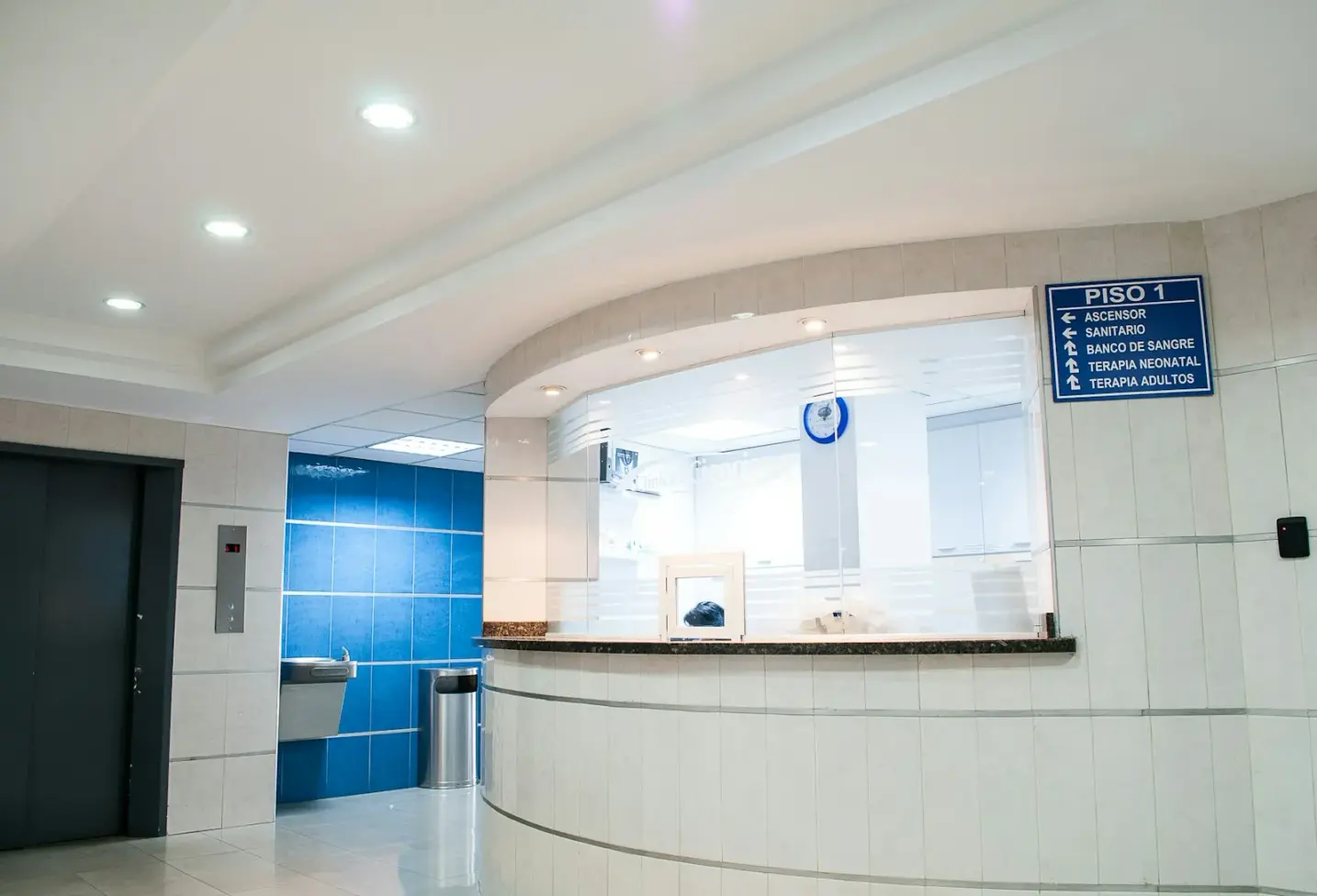
A waiting room is rarely empty of feeling. People sit with appointment nerves, work emails, children on a hip, or the quiet boredom of ten minutes that stretch. The wall they face either softens that wait or sharpens it. Stock motivational posters with slogan typography do the second job: they sell positivity while the room still smells of hand gel and printer toner. Waiting room art prints professional practices actually need work differently. They stay human, quiet and designed, so the elevation reads as care rather than as corporate wallpaper.
This guide is for small clinics, dental practices, therapy rooms, law offices and shared workspaces that want calm abstract waiting room art or soft nature studies without the cliché of framed catchphrases. Studio Vallor prints for European interiors on 250 g/m² matte art paper with sustainable inks. Formats stay at 30×40, 50×70 and 70×100 cm. Frames come in natural oak, dark oak, matte black and matte white. Shipping is free from €50. What follows is how to choose, place and frame waiting-area art so it feels like hospitality instead of motivational stock.
Why this matters for premium art prints
Waiting walls are the first material promise a practice makes after the door. Reception desks, seating and lighting all speak. Art speaks loudest when it is wrong. A glossy slogan print about “teamwork” or “believe” tells visitors the room was furnished from a catalogue aisle, not from a considered interior. Premium art prints reverse that signal. A calm composition on proper paper suggests that someone thought about the minutes people spend looking sideways while they wait.
Small clinics and offices feel this pressure more than large hospital atriums. In a compact suite, every wall is close. Patients and clients see the same elevation every visit. Cheap poster stock ages in fluorescent light. Motivational lettering that once felt energetic becomes visual noise. Human, non-slogan work ages with the room instead of against it. Soft abstraction, quiet botanicals and open landscape studies hold attention without instructing anyone how to feel.
There is also a professional dignity at stake. Therapy and medical spaces ask for trust. Legal and consulting rooms ask for composure. Art that lectures with slogans undercuts both. Waiting room art prints professional interiors deserve treat the visitor as an adult with an interior life, not as an audience for corporate cheer. The wall can be warm without being sentimental, and calm without being cold.
Scale and material raise the same stakes as in a living room, with one extra constraint: many waiting areas sit under mixed lighting, glass doors and west-facing glare. Thin paper waves. Gloss throws reflections into eyes that are already tired. A framed sheet on 250 g/m² matte art paper, hung with the same care you would give a home dining wall, keeps colour readable and the practice looking finished. European production and sustainable inks keep editions consistent if you later add a second print in a corridor or treatment room.
Longevity matters for budgets as much as for taste. Small practices replace furniture slowly. Art that still feels right after five years of seasons, staff changes and new seating fabric is cheaper than rotating slogan stock every time a supplier catalogue lands. Calm abstract waiting room choices and restrained nature editions earn that longer life because they do not depend on a fashion in corporate messaging.
Finally, waiting rooms are shared by very different people on the same afternoon: a parent with a toddler, a client in a suit, a neighbour who has never been inside before. Slogan art tries to speak one voice to all of them and usually misses. Open, human imagery lets each person find their own quiet. That is not vague design talk. It is why the best waiting walls feel like rooms rather than like campaigns.
How to choose / place
Begin with the room’s job, not with a poster you already like online. Note who waits here, how long, and what they face: a reception hatch, a glass street front, a corridor of closed doors. Note the seating height, the floor finish and whether daylight is cool morning light or hot afternoon stripe. Those facts decide whether a calm abstract field, a soft botanical or a quiet coastal study will settle the elevation. Then choose art that would still feel honest if every slogan in the building were removed. If a print only works because it says something in bold type, it is marketing, not waiting-room art.
Prefer images that behave like pictures, not like packaging. Large sans-serif mottos, stock handshake photos and oversaturated sunrise clichés belong in presentation decks, not on the wall people stare at while anxious. Soft gradients, open compositions, measured colour and clear negative space belong on waiting walls. When you shop waiting room art prints professional catalogues, apply a simple test: would this print still feel welcome in a well-designed home hallway? If the answer is no, keep looking.
Colour should borrow from the quietest materials already in the suite. Pale wood reception desks, grey upholstery, cream plaster, linen screens and muted vinyl floors already form a base. Let the poster deepen that base with one or two warmer or cooler notes rather than introducing a loud accent that fights the logo colour on the window vinyl. Brand colour can live on signage and stationery. The art wall can afford restraint. Calm abstract waiting room schemes fail when every surface tries to “energise.” Waiting people rarely need energising. They need a place for their eyes to rest.
Placement follows seated sightlines more than standing gallery habit. Most visitors look from chair height. Hang so the composition is comfortable when you sit in the least favourite seat, the one that faces the wall most directly, and when staff glance up from reception. That dual audience is specific to waiting rooms. Living rooms hang mainly for standing and sofa height. Corridors hang for walking pace. A waiting area sits between those logics. Measure twice, mock once with kraft paper, then drill.
Leave breathing plaster. Waiting rooms already hold brochure racks, coat hooks, sanitiser stations and sometimes a screen showing looped information. Crowding the art with pinned notices on every side turns even a strong print into background static. Give the frame a clean margin. Notices can live on a dedicated board elsewhere so the designed wall keeps its job as the room’s quiet focus.
Nature or abstract for clinic walls
Nature and abstract are the two families that most often succeed in small clinics and offices, and the choice is less binary than it sounds. Soft nature studies bring air, distance and organic rhythm. They suit rooms that feel tight, windowless or heavily clinical. A quiet botanical, a misted hillside or a spare coastal horizon can lower the sense of enclosure without pretending the room is a spa. Abstract work brings structure, colour and modern calm. It suits rooms that already have plants, timber and soft textiles, and that need a composed focal plane rather than another leaf motif.
For medical and dental waiting areas, many practices lean nature first because organic forms feel less institutional than hard geometry. That instinct is sound when the image stays quiet: limited palette, open sky or soft foliage, no dramatic wildlife drama. Overly romantic sunsets and neon florals can feel as loud as slogans. Choose nature that would sit beside pale oak and grey fabric without demanding a tropical story.
For therapy, coaching and legal waiting rooms, calm abstract waiting room art often reads more adult. Soft fields of colour, gentle linear structures and open compositions signal thoughtfulness without importing a wellness cliché. Abstract also survives rebrands better: when the practice updates its logo colour, a restrained abstract rarely looks suddenly wrong the way a literal themed print can.
You can mix the two across a suite if you keep paper, frame and palette disciplined. A nature piece in the main waiting bay and a quieter abstract in a side corridor can feel like one interior language. Browse the nature collection and the abstract collection with your wall measurements and seating photos in hand. Ask whether each piece would still feel human if the waiting chairs were empty and the lights were low. That empty-room test filters well.
If the suite already has strong timber, stone or textile pattern, abstract usually clarifies the wall. If the suite is mostly white laminate and cool LEDs, nature usually warms it. Neither choice needs a caption. The image should do the work without instructing the visitor to “breathe” or “smile.”
Why slogan and motivational stock fails
Slogan art fails waiting rooms for three practical reasons. First, it tells people how to feel at the exact moment they may not want instruction. Second, it dates quickly: typography trends and corporate catchphrases age faster than soft imagery. Third, it signals that the wall was filled from a stock motivational aisle rather than chosen as part of the interior. Visitors notice that. Staff notice that every day.
Motivational stock also crowds the eye with lettering. Waiting rooms already carry text: check-in screens, price lists, privacy notices, nameplates. Another paragraph on the wall adds cognitive load. Human art without slogans gives the eye a rest from reading. That rest is part of professional hospitality.
There is a difference between a quiet typographic artwork designed as art and a poster that exists only to deliver a phrase. The first is rare and usually spare. The second is common and usually loud. For small clinics and offices, skip both if you are unsure. Soft abstract and nature editions from a poster house built for interiors are the safer professional path. Studio Vallor’s approach stays image-led: composition, colour and paper first, no catchphrase required.
If you already own slogan prints, contain them. Move them to a staff kitchen or remove them. Reserve the public waiting elevation for non-slogan work. The room will feel clearer the same afternoon you make that edit. Clients rarely miss the motto. They notice the new calm.
Scale: 30×40, 50×70 and 70×100
Waiting rooms are often narrower than living rooms, yet their main wall still needs decisive scale. A lonely postcard-sized sheet above a three-seat bench looks accidental. Match the print’s outer edge to the furniture run below it the same way you would above a sofa at home.
The 30×40 cm format suits niches, narrow returns beside doors, and modular pairs in corridors. Alone on a long waiting wall it rarely carries authority. Use it when architecture is tight or when you plan two related sheets with even gutters and matched frames. Small formats also work well beside a reception hatch where a large frame would crowd the desk zone.
The 50×70 cm format is the workhorse for many small practices. It reads as intentional on a typical European clinic wall, leaves plaster margins for calm, and does not overwhelm a modest ceiling. Above a bench of two or three seats it often hits the sweet spot between presence and proportion. For waiting room art prints professional teams refresh on a limited budget, one strong 50×70 usually beats three small mismatched sheets.
The 70×100 cm format belongs on the main continuous wall when the room can take a statement: a wider waiting bay, an open reception that faces the street, or a shared office lobby with a clear elevation. Check door swings, fire extinguisher positions and screen mounts before you commit. A large frame needs clear wall and clear traffic. In tight rooms, a well-placed 50×70 with breathing space will always look more professional than a 70×100 forced into a cluttered plane.
Orientation follows furniture more than habit. A low wide bench under a tall narrow print can feel top-heavy. A tall wall between high windows may prefer portrait. Mock the outer rectangle with paper at the real size. View it from the entrance and from the middle seat. If the mock-up disappears into the plaster, scale up. If it crowds the cornice, the coat hooks or the notice board, scale down or shift laterally.
Distance in waiting rooms is usually short. Fine detail can survive when it would dissolve across an open-plan loft. Still avoid microscopic texture that only rewards nose-distance inspection. People glance, then look at their phone, then glance again. Broad shapes, clear silhouettes and calm colour fields win those glances. Calm abstract waiting room compositions are especially strong at that distance because they hold as a whole shape rather than as a puzzle of tiny marks.
Height for seated visitors and staff
Height is the question practice managers ask most, and the answer starts in the chair. Sit where visitors sit. Note natural eye level. Then stand at reception and at the entrance and note where your gaze lands on the candidate wall. The print’s visual centre should live between those marks, slightly favouring the seated visitor because that is the primary audience. Classic living-room gallery height is often a touch high for waiting benches. Drop the centre until seated viewing feels natural, then confirm that staff walking through do not feel the frame is hanging at shin-advertising height.
Keep a clear gap above seating backs and radiator covers. Benches and modular chairs need air under the frame so the elevation does not feel stacked. Avoid hanging so high that a band of empty plaster between furniture and art looks like a forgotten zone. The art should converse with the seating mass, not float toward the ceiling tiles.
For corridors that feed the waiting bay, hang for walking pace a little higher than the seated main wall, but keep frame finishes identical so the suite still reads as one interior. For grids, keep the whole outer rectangle in the seated-friendly band. Do not let the top row climb into adult-only territory while the bottom row sits in bag-and-buggy splash range. Even spacing across a planned block keeps both visitors and staff reading one composition.
If children share the waiting room, resist hanging designed art at toddler height on the main wall. Soft mats and a low book basket serve children better than a precious frame in the kick zone. Keep premium waiting room art prints at shared adult-child viewing height on the safest elevation, and let children’s own drawings live on a dedicated rail if you want participation without risking the main piece.
One calm wall as the visual anchor
Not every waiting surface needs art. Choose one elevation as the anchor and let the others hold windows, reception joinery or quiet plaster. That single decision does more for a human, professional look than any number of small decorative objects.
The best candidate is usually the wall visitors face from the main seats, or the wall seen first from the entrance if seating faces the desk. Avoid the wall behind the door swing, the wall that takes the coat crush, and the wall already broken by a television. Soft art deserves a safer, clearer plane. If the only free wall is busy with switches and a sanitiser unit, a single well-placed 50×70 may still work with careful lateral offset. Do not force a grid into fragmented plaster.
Once the anchor is set, resist the urge to “complete” every remaining surface with more posters. Empty plaster in a waiting room is not a failure. It is rest. Brochures and equipment already provide density. Designed art needs contrast against that density to register as intentional. Practices that fill all four walls with mixed stock often still feel clinical and cluttered. The clutter was never only on the side table. It was on the eye.
Anchor logic also helps when the waiting room opens onto a corridor of treatment doors. Let the public bay carry the strongest calm piece, and let secondary walls stay quieter or empty. Browse the wider posters catalogue once the anchor brief is clear: size, palette, nature versus abstract, framed or unframed. One coherent waiting wall, linked to the rest of the suite, reads as care. A scatter of motivational leftovers does not.
Materials: paper, frame, light
Materials decide whether calm art still looks premium after a year of mixed lighting, cleaning routines and seasonal sun. Paper weight, frame profile and daylight management are not afterthoughts. They are how waiting room art prints professional interiors stay readable and intact.
Studio Vallor prints on 250 g/m² matte art paper as the house standard. The weight keeps the sheet flat so raking light from glass doors does not show waves. The matte face scatters daylight instead of throwing a window reflection into a seated visitor’s eyes. Sustainable inks and European production sit behind that sheet so colour stays consistent if you later add a companion print in a consult room. Free shipping from €50 makes it easier to order the right format once instead of compromising on a leftover size. Conditions live on the shipping and returns page when you need them. The useful decisions remain on the wall: finish, moulding and honest light.
Matte art paper under clinic and office light
Waiting rooms often inherit difficult light: street-facing glass, cool ceiling LEDs, a west window that stripes the bench at four o’clock, or a deep plan with almost no daylight at all. Matte 250 g/m² paper is built for that mixed exposure better than glossy gift-shop stock. Gloss turns into a mirror when the sun moves or when LED panels sit opposite. Matte keeps pigment in the fibre and colour in view.
Calm abstract fields and soft nature gradients benefit especially. Pale backgrounds and gentle transitions wash out under glare. Matte preserves those quiet shifts so a soft sky still reads as sky at late afternoon, and a muted abstract still holds its midtones under cool white lamps. If you are comparing finishes in general, which paper to choose for a poster covers the broader logic. For sun-struck reception bays, matte poster paper in sunny rooms goes deeper on glare. For waiting rooms the short rule is simple: matte first, almost always.
Keep the sheet out of continuous hard sun when you can. UV still ages pigments over years even on quality paper. Sheer blinds that tame the beam without darkening the room are enough in many street-facing suites. Shift seating an arm’s length if the only wall available takes a direct afternoon stripe. Small shifts protect colour more than any later regret about faded edges.
Cleaning routines are the other clinic reality. Matte paper inside a frame is far easier to live with than an unframed sheet near hand traffic and sanitiser mist. If you love the look of clips or magnetic hangers in a creative office, place them away from the main public bay and accept that edges will age faster. For a main waiting elevation, framed matte paper is the calmer long-term choice.
Frames that read professional without feeling cold
Frame like a considered home interior, not like a hospital procurement catalogue. Natural oak warms soft nature studies and softens clinical white. Dark oak or matte black sharpens abstract structure and suits cooler plasters and charcoal upholstery. Matte white can disappear into pale walls and let the image float, which helps when you want the art to feel almost built-in beside white joinery.
Avoid novelty mouldings, gold-flash bargain frames and chunky trophy profiles. They date faster than the print and signal stock décor even when the image is calm. Matching frames across a small pair or corridor sequence matters more than decorative profiles. Even gutters and one wood or paint tone let quiet motifs speak as a single composition.
Glazing is a light and durability decision. Anti-reflective glazing helps when the print faces a window or a bright LED bank. Ordinary reflective glass can undo matte paper’s work at the wrong hour. In busy family clinics, consider placing framed work slightly above bag-swing height and on the calmest wall so wheeled buggies are less likely to connect. Unframed hanging on a main waiting wall usually loses to framed hanging for both protection and professional presence. When you are weighing the two approaches in general, framed versus unframed art posters lays out the trade-offs; for public waiting bays, framed usually wins.
Hardware should be solid. Use proper wall plugs for the substrate you have, and check that cleaning staff can wipe around the frame without knocking it askew. A designed wall that hangs crooked every Monday morning is no longer designed.
Daylight, LEDs and evening appointments
Daylight and artificial light set the palette you actually live with. Morning street light can be cool and kind to soft blues. Afternoon light is warmer and can push yellows forward. Cool clinic LEDs can flatten warm pigments if the print was chosen only under home lamps. View your shortlist against the real waiting wall at both ends of the day, and under the lights you run for late appointments, before you order. Waiting room art that looks gentle at noon can feel chalky under cold LEDs if the midtones collapse.
Ceiling spots aimed hard at the glass create hot discs and restless shadows. Soft ambient light or a shaded wash keeps abstraction and nature even. Reception task lighting should light the desk, not stripe the poster. Live with temporary placement for a day of real appointments before you commit to picture lights. Most small waiting rooms do not need dedicated art lighting. They need the ceiling scheme not to fight the art.
After dark, many practices still see clients. Soft motifs that remain calm under warm evening lamps earn their place. If a print only works in cold daylight, winter late slots will annoy staff and visitors alike. Choose editions whose midtones survive both conditions. That is part of what “feels human” means when the street outside is dark and the waiting bay is the softest room left in the suite.
Common mistakes
Buying slogan or motivational stock because it seems “positive.” Visitors do not need a caption. They need a calm elevation. Non-slogan abstract and nature work ages better and feels more professional.
Choosing a format that only fits the empty wall in your head. Measure the bench width and the free plaster. A 30×40 alone on a wide elevation looks like a leftover. Scale up or plan a small matched pair.
Hanging at pure standing gallery height. Waiting rooms need seated sightlines. Drop the centre until the middle chair feels served.
Mixing notice-board clutter with the art wall. Pins, flyers and QR cards steal the eye. Give notices their own board.
Filling every wall because empty plaster feels unfinished. One anchor wall is enough. Let reception joinery and windows breathe.
Ignoring glare from glass doors and LED panels. Mock up through a clear afternoon and a lit evening. Fix reflections before the real print arrives. Matte paper helps; placement still matters.
Framing in cold chrome or bargain gold that fights the rest of the suite. Match mouldings to timber and paint already in the room so the waiting bay belongs to the practice.
Ordering without checking quieter Abstract and Nature editions first. Start with human, open compositions. You can always add brand colour through signage without surrendering the wall to typography.
Studio Vallor collections to explore
Begin with the abstract collection when you want calm abstract waiting room structure without slogans: soft fields, measured geometry and colour that answers your seating rather than competing with it. Then walk the nature collection when the suite needs air, organic rhythm or warmth against clinical white. Favour editions that still feel honest without a motivational caption beneath them.
Compare scale and mood across the wider posters catalogue once you know whether the anchor wall wants a single 50×70 or a quieter pair of smaller sheets. Use the collections overview when you want to move between Abstract, Nature and other lines without losing the thread of paper quality and format. The same 250 g/m² matte art paper, sustainable inks and European production run across these editions, so a waiting bay and a nearby corridor can share one material language even when the imagery differs.
Studio Vallor keeps formats at 30×40, 50×70 and 70×100 cm so grids stay modular. Frames in natural oak, dark oak, matte black and matte white let you tune warmth without changing the print. Free shipping from €50 applies under the usual conditions. The house is built for interiors that are lived in, including the quiet, shared ones where people wait. Choose the waiting-area print that still feels inevitable when the chairs are empty and the evening lights are low.
If you are still weighing nature against abstract, return to the seating photos and the empty-room test. If you are still weighing paper and glare, return to the matte and sunny-room guides linked earlier. Those practical habits pair cleanly with professional selection: height for seated visitors, breathing plaster, matched frames and no slogans. Waiting rooms simply add mixed light, public traffic and the need for art that respects adult feeling without performing corporate cheer.
FAQ
Nature or abstract for a small clinic waiting room?
Choose nature when the suite feels tight, cool or heavily clinical and you want organic calm without spa cliché. Choose abstract when the room already has timber, plants or soft textiles and you need a composed modern focal plane. Both work when the image stays quiet, open and free of slogans. Many practices use nature in the main bay and a softer abstract in a side corridor, with matched frames and the same matte paper so the suite still reads as one interior.
Should waiting room art include slogans or motivational quotes?
No, not on the main public wall. Slogan and motivational stock tells visitors how to feel, dates quickly and adds more text to a room that already carries notices and screens. Human waiting room art prints professional practices prefer stay image-led: calm abstract fields or soft nature studies that rest the eye. If you love a phrase, keep it in a staff area or on printed collateral, not on the elevation people face while they wait.
Which format works best for office and clinic waiting walls?
For many small waiting bays, 50×70 cm is the most reliable single piece: present without overwhelming a modest wall. Use 70×100 cm on a continuous main elevation in a wider lobby. Keep 30×40 cm for niches, door returns or a tight matched pair. Always relate the outer rectangle to the seating width below. Scale that looks intentional at home still looks intentional in a practice.
Does matte paper matter under clinic LEDs and street glare?
Yes. Waiting rooms often mix glass doors, cool LEDs and afternoon sun. Matte 250 g/m² art paper scatters light and keeps soft colour readable, while gloss turns reflective. Pair matte paper with thoughtful placement out of the hardest sun stripe when you can, and consider anti-reflective glazing if the wall faces a window. Studio Vallor’s European production and sustainable inks are built around that matte interior use.
How do I keep waiting-area art feeling human rather than corporate?
Skip catchphrases, stock handshakes and overbright clichés. Choose open compositions with restrained colour that would also feel welcome in a well-designed home hallway. Hang for seated sightlines, leave plaster around the frame, and match oak or matte mouldings to the rest of the suite. One calm anchor wall does more for a human atmosphere than a scatter of motivational leftovers. Browse Abstract and Nature with that brief, then order the format that fits the bench you actually have.