Practical guides
Art Posters Near Glass Cabinets | Studio Vallor
Reduce reflections when hanging art posters near glass cabinets: matte paper, angles, motif tips.
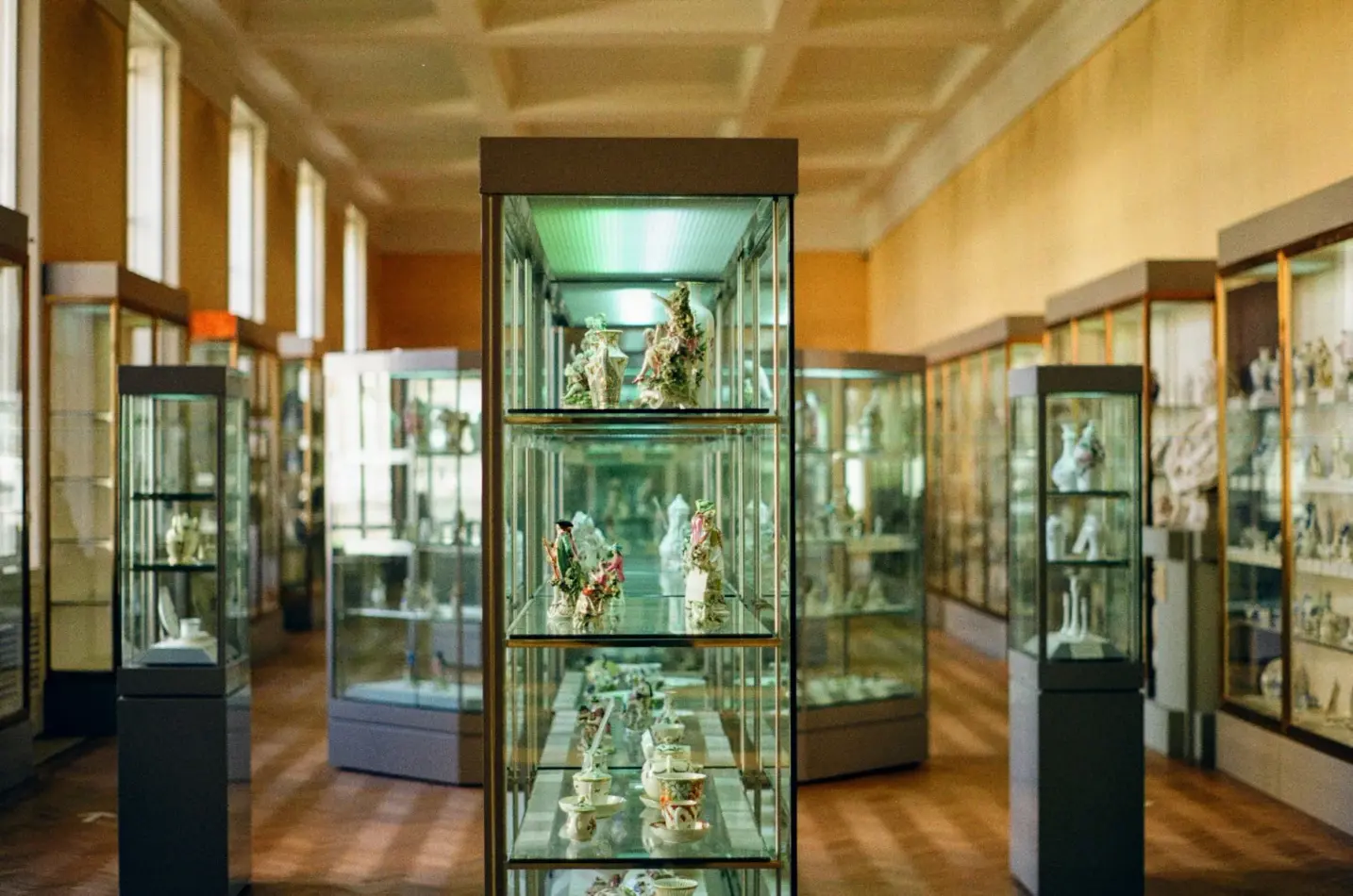
A glass display cabinet looks elegant until the wall beside it starts fighting itself. You hang an art poster you love, step back, and see a second room floating across the sheet: a lamp, a window, the white of the ceiling, even your own moving shadow. The print is still there. The double reflection fight has simply won the first round.
This guide is for homes with a vitrine, a glass-front sideboard, or a china cabinet that sits close to a wall you want to decorate. Sunny-room glare is one problem. Cabinet glass is another. It multiplies light sources and throws them sideways onto paper and frame glazing. Studio Vallor prints premium art posters for European interiors on 250 g/m² matte art paper with sustainable inks. Formats stay at 30×40, 50×70 and 70×100 cm. Frames come in natural oak, dark oak, matte black and matte white. Shipping is free from €50. What follows is how to hang an art poster next to a glass cabinet without reflections stealing the image, how matte paper helps without solving placement alone, and when a quieter motif is the smarter buy.
Why cabinets amplify glare
A single window is a single bright rectangle. A glass cabinet is a set of planes that catch that rectangle, plus every lamp in the room, plus the pale surfaces of walls and ceilings. Each pane acts like a soft mirror. When you place wall art beside or opposite that furniture, you are no longer dealing with one bounce. You are dealing with a chain.
Stand at the sofa and look toward a typical living-room elevation. The cabinet doors face you, or they face the walkway. Behind or beside them, a poster waits on plaster. Light from a floor lamp hits the glass, travels to the print (or to the frame glass if the piece is framed), then returns to your eye mixed with the image. At the same time, daylight from a side window may graze the cabinet interior and flash out through the same doors. The result feels like a double exposure. Pale skies in a travel print turn milky. Soft abstracts lose their midtones. Nature greens flatten into haze.
Vitrine glare art problems are worse than ordinary wall glare for three physical reasons. First, cabinet glass is usually vertical and continuous, so it presents a large reflective area at eye height. Second, the interior of the cabinet is often lit, either by small LEDs or by spill from the room, which creates bright objects behind the glass that then project onto neighbouring surfaces. Third, the cabinet sits in the furniture zone where people actually sit and stand, so viewing angles are fixed. You cannot casually walk past the flash the way you might pass a bright corridor print. You live with it every evening.
Glass-front sideboards do the same work at a lower height. Their doors may be shorter, yet they still sit under wall art in many dining rooms and hallways. When a poster hangs above or just beside that piece, raking light from a ceiling spot or a pendant can bounce from door to frame and back. The eye reads the bounce as a smear across the lower third of the print, exactly where many compositions place their quietest detail.
Display cabinets also change over the day. In the morning, a north window may keep things calm. In the afternoon, a west window wakes the glass. After dinner, warm bulbs take over and the cabinet becomes a lantern of reflections. An art poster that looked perfect at noon can fail at eight. That is why art poster reflections glass cabinet planning must include an evening test, not only a daylight photograph of an empty wall.
Materials inside the cabinet matter more than people expect. White ceramics, polished metal, mirrored trays and glossy books all raise the brightness behind the glass. Dark wood shelves, matte ceramics and fabric-lined backs calm the interior and reduce what the doors can throw onto the neighbouring print. You do not need to empty a collection you love. You can edit the brightest objects away from the doors that face the art wall, or shift them deeper so they sit in shadow.
The wall finish next to the cabinet plays a role too. Fresh white plaster next to clear glass creates a hard contrast that makes every reflection look sharper. A slightly warmer or softer wall colour can reduce the perceived punch of those flashes without hiding the print. The cabinet does not become invisible. It simply stops shouting.
Finally, frame glazing on the poster itself can join the fight. If the print sits under glass or acrylic, you now have two reflective systems in conversation: cabinet doors and frame face. Matte paper behind that glazing still helps, because pigment scatter softens what returns through the frame, but the geometry of the room remains decisive. Understanding that cabinets amplify glare is the first step. The next is accepting that paper finish and placement are partners, not rivals.
Matte paper helps but placement decides
Matte paper is the right default when you hang a print near a vitrine. Gloss turns every lamp into a hard rectangle. Semi-gloss softens the edge but still veils contrast. Matte 250 g/m² art paper scatters light across the fibre so colour stays readable when a soft bounce arrives from the side. Sustainable inks sit in that grain rather than riding a plastic sheen. European production keeps the face consistent from sheet to sheet. For a fuller comparison of finishes and weight, which paper to choose for a poster remains the practical companion to this cabinet-focused guide.
Helpful is not the same as sufficient. Placement decides whether matte paper gets a fair fight. Put a matte poster directly opposite a brightly lit cabinet under a cool spotlight, and you will still see a ghost of doors and shelves. Move that same poster one wall over, or raise it so the main bounce misses your seated eye line, and the matte surface suddenly looks expensive again. The paper did not change. The light path did.
Think in paths, not in product claims. Light leaves a source, hits glass, leaves glass, hits paper or frame, then reaches your eye. Break any link in that chain and the double reflection fight weakens. You can dim an interior cabinet LED. You can angle a floor lamp away from the doors. You can hang the poster where the doors do not face it squarely. You can choose a motif that forgives residual haze. Matte paper strengthens the paper link. It does not rewrite the room.
Unframed matte sheets on a dry, flat hang can actually outperform a framed glossy under glass in a cabinet-heavy corner, because you remove one reflective layer. Framed pieces still make sense for presence, edge protection and a finished look beside furniture. If you frame, prefer a moulding that does not add chrome flash at the sight edge, and treat the glazing as something you will manage with angles. Natural oak and dark oak sit quietly beside wood cabinets. Matte black and matte white keep the elevation architectural without inventing a second shiny object.
Format choice affects how much surface you put at risk. A 30×40 cm print beside a tall vitrine can look timid, yet it also presents less area for bounce to paint. A 50×70 cm sheet is the common living-room compromise: enough presence to hold the wall, still manageable if you need to shift left or right of a bright door panel. A 70×100 cm piece beside a large glass sideboard can look magnificent when the light path is clean, and punishing when it is not. Size should follow a successful evening test, not only a daytime mood board.
Distance from the cabinet matters in centimetres, not in abstractions. A poster that shares a tight vertical joint with the cabinet edge often catches the brightest spill from the nearest door. Giving the moulding a little air, even a hand’s width of plaster, can move the print out of the worst bounce while still reading as a paired composition. If the elevation is narrow, prefer stacking a quieter print above a lower cabinet rather than forcing a large sheet into the hottest reflective zone.
Browse posters with your cabinet in mind, not only with a blank white wall in mind. Hold a phone photo of the elevation under evening lamps when you compare candidates. Matte paper will be the constant at Studio Vallor. Your job is to choose a composition and a size that survive the real bounce of your glass. Placement decides whether that investment stays visible after dinner.
Angles relative to windows and lamps
Angles are the quiet tools of people who live with glass furniture. You do not need a lighting redesign. You need honesty about where windows sit, where lamps point, and where your eyes rest when you use the room.
Start with the window. If daylight enters from the side and strikes cabinet doors full face, those doors will throw a soft copy of the window onto any wall that faces them. Hanging the poster on the wall that receives that throw is the most common mistake. Prefer the wall that shares an edge with the window, so daylight washes the room without painting the window’s shape onto the print. If the only free wall is opposite the cabinet, treat that wall as a high-risk zone and demand a evening lamp test before you drill.
Opposite the cabinet is not forbidden. It is conditional. Risky if lights bounce between glass and frame. Safer if the cabinet interior is dim, if door glass is slightly inset or divided, and if your main seating looks at the print from an oblique angle rather than straight on. A slight offset of the hanging point, so the poster is not centred on the brightest door, can be enough. People often centre art on furniture by habit. Near glass, centre on the calmest visual mass, not on the shiniest rectangle.
Lamps deserve a slow walk. Ceiling spots aimed at a vitrine to “show the collection” are frequent culprits. They light the objects and the glass at once, then the glass lights your poster. Aim spots into the cabinet from a steeper angle so they graze objects without flooding the doors, or switch those spots off when you want the wall art to lead the evening. Floor lamps with open shades can throw a bright cone across doors. Rotate the shade, lower the lumen output, or move the lamp a step so the cone misses the glass. Wall washers that rake a poster from the side are usually kinder on matte paper than frontal floods, provided they do not first hit a cabinet door that then mirrors them.
Viewing height and seating height interact with those angles. When you sit on the sofa, your eye line often hits the middle of a 50×70 or 70×100 cm sheet and the upper doors of a tall cabinet at the same time. That shared band is where double reflections feel worst. Raising the print a little, or choosing a composition whose darkest mass sits in that band, can hide residual bounce. Lowering a harsh pendant so it no longer flares across door tops can do the same from the furniture side.
Dining rooms with glass sideboards under art need special care with pendants. A bright globe above the table reflects in the sideboard doors and then into a print hung above or beside the piece. Diffused shades, warmer bulbs and a slight lateral offset of the art from the pendant’s reflection line help more than buying a different print. Test by sitting in your usual chair at dinner height. Standing in the doorway lies. Seated eyes tell the truth.
Hallways with a shallow glass cabinet are short on angles. You walk past rather than sit, which can forgive a brief flash, yet a poster at the end of the hall opposite the cabinet will still catch every pass of a ceiling light. Prefer a side wall for the print, keep cabinet LEDs on a separate switch, and choose a motif that stays legible under brief glare. Practical hanging craft for general walls also appears in external guides such as how to hang wall art; use those for hardware height, then return here for the glass-specific bounce logic.
Night versus day remains the final angle check. Tape a large kraft sheet or cardboard at the intended size and position. Live with it for twenty-four hours. Watch morning, late afternoon and evening. If the kraft flashes hard at the hour you actually use the room, move the plan before the nail goes in. Matte paper will improve the final result. It will not invent a new geometry.
When to choose a quieter motif
Paper and angles can remove most of the fight. Motif choice removes what remains. Some images forgive a soft veil of reflection. Others collapse the moment a lamp ghost crosses the sheet.
Pale skies, large cream fields, soft misty horizons and high-key travel posters are beautiful in calm light and fragile beside glass cabinets. A white cloud bank becomes a projection screen for every door reflection. A pale abstract with delicate graphite lines can lose its drawing under haze. If your elevation sits in a high-risk bounce zone and you cannot move the furniture, prefer compositions with stronger midtones and a darker overall key.
Dark abstracts often hide reflections better than pale skies. A deep graphite field, a rust and charcoal block, or a nature print with shadowed foliage gives residual bounce less bright surface to write on. The reflection still exists physically. Your eye simply has more pigment contrast to lock onto, so the ghost matters less. That is not a rule against light art forever. It is a rule for the wall that shares air with a vitrine.
Busy detail can help or hurt. Fine line maps and intricate botanical drawings look exquisite up close, yet a soft reflection can smear their thinnest marks. Broader shapes, clear colour blocks and measured abstract gestures stay readable from the sofa even when a faint lamp echo remains. Children-universe prints with large simple forms can work in family rooms with glass toy cabinets for the same reason: silhouette beats filigree when light is imperfect.
Travel posters deserve a special note. Coastal blues and sun-washed plazas often carry large pale zones. If you love that mood beside a cabinet, look for editions where a darker architectural mass, a deep sea band or a strong foreground sits in the lower or central third, the zone most likely to catch sideboard bounce. Nature posters with forest interiors, evening light or denser canopy behave better than open snow fields or blown-out sky gradients.
Quiet does not mean dull. Quiet means controlled contrast and fewer huge light reservoirs on the sheet. Studio Vallor’s universes (Travel, Abstract, Nature, Children) all contain calm and vivid options. Browse collections with your cabinet photo open beside the screen. Ask one blunt question: if a soft white rectangle floated across the middle of this image at eight in the evening, would the composition still hold? If yes, you are close. If no, keep looking before you commit to holes in the plaster.
Frame colour can support a quieter motif. Matte black around a dark abstract deepens the field and makes small reflections feel like part of the edge rather than a flaw on the image. Natural oak around a midtone nature print keeps warmth without adding shine. Matte white can disappear into plaster when you want the cabinet wood to lead the furniture line and the print to float. Avoid high-gloss mouldings next to already reflective doors. Two shiny systems in one elevation rarely look premium; they look busy.
If you already own a pale print you love, you are not forced to replace it. You can relocate it to a calmer wall and give the cabinet elevation a darker companion. Seasonal rotation is kinder to plaster when hardware stays fixed and only the sheet or framed unit changes. The cabinet wall can carry the forgiving motif. The quieter corridor can carry the pale sky.
Mistakes
Centring the poster on the brightest glass door because the furniture “wants” symmetry. Symmetry that creates a mirror fight is not careful styling. Centre on calm plaster or on the darkest door panel instead.
Judging the hang only at noon with cabinet lights off. Art poster reflections glass cabinet problems appear when you live in the room. Turn the vitrine LEDs on. Turn the floor lamp on. Sit down. Then decide.
Choosing glossy paper to make colours “pop” beside a glass sideboard. They will pop as reflections. Stay with matte 250 g/m² art paper so pigment stays in the fibre.
Framing under glass and then aiming a spotlight at the cabinet doors opposite. You have built a bounce loop. Soften the lamp angle before you blame the print.
Filling the cabinet front with white porcelain and mirrored objects while hanging a pale abstract next door. You raised the brightness of the projector. Edit the front row or move the print.
Buying a 70×100 cm high-key travel sky for a narrow wall that faces the vitrine squarely. Scale without placement planning multiplies the problem. Test size with kraft first.
Matching a chrome lamp, chrome cabinet handles and a glossy frame in one sightline. Reflective families stack. Break the stack with matte paper, matte moulding and softer metal finishes where you can.
Ignoring distance. Pressing the frame hard against the cabinet edge puts the print in the spill zone. Leave a little plaster air when the elevation allows.
Treating anti-reflective glazing as the first purchase. It can help when framed, yet it is a later refinement. Start with matte paper, lamp angles and motif honesty. Add specialised glazing only if the geometry remains difficult after those steps.
Drilling before a twenty-four-hour mock-up. A cardboard rectangle is cheap. Patching plaster after a bad guess is not.
FAQ
Opposite the cabinet?
Risky if lights bounce between glass and frame. Opposite can work when the cabinet interior stays relatively dim, when your seat views the print at an oblique angle, and when the poster’s midtones are strong enough to forgive a soft ghost. If your main lamp faces the doors and the doors face the art, choose another wall or change the lamp path first. A small lateral offset from the brightest door often helps more than a perfect furniture-centred hang.
Need AR glass?
It helps when framed; start with matte paper and lamp angles. Anti-reflective glazing can reduce the frame’s own mirror effect, which matters when cabinet doors and frame glass talk to each other. It does not remove bounce from the room’s geometry, and it does not replace a matte 250 g/m² sheet. Solve placement and lighting, then consider AR glazing as a refinement for a stubborn elevation, not as the opening move.
Dark abstracts?
They can hide reflections better than pale skies. Deeper graphite, rust, charcoal and shadowed nature fields give your eye more contrast to hold when a soft lamp echo crosses the sheet. Pale open skies and large cream abstracts behave like projection screens beside a bright vitrine. If the cabinet wall is your only option, lean darker or more midtone-rich in the motif, and keep matte paper as the constant.
A glass cabinet should display what you love, not cancel the wall beside it. Reduce art poster reflections glass cabinet tension with matte paper, honest angles and a motif that forgives the light you actually live with. Then the vitrine and the print can share the room without fighting for the same photons.