Practical guides
Reading Nook, One Nature Poster: Calm Without a Gallery Wall
Stage a calm reading nook with one nature poster: motif, format, lamp glare tips, and bookshelf balance.
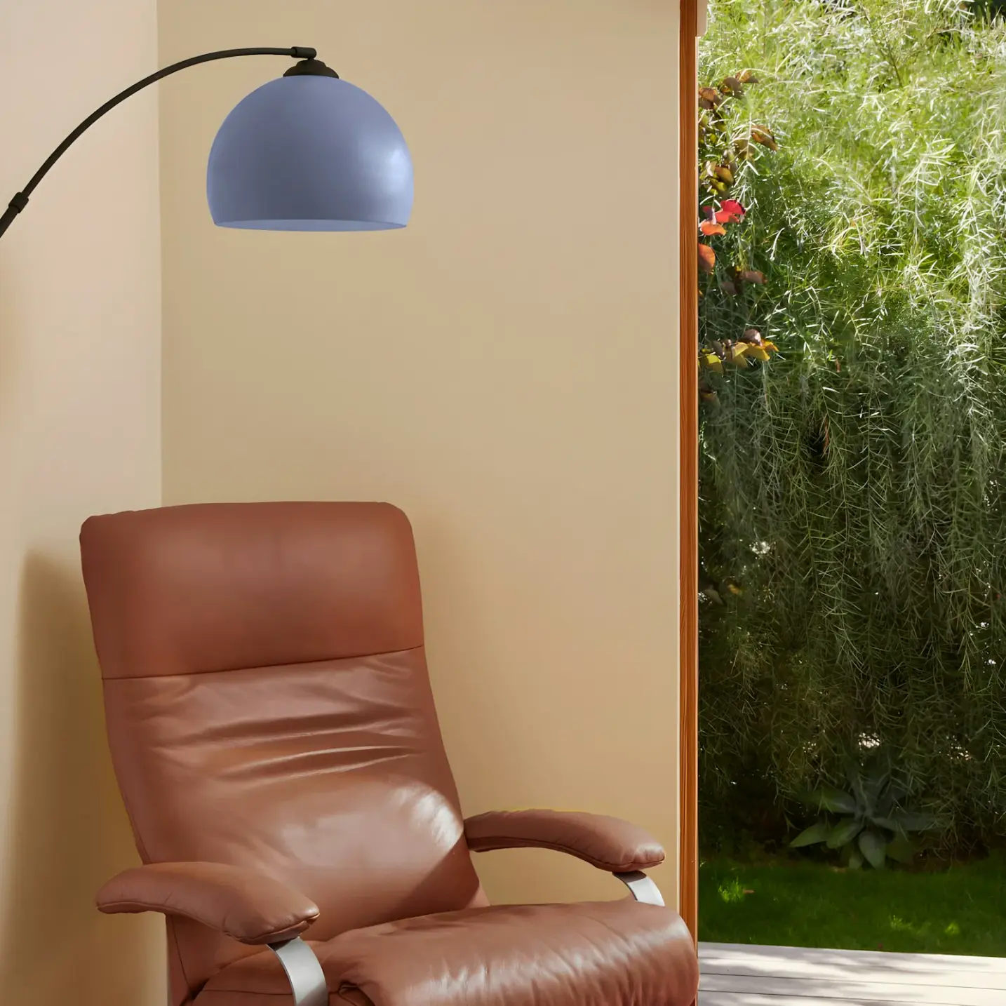
A reading nook does not need a gallery wall to feel finished. In a rented flat in London, Manchester, Brooklyn, or Chicago, the corner that works is usually small: one armchair, a lamp that finally sits at the right height, a short run of shelves, and a patch of plaster that still looks temporary. Autumn makes that corner more valuable. Days shorten. You want a place to sit with a novel or a long article without the rest of the room asking for attention. One calm nature poster can give that corner a visual resting point. More prints often steal the quiet you came for.
Studio Vallor prints premium art posters on matte 250 g/m² art paper with European production and sustainable inks. The Nature universe is built for soft foliage, misty horizons, and outdoor air that settles a wall without turning a rental into a theme. Browse those editions in the nature collection, compare atelier formats across the posters catalogue, and keep room-by-room logic nearby in How to style posters in every room. This guide is specifically about staging a reading nook with one nature poster: motif, format, lamp glare, and bookshelf balance for UK and US renters building a calm autumn corner.
The brief is deliberate. Skip collage grids beside the chair. Skip travel postcards that pull the eye into destinations when you meant to stay in a chapter. Choose one quiet landscape or botanical that can live beside the armchair through weeks of early dark. The wall should invite lingering, not perform.
Why a reading corner needs one visual resting point
Reading is already a negotiation with distraction. Your phone is somewhere. The kitchen light is on. Someone else in the house is moving. The wall next to your chair can either join that chatter or offer a single soft place for peripheral vision to land when you look up from the page. That is the job of reading corner wall art at its best. One calm nature print beside the armchair steadies the corner. Five competing images turn the same square metres into a mini exhibition you never meant to curate.
Gallery walls have their place. Hallways, stair landings, and open living walls can carry rhythm and collection energy. A reading nook is a different brief. You sit closer. You sit longer. You notice reflection from the lamp. You notice when a bold horizon keeps pulling your gaze away from the paragraph. Clutter on the wall reads louder when your body is still. Renters often inherit white or cream walls and a leftover corner beside the sofa or under a window. Filling that leftover space with a grid of small frames feels productive. For reading, it usually feels busy.
One visual resting point also simplifies decisions you do not have time for. Matching three frame colours, aligning six centres, and keeping equal gaps on uneven rental plaster is a project. Choosing one nature poster in a clear format is a weekend afternoon. You can still change the print later when seasons shift. The architecture of the nook stays simple: chair, lamp, shelf, one image. That simplicity is what makes the corner feel intentional rather than unfinished.
There is a psychological reason the single print works. When you settle into a chair with a book, your attention wants a narrow field. Soft outdoor subjects support that field because they do not demand decoding. A quiet canopy, a foggy field edge, a branch study with air around the stem, these images stay present without insisting. Bold typography, neon botanicals, and sharp postcard landmarks ask for a different kind of looking. They can be beautiful elsewhere in the home. Beside the reading chair they often interrupt.
Autumn sharpens the need. Warm lamps come on earlier. Blankets migrate to the arm of the chair. The window may show rain or early dusk rather than a bright garden. A nature poster for a reading nook can echo that outdoor season without turning the corner into a Halloween set or a harvest display. Soft ochres, muted greens, misty blues, and linen grounds sit kindly with wool throws and oak shelves. The print becomes part of the ritual of sitting down, not a seasonal sticker you will resent in March.
Renters also need walls that forgive. Many leases limit holes. Some corners only allow a lean on a shelf or a single secure hook. One poster respects those limits. You can frame it for a finished look, or lean a stable size on a deep shelf if the arrangement stays clear of steam and open windows. Either way, the eye has one place to rest. That is enough design for a corner whose real luxury is time with a book.
Choosing nature motifs that invite lingering
Not every nature image invites lingering. Some energise. Some narrate. Some look calm in a thumbnail and loud at armchair distance. For a reading nook, favour motifs that keep mid-tone structure and leave breath around the subject. Dense photographic forests can feel heavy when you sit a metre away under a warm lamp. Ultra-sharp herbarium plates can feel clinical beside a soft throw. The sweet centre is outdoor calm that still has a clear form: soft foliage with air, misty horizons with a gentle horizon line, plant studies that do not crowd the paper edge.
Think about how close you will sit. In a living room sofa hang, you often view from across the room. In a reading corner, your shoulder may be thirty to sixty centimetres from the frame. Fine chaotic detail can start to itch. Softer transitions and quieter value ranges age better at that distance. If you already keep real plants beside the chair, the wall can stay slightly more atmospheric so the living greenery and the print do not compete for the same literal reading. If the corner is dry and plant-free, a gentle botanical can supply the outdoor note the chair is missing.
Palette should borrow from what you cannot change. Rental walls are often cool white. Curtains may be beige. The chair may be charcoal, rust, forest green, or a worn linen that has seen better decades. Choose a nature print that shares one neighbour hue, then holds a quieter second note. Soft sage beside oak shelves. Warm mist beside a terracotta throw. Charcoal stems against pale plaster. Avoid introducing a fourth accent colour that only lives in the poster. The nook should feel collected, not like a new product arrived and refused to introduce itself.
Season matters without becoming costume. Autumn reading corners like warmth in the ground of the image more than literal pumpkins or leaf piles that scream October. Outdoor art that suggests cooler air, softer light, and quieter colour often lasts from September through winter. If you want a broader sense of how seasonal wall art is framed elsewhere, autumn poster ranges such as the pieces gathered on Laboo Studio’s posters of autumn show how many shops lean into seasonal motifs. For a daily reading chair, Studio Vallor’s calmer Nature editions usually serve longer because they invite lingering rather than announcing a holiday.
Soft foliage vs misty horizons
Soft foliage and misty horizons are the two motif families that most often succeed beside a reading chair, and they do slightly different jobs. Soft foliage keeps a living texture in the corner. A eucalyptus study, a quiet branch, a muted canopy edge, these images give the eye something organic to graze when you look up. They pair especially well with real books, timber shelves, and plants. They also link kindly to natural oak or dark oak frames. If your nook sits against a white rental wall that feels cold, foliage with a little brown or grey in the green warms the elevation without needing a loud accent.
Misty horizons do the opposite kind of good. They open the corner. A soft field edge, a foggy shore line, a pale sky over quiet land, these images give depth when the physical nook is tight. In a studio flat where the chair sits against a short wall between a wardrobe and a window, a misty landscape can make the plaster feel less close. Horizontals often suit that job. Vertical misty studies can work too if the composition still leaves air at the top and bottom so the frame does not feel sealed shut.
Choose foliage when the corner already has open space but needs softness. Choose mist when the corner already has soft textiles and needs distance. You can also decide by lamp behaviour. Highly detailed leaves under a strong reading lamp can look busier at night. Misty grounds often stay gentle when the bulb is warm and close. Test both ideas by holding a laptop mock-up or a printed A4 crop at the real hang height for an evening. Notice which image lets you return to the page without a second look.
Neither family needs high chroma to feel premium. Soft olive, dusty blue-green, stone grey, warm linen, muted ochre, and charcoal are enough. Neon jungle greens and postcard turquoise horizons tend to bounce under lamp light and fight book spines. Studio Vallor’s Nature approach leans toward indoor readability: coherent palette, calm subject, matte pigment that stays in the fibre. That is the register a reading nook wants.
Motifs to avoid next to a book pile
Some motifs that photograph well in a styled living room struggle next to a real book pile. Bold travel prints are the clearest example. A sharp city skyline or saturated coastal landmark can look excellent in a hallway. Beside a reading chair it often becomes another story competing with the one in your hands. Travel can distract. Nature usually keeps the eye quieter for reading. If you love Travel editions elsewhere in the home, keep them on walls you pass rather than walls you sit beside for an hour.
Dense wildlife close-ups can have the same problem. A vivid bird portrait or high-contrast animal eye invites attention. That attention is charming on a larger lounge wall. At reading distance it can feel watched. Prefer quieter animal-adjacent nature only when the form is soft and the background stays breathable. Most reading nooks do better with plants and landscapes than with wildlife drama.
Typography-heavy botanicals and quote prints also crowd a book corner. You already brought language into the chair. The wall does not need another sentence. Pure graphic leaf silhouettes in black and white can work in a minimal room, but they sometimes feel hard next to warm autumn textiles. If your shelves are already a patchwork of bright spines, avoid posters with strong secondary graphics, stamps, or collage layers. The spines supply pattern. The wall should supply rest.
Finally, avoid ultra-saturated seasonal kitsch if you want the nook to last. Maple leaf explosions, cartoon harvest scenes, and novelty autumn illustrations date quickly and rarely look premium beside a serious reading lamp. Soft outdoor subjects with seasonal temperature in the palette give you autumn atmosphere without locking the corner to one month.
Format and height beside an armchair
Format is where many reading corners go wrong. People order a large statement print because the wall looks empty in a photo, then discover the chair feels smaller once the frame arrives. Or they hang a tiny 30 × 40 so high that the corner never coheres. Studio Vallor atelier formats are concrete: 30 × 40, 50 × 70, and 70 × 100 cm. Framing in natural oak, dark oak, matte black, or matte white adds outer centimetres, so plan for the moulded size if you want a finished object from day one.
For most armchair nooks in rented flats, 50 × 70 is the reliable centre. It is large enough to feel intentional beside a standard lounge chair, small enough to leave air when a lamp and a shelf already occupy the corner. A vertical 50 × 70 often elongates a tight corner and draws the eye up without needing a gallery stack. A horizontal 50 × 70 suits a wider wall beside a sofa-chair combo, especially when the chair sits off the end of a sofa and you want the art to bridge seating rather than tower above one seat.
Use 30 × 40 when the wall strip is narrow, when you plan to lean the print on a shelf, or when the chair sits under a low shelf run. A compact vertical can steady the space between a window reveal and a bookcase without blocking either. Reserve 70 × 100 for genuinely wider elevations with open compositions. In a small reading niche, the largest size can oppress the chair and steal the sense of retreat. Open misty horizons survive large scale better than dense dark foliage. When in doubt, tape a kraft paper rectangle at the intended height and live with it for two evenings under the real lamp.
Height should connect the print to the seated body, not to the ceiling. Sit in the chair with your usual posture. Notice where your eyes rest when you look up from a paperback. That band is your target. For many chairs, the optical centre of the poster lands near seated eye level or slightly above, with a clear breathing gap between the top of the chair back and the bottom of the frame. If the chair has a high wing back, raise the print so it does not collide visually with the upholstery line. If the chair is low and modern, avoid floating the frame halfway to the ceiling where it abandons the nook.
Centring needs honesty. Centre on the chair and lamp composition you actually use, not only on the architectural midpoint of the wall. In rentals the chair is often nudged toward a socket or a window. Hang for the lived cluster. If a bookshelf takes one side, leave a deliberate margin so the frame does not kiss the shelf edge. A few centimetres of plaster between objects keeps the corner readable. How to style posters in every room helps when the nook shares an open-plan wall with dining or lounge zones; the local rule stays simpler. One print, seated height, air around the frame.
Orientation follows the wall more than fashion. Vertical often elongates a tight corner above a low chair. Horizontal suits a wider wall beside a sofa-chair combo. Square-feeling crops are less common in atelier sizes, so decide early whether you want lift or breadth. Tape both orientations if you are unsure. Autumn evenings under a warm lamp will tell you which empty rectangle feels like a place to stay.
Lamp light, glare, and matte paper
The reading lamp is the friend and the risk. You need light on the page. That same light can throw a bright rectangle back from the wrong paper or glazing combination. Matte 250 g/m² art paper is the practical face for a nature poster in a reading nook because it scatters lamp light instead of mirroring it. Soft greens and misty greys stay readable. Glossy sheets can flash every time you shift in the chair. Even when you plan to frame, the print face still matters. Ordinary reflective glass plus a glossy sheet stacks glare. Matte pigment under careful glazing stays kinder.
Place the lamp so the bulb serves the book first. A floor lamp that arcs over the shoulder usually lights pages without firing straight into the poster. A side table lamp with an opaque or soft shade can wash the chair while keeping the wall in a gentler secondary glow. Avoid aiming an exposed bulb at the frame. If your only lamp is bright and close, angle it slightly toward the seat and let the poster sit just outside the hottest cone of light. Warm bulbs in a living range usually caress nature palettes better than icy office LEDs. Cool white light can make soft foliage look dusty and mist look clinical.
Daylight still counts. A garden window reading nook is lovely until afternoon sun rakes across glazed art. Sheer curtains tame that without killing the outdoor feeling. If the corner faces strong sun for hours, keep the poster on a side wall rather than directly opposite the brightest glass, and trust matte paper. The guide on matte poster paper in sunny rooms goes deeper on glare control. North-facing corners have the opposite problem: cooler, flatter light that can make pale prints disappear. Warmer botanical grounds and oak frames help; botanical posters for north-facing rooms pairs well with that case.
Framing choices interact with light. Natural oak softens a warm lamp corner and links to timber shelves. Dark oak deepens foliage and mist with a richer edge. Matte black can look sharp with graphic plant forms, but test it beside black lamp stems and dark screens so the corner does not go severe. Matte white lightens the assembly on cool rental plaster. Slim profiles suit small nooks better than ornate mouldings, which steal attention from quiet nature subjects and collect more dusting drama. For a fuller framed versus lean conversation, framed vs unframed art posters helps you decide based on traffic, humidity, and how permanent the hang can be.
Care stays ordinary. Keep the sheet away from a radiator that bakes the lower edge. Avoid steam if the nook shares air with a kitchen kettle path. Dust frames with a soft dry cloth. Free shipping from €50 under metropolitan France conditions on Shipping and returns makes it easier to order the format that fits the chair wall instead of compromising on a leftover size. The useful sequence remains motif, seated height, matte paper, then lamp angle. If the page is lit and the nature print stays quiet in your peripheral vision, the corner is working.
Bookshelf dialogue without competing spines
Most reading nooks include books, and books are already visual noise in the best way. Spines bring colour, type, and irregular heights. A nature poster beside a bookshelf should dialogue with that texture, not compete with it. Leave a clear margin between the outer edge of the frame and the shelf run. When the print kisses the books, both look cramped. When a hand’s width of wall remains, the corner breathes.
Colour harmony helps more than matching every spine. You will never control the next paperback that arrives. Instead, choose a poster palette that can sit beside mixed books without needing them to be styled for a photograph. Soft sage, stone, mist blue, and warm linen tolerate bright spines better than neon botanicals. If your shelves are mostly clothbound neutrals, a slightly deeper foliage print can add life. If your shelves are a festival of orange thrillers and teal essays, quieter mist may be the kinder wall.
Lean versus hang is a practical bookshelf question. Yes, the poster can lean on the shelf if it stays stable and clear of steam or open windows. A 30 × 40 or a carefully angled 50 × 70 can sit on a deep shelf behind a low stack of books, with the frame back supported so it cannot slip. Do not lean large glazed pieces where a window draft or a slammed door vibrates the shelf. Do not block the books you actually reach for every night. The lean should feel intentional, not like storage overflow. In many rentals, a single secure hook with a framed print is cleaner long term, while a lean works for seasonal rotation or for walls you cannot drill.
Height relative to shelves matters. If the poster hangs on the wall beside the bookcase, align something: the top of the frame with the top shelf, or the optical centre with a mid shelf line. Exact millimetre matching is less important than a visible relationship. Random floating between unrelated shelf heights makes the corner feel accidental. If shelves run above the chair, keep the poster on the side wall rather than sandwiching the frame under a heavy upper shelf that casts a permanent shadow band.
Avoid turning the shelf itself into a second gallery. A nature poster plus three small frames plus objects plus trailing plants can erase the calm you wanted. Let the one print be the wall’s voice. Let the books be the shelf’s voice. A single ceramic, a small plant, or a candle can join without becoming a display battle. Poster beside bookshelf styling succeeds when each surface has one job.
Common staging mistakes in small flats
Treating the reading nook like a gallery wall audition. Multiple small prints beside the chair add decision fatigue every time you sit down. One calm nature poster is usually stronger in a tight corner.
Choosing a bold travel print because you love the destination. Travel can distract when the brief is lingering with a book. Keep Travel editions for hallways and lounge walls you pass; keep Nature beside the armchair.
Hanging too high so the poster joins the ceiling moulding instead of the chair. Sit first. Hang for seated eye level and a clear gap above the chair back.
Going oversized with a dense canopy in a niche that already holds a lamp and shelves. A 70 × 100 heavy forest can shrink a small flat corner. Prefer open compositions or start with 50 × 70.
Using glossy paper under a close reading lamp. Reflections fight pages. Matte 250 g/m² art paper stays polite through warm evening light.
Letting the frame kiss the bookshelf. Leave plaster between objects so spines and nature can coexist without looking cramped.
Leaning an unstable glazed print on a shallow shelf near an open window. Lean only when the shelf is deep, the print is stable, and steam or weather will not reach it.
Centring on the empty wall while ignoring the real chair and lamp cluster. Hang for the furniture you use, especially in rentals where sockets dictate placement.
Picking neon autumn kitsch that will feel finished by November. Soft outdoor temperature in the palette lasts longer than novelty leaves.
Ignoring evening light and judging the print only at noon. Reading nooks earn their keep after dark. Check the motif under the real lamp before you commit.
Skipping measurements. Formats are 30 × 40, 50 × 70, and 70 × 100 cm. Tape the rectangle. Read under it for two nights. Then order.
Mixing frame finishes across a tiny corner. Oak beside glossy black beside white reads as clutter faster when the floor already holds a throw basket and charging cables. Match slim mouldings when you want calm.
Soft path to Studio Vallor nature prints
Start in the nature collection. Look for soft foliage and misty horizons with breath around the subject and greens or blues that already carry a little grey, brown, or stone. Those are the editions that sit kindly beside an armchair, a warm lamp, and a mixed bookshelf through autumn evenings. Avoid images that feel like they need a gallery grid to make sense. One print should be enough.
Then open the full posters catalogue to compare scale across families if your home needs companions elsewhere. Travel can live in the hall. Abstract can steady an open-plan wall. Children editions can stay in bedrooms. The reading nook can remain Nature-led so the chair keeps a quieter outdoor register. The wider collections index helps you keep that map coherent as the flat fills in.
Materials stay consistent while you build slowly. Matte art paper at 250 g/m². European production and sustainable inks. Ready-to-hang thinking in natural oak, dark oak, matte black, and matte white. Atelier formats at 30 × 40, 50 × 70, and 70 × 100 cm. Free shipping from €50 according to the conditions on Shipping and returns. That consistency lets you hang one calm nature poster now and add a related piece later without paper mismatch.
If you want placement logic beyond the chair corner, return to How to style posters in every room. If daylight is cool, keep botanical posters for north-facing rooms nearby. If sun and lamps worry you, use matte poster paper in sunny rooms. If you are deciding whether to lean or hang, framed vs unframed art posters clarifies the trade-offs for renters.
Choosing Studio Vallor for a reading nook is less about decorating a corner for guests and more about protecting a daily ritual. One quiet landscape or botanical, matte pigment, and a frame or lean that respects your walls give the chair a visual resting point without gallery clutter. Measure the chair wall, check the lamp, leave air beside the shelves, and let the nature print stay soft enough to live with every ordinary autumn evening.
FAQ
Horizontal or vertical above a low chair?
Vertical often elongates a tight corner and draws the eye up above a low chair without needing a stack of frames. Horizontal suits a wider wall beside a sofa-chair combo, where the art can bridge seating rather than tower over one spot. In many rented reading nooks, a vertical 50 × 70 is the calm default; switch to horizontal when the free plaster is clearly wider than it is tall. Tape both orientations at seated height under your real lamp before you order. Soft foliage and misty horizons both work in either direction when the composition still leaves breath in the image.
Can the poster lean on the shelf?
Yes if it stays stable and clear of steam or open windows. A deep shelf, a modest format such as 30 × 40 or a careful 50 × 70, and a frame back that cannot slip make leaning workable for renters who prefer fewer holes. Keep the lean out of window drafts and kettle steam paths, and do not block the books you reach for nightly. For longer stays and larger glazed pieces, a single secure hang is usually cleaner. Either way, leave margin so the poster and spines do not compete for the same edge.
Will a bold travel print work instead?
Travel can distract; nature usually keeps the eye quieter for reading. A sharp skyline or saturated landmark asks for attention that competes with the page, especially at armchair distance under a warm lamp. Keep bold Travel editions for hallways and lounge walls you pass through. Beside the reading chair, soft foliage and misty horizons support lingering. If you love a destination print, hang it where you glance while walking, not where you sit for a chapter. The reading nook wants outdoor calm more than postcard energy.