Practical guides
Framed Art Poster Gift Before November | Studio Vallor
Buy a framed art poster gift before the November rush: motif, frame, size, and delivery buffer tips.
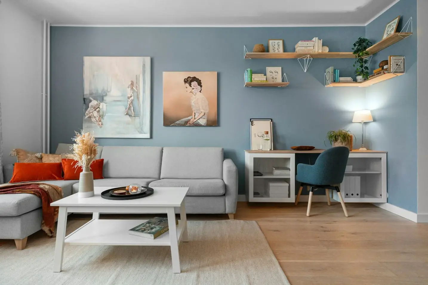
Buying a framed art poster gift before November is less about chasing a sale and more about protecting calm. Mid-to-late October still gives you time to choose a motif, pick a frame colour you have never seen on their wall, settle on a size without measuring their flat, and leave a delivery buffer before birthdays and early holiday gatherings stack up. Once November arrives, calendars tighten, carriers fill, and gift decisions get louder. A premium print deserves the quieter window.
This guide is for gift shoppers planning November birthdays and early presents who want wall art that feels considered rather than last-minute. Studio Vallor prints in Europe on 250 g/m² matte art paper with sustainable inks. Formats stay in the atelier range of 30 × 40, 50 × 70 and 70 × 100 cm. Ready-to-hang frames come in natural oak, dark oak, matte black and matte white. Free shipping from €50 applies under the usual conditions, which helps when you want the gift to arrive as a finished object rather than a rolled compromise. Browse the collections while you read, keep the posters catalogue open for scale, and treat the abstract collection as a safe lane when taste is hard to guess.
A framed art poster gift works when three decisions hold: motif that survives taste differences, frame that does not fight unknown décor, and timing that leaves room for delays. The sections below walk those decisions without turning the purchase into a checklist of panic.
Why mid-to-late October is a smart gift window
November is when gift culture gets busy. Birthdays cluster, early festive dinners appear, and people start buying for December while still covering autumn occasions. Carriers and ateliers feel that pressure in small ways: more parcels, more questions, less patience for a wrong size. Mid-to-late October sits just before that pile-up. You still have weeks of ordinary delivery rhythm, and you can open the package yourself, check the print, and decide whether a short note about hanging height belongs with the gift.
Buying early also changes the quality of the choice. When you shop in a rush, you reach for the loudest image or the frame that photographs well in the product shot. When you shop with a buffer, you can ask quieter questions. Will this motif still look right in January? Does the frame colour assume a wall you have never seen? Is 70 × 100 generous or awkward in a flat you only know from video calls? Those questions need time, not a midnight checkout.
There is a psychological benefit too. A framed poster that arrives a week before the occasion feels like care. The same object ordered three days late feels like recovery. Premium paper and European production already signal intention; timing should match that signal. Free shipping from €50 makes it easier to complete the gift with a frame rather than postponing the moulding for later, but only if you order while delivery still behaves normally.
October light helps you evaluate colour on your own screen and in your own room before you send the gift. Warm LED evenings and cooler daylight both show how ochres, soft greens and graphite fields behave. If you are choosing on behalf of someone else, that check still teaches you how the print will sit under mixed household light. Waiting until the first cold November weekend often means choosing under poorer attention and brighter seasonal marketing noise.
Finally, early purchase leaves room for a plan B that does not look like a plan B. If a framed piece feels too committed once it arrives at your door, you still have time to switch to an unframed print with a note about frame options, or to swap motif within the same format family. That flexibility disappears when the party is tomorrow. Mid-to-late October is the window where a framed art poster gift can stay premium without becoming a logistics problem.
Choosing a motif that survives taste differences
Gifting wall art fails most often at the motif stage. People buy what they love, or what trends say is seasonal, and hope the recipient will adapt. A better approach is to choose a motif that can live in a shared space without demanding a shared biography. Studio Vallor’s four universes (Travel, Abstract, Nature, Children) give you clear families. For gifts under uncertainty, Nature and Abstract are usually safer. Travel can be perfect when you know the destination story. Children works for adults only when the design stays calm enough for living rooms.
Taste differences show up in colour temperature, contrast, and how much story an image tells. High-saturation postcards polarise quickly. Soft fields, quiet botanicals and measured geometries leave room for the recipient’s furniture to keep speaking. Think about the rooms you have actually seen: beige sofas, oak floors, white rental walls, charcoal accents. Motifs that borrow those midtones tend to land. Motifs that insist on a single loud hue ask the whole room to rearrange itself around the gift.
Another useful filter is permanence. Halloween-adjacent graphics, heavy festive typography and joke illustrations age badly on a wall meant to last. Autumnal warmth can still exist in ochre, mist and foliage without locking the print to one month. If you want seasonal mood without seasonal expiry, look for atmosphere rather than props. A framed art poster gift should still feel right when the calendar moves on.
When you shortlist, open two or three candidates at the same format so scale does not trick you. A motif that feels quiet at thumbnail size can shout at 70 × 100. A motif that feels empty at 30 × 40 can breathe beautifully at 50 × 70. Compare on the posters pages with the recipient’s likely wall in mind, not only with your own taste.
Nature and abstract as safer lanes
Nature prints gift well because they rarely require a personal legend. Soft foliage, misted horizons and botanical studies speak a language most adults already accept in living rooms and hallways. They also sit kindly beside plants, linen and timber. On 250 g/m² matte art paper, dusty greens and warm earth hold nuance under LED without turning neon. That matters when you cannot control the recipient’s bulbs.
Abstract is the other reliable lane. Colour fields, quiet geometry and layered shapes let the recipient project their own reading. You are not guessing their favourite city or their childhood animal. You are offering structure and temperature. Browse the abstract collection when the décor is unknown and you still want a gift that feels designed rather than generic. Soft clay, graphite, sage and muted blue tend to travel better across households than electric contrast.
Pairing Nature or Abstract with a frame is easier too. Natural oak supports warm botanicals and earthy abstracts. Matte black anchors graphic fields and higher contrast. Matte white lightens a print that might otherwise feel heavy on a small wall. Dark oak deepens a moodier palette without the hardness of black. Because these lanes are less narrative, a slightly imperfect frame guess is less embarrassing than a wrong landmark.
If you know the recipient likes calm rooms, prefer motifs with breathing space: sky bands, pale margins, open compositions. Busy botanical dense-packs and highly fragmented abstracts can look premium in isolation and restless above a sofa. Gift art should leave the room feeling settled after the wrapping paper is gone.
Travel only when you know the destination story
Travel prints make wonderful gifts when the destination is shared memory, not a tourist guess. A city you visited together, a coast that marks a chapter, a skyline that appears in their stories: those prints carry meaning. A random capital chosen because it looks chic in a product grid can feel like a souvenir from a trip they never took.
When Travel is the right answer, keep the graphic quiet. Soft horizons and restrained typography age better than loud landmarks and airport-poster energy. The gift should read as art first and place second. That balance is what separates a premium travel poster from a gift-shop sheet. European production and sustainable inks keep colour consistent, so a Travel edition ordered as a gift still matches the quality of pieces they might buy for themselves later from the collections index.
If you are unsure whether the destination is mutual, step back to Nature or Abstract. You can always write a short card that explains why you chose calm over a map. Thoughtfulness is not only personalisation; sometimes it is restraint.
Frame colour when you have not seen the wall
Frame colour is the most visible guess in a framed art poster gift. Natural oak, dark oak, matte black and matte white each push the print in a different direction. Without seeing the wall, you are reading clues: furniture photos, video-call backgrounds, the metals of their lamps, the timber of their shelves.
Natural oak is often the safest warm guess. It suits light floors, linen sofas and cream walls. It softens Abstract fields and Nature studies. Dark oak works when the home already has deeper wood or a moodier palette. Matte black is strong with graphic Abstract work and with rooms that already use black metal. It can look sharp against white plaster and severe against warm timber if nothing else in the room is black. Matte white helps on busy or dark walls and keeps small formats from feeling heavy, though it can disappear on already white rental paint if the moulding is very thin.
When clues conflict, prefer the quieter frame and a motif that does not need drama. A soft Nature print in natural oak forgives more than a high-contrast Abstract in matte black. You can also gift unframed with a note pointing to frame options if the wall is a complete unknown; that path appears again in the FAQ because it is a real strategy, not a compromise of quality. The paper remains 250 g/m² either way.
Think about glass and light even when you cannot visit. Ordinary reflective glazing can mirror windows; matte paper behind it still helps, but placement will matter. Your gift note can mention hanging away from direct midday glare. That small sentence makes the frame feel intentional rather than accidental.
Matching the frame to other objects is more useful than matching it to a trend. If their coffee table is oak, natural oak frames rhyme. If their floor lamps are black, matte black can echo without shouting. If everything is pale and soft, matte white or natural oak usually wins. Dark oak is the considered choice for rooms that already lean into walnut, smoked timber or evening-heavy lighting.
Size decisions without measuring their flat
Size anxiety is normal when you cannot walk the room with a tape. Studio Vallor’s three formats give you a practical map. 30 × 40 cm is intimate: hallways, shelves above, smaller walls, or a gift that should not dominate. 50 × 70 cm is the versatile middle for most living rooms. 70 × 100 cm needs a clearer wall plan and furniture width that can justify the scale.
For most living rooms you have only seen in photos, 50 × 70 is the generous default. It reads as a real artwork once framed, without assuming a blank architectural wall. 70 × 100 can feel luxurious in a large open-plan space and oversized above a compact sofa. 30 × 40 can feel precious in a careful interior and underwhelming if you intended a main-wall present. When in doubt, ask yourself whether the gift is meant to be the hero of a wall or a thoughtful accent. Heroes lean 50 × 70 or carefully chosen 70 × 100. Accents lean 30 × 40.
Furniture width is the hidden measurement. A sofa that looks wide on video may still be shorter than a 70 × 100 outer frame. A console that looks long may only support a 50 × 70 centred above it. If you can estimate sofa width from known objects (cushions, a throw, a laptop on the arm), do that before upgrading format. Framing adds outer centimetres, so measure the moulded size in your mind, not only the paper size listed on the posters pages.
Ceiling height and hanging habits matter too. Low ceilings punish oversized sheets that climb too high. Rooms where art already sits lower can accept 50 × 70 more easily than a towering 70 × 100. If the recipient rents and moves often, a mid size framed piece travels better than a huge one.
A useful gift heuristic: choose the size you would hang in a similar room of your own, then step one degree more conservative if you have never visited. Generosity in art gifting is not always maximum centimetres. It is correct proportion plus paper quality they can feel when they unpack the 250 g/m² sheet.
Packaging, delivery buffer, and returns mindset
A framed art poster gift is a physical object with edges, glass or glazing, and weight. Packaging exists to protect that object, not to decorate the unboxing. Still, how you handle arrival matters. Order early enough that the parcel can reach you first when you want to wrap it yourself, or reach them with time to spare before the occasion. Mid-to-late October supports that buffer; mid-November often does not.
Build a delivery buffer into the emotional timeline, not only the carrier estimate. Birthdays slide, hosts change dinner dates, and parcels take detours. If the gift must be present on a specific evening, aim for arrival several days earlier. Free shipping from €50 is helpful for completing a framed order, but shipping speed still depends on ordinary logistics. European production keeps quality consistent; it does not erase calendars.
Returns mindset should be calm and practical. Choose sizes and frames you would still respect if the motif needs a swap within policy windows. Keep paperwork. Inspect the print when it arrives at your door so you are not discovering a transit scuff on the morning of the party. Premium gifts deserve that quiet check.
If you are sending directly to the recipient, include a short note about hanging: approximate height relative to furniture, preference for avoiding harsh midday glare, and the reminder that matte 250 g/m² art paper is meant to be read, not blasted with a spotlight. That note is part of the gift’s intelligence.
Packaging also affects how “premium” feels. A framed piece that arrives intact, with corners protected and the print flat, reinforces the decision to buy before the rush. A late, battered parcel undermines even a perfect motif. Timing is part of materials care.
Mistakes that make a premium print feel rushed
The first mistake is seasonal literalism. Pumpkins, slogan autumn typography and joke motifs date the gift before New Year. Warmth can live in colour and atmosphere without costume. If you want autumn mood, choose soft landscape light or quiet ochre abstract fields rather than holiday props.
The second mistake is over-personalisation that misses. A Travel city they do not love, a Children motif that feels nursery-bright in an adult flat, an Abstract palette that fights their sofa: these choices feel intimate in the shopper’s head and awkward on the wall. Safer lanes exist for a reason.
The third mistake is size bravado. Ordering 70 × 100 because it looks impressive online, without a wall plan, is how framed gifts lean in storage. 50 × 70 forgives more. 30 × 40 can be perfect when the room is small or the gift is meant for a niche.
The fourth mistake is frame fashion over room evidence. Matte black everywhere is not automatically modern. Natural oak everywhere is not automatically Scandinavian correctness. Match clues you have. When clues are thin, choose the quieter moulding.
The fifth mistake is ignoring light. Gifting a glossy expectation into a room full of windows, or assuming any frame glass will behave, leads to reflection complaints. Studio Vallor’s matte paper helps; placement still matters. Mention it.
The sixth mistake is compressing time until the gift becomes a tracking-number story. Premium paper, sustainable inks and ready-to-hang frames deserve a calmer narrative than “hope it arrives tomorrow.” Buy in the October window when you can.
The seventh mistake is stacking too many decisions at once: new motif universe, maximum size, boldest frame, direct shipping, no buffer. Pick two ambitions, keep the rest conservative. A framed art poster gift should feel inevitable in their room, not like a cluster of risks.
Soft commercial path through Studio Vallor
If you are ready to choose, keep the path short. Start at the collections index and decide whether Nature, Abstract, Travel or Children fits the recipient’s life as you actually know it. When taste is unclear, open Abstract and Nature first. When a shared destination exists, open Travel with restraint. When the gift is for a design-led adult who still loves gentle illustration, preview Children carefully and keep the motif calm enough for shared spaces.
Then move into the posters catalogue to lock format. Prefer 50 × 70 for most living-room gifts, 30 × 40 when the wall is modest, and 70 × 100 only with a clear wall story. Add a frame in natural oak, dark oak, matte black or matte white according to the furniture clues you trust. Remember the house facts: 250 g/m² matte art paper, European production, sustainable inks, free shipping from €50 under stated conditions.
For a focused Abstract browse when you want colour without biography, use the abstract collection. That lane often solves the November-gift problem of not knowing their exact décor. Nature remains the parallel safe choice when the home already leans plants, timber and soft daylight.
External inspiration can sharpen your eye without dictating your cart. Looking at how other ateliers present framed autumn sets, such as this framed autumn triptych example, helps you notice scale, moulding weight and seasonal restraint. Bring those observations back to a single Studio Vallor print that will live alone on their wall, not a temporary shop display.
Order while October still has room. Inspect when the parcel arrives. Add a short hanging note. Let the framed art poster gift feel like timing and taste working together, not like a scramble before the November rush.
FAQ
Is unframed safer if I do not know the décor?
Sometimes. A quality unframed print plus a note about frame options can feel more thoughtful than a wrong frame. Studio Vallor’s 250 g/m² matte art paper already reads as intentional when hung flat and centred. You can mention natural oak, dark oak, matte black and matte white as ready paths once they see the print against their wall. Framed is still excellent when furniture clues are strong. Unframed is the graceful exit when every moulding colour feels like a coin toss. Either way, buy before November so the conversation about framing stays calm.
Which size for most living rooms?
50 × 70 cm is a versatile middle; 70 × 100 needs a clearer wall plan. Most gift living rooms that you know only from photos or visits accept 50 × 70 as a finished hero once framed. 30 × 40 suits smaller walls, niches and careful accents. Upgrade to 70 × 100 when sofa width, ceiling height and blank plaster clearly support it. When uncertain, the middle format protects both generosity and proportion.
Can I gift children prints to adults?
Only if the motif is design-led and calm enough for shared spaces. Soft shapes, muted palettes and illustration that avoids toy-bright characters can live in adult living rooms and hallways. Loud mascots and nursery primary colours rarely do. If you are unsure, Nature or Abstract remains the safer adult gift. When Children is right, treat it as design first and age label second, and keep the frame as grown-up as the rest of their home.